

Certain home tasks, try as we might, are commonly put off – clearing the gutters, cleaning out the oven, etc. For Alicia Silverstone, it was creating a gallery wall in her living and dining area.
'It's taken me 13 years to get pictures of my son up on the wall,' the Clueless star states in a clip on her Instagram page. She explains that she's opted for peel-and-stick picture frames from Mixtiles, which she says are super easy to use.
We can see in the video that Silverstone has arranged family photos in neat rows of four, making a personalized and organized visual area on the wall. Half the battle of gallery walls is choosing art or photos; the rest is arrangement. Fortunately, we got some insight from an expert to brainstorm some gallery wall ideas of our own.
According to experts, spacing is one of the first careful considerations to make when plotting out a gallery wall. In fact, there is a specific measurement to keep in mind.
'As Picasso said learn the rules like a pro so you can break them like an artist,' says contemporary artist Jessie Read of Jessie Read Art. 'The rules suggest 57 inches off the floor, three to six inches apart.'
Though gallery walls are inherently collage-like, Read says that determining a general theme or common thread between works or images helps make a space look more cohesive and visually pleasing.

'First I consider the space, the actual wall, as well as the light coming into the room,' she explains. 'Then I consider the artwork to be hung. Collections stay together, for the most part… the artwork and the furniture should relate. I’m working to create a balance - combine monochromatic and colorful, abstracts and realism, old and new.'
In Silverstone's case, the simple black and white frames pair perfectly with her wood floors and dining table, contributing to a modern yet timeless appearance in the space
Finally, height matters when creating a gallery wall. There should ideally be at least one piece that gently meets our natural gaze; however, the beauty of these multi-work walls is that varying height placements are encouraged.
'Eye level, yes, but I like surprises (rule break),' Read states. 'I hang some pieces high and some low but always balanced. And hang paintings high enough above a sofa so no one hits their head on it.'.

Abstract and neutral, this fine line print is the perfect pairing for a modern and minimal space.

Pops of color and soft shapes are vibrant and inviting for a communal space.

This print infuses a room with some modern yet natural elements.
Overall, we recommend arranging photos in rows, like Silverstone has done, for those who want a neat and uniform gallery appearance on their walls. However, more experimental placements work well for abstract works, such as the ones we have included above. Either way, ensure that hung photos or works represent indivudal tastes and bring a sense of joy or calm to a space.

-
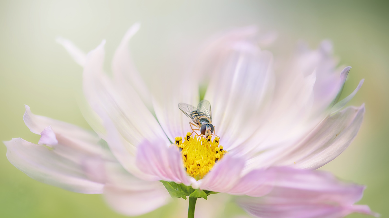 How to help hoverflies in your yard – discover the crucial role they play and 5 plants these underrated pollinators love
Hoverflies are also an effective form of natural pest control
-
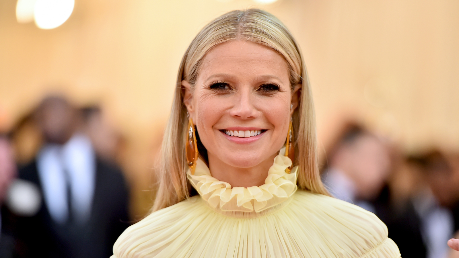 Gwyneth Paltrow uses LED lights to bring a gallery-like feeling to her kitchen cabinets – you can achieve the same, unique look for $24
Gwyneth's glass-front cabinets become more chic and accessible with their hidden lights, which create a subtle glow in the space

