Joey King's simple living room celebrates a minimalist style with refreshingly pared-back shelf styling – here's how to recreate her perfect design
The actress's living room is proof that you do not need excessive decoration to make a space look stylish. Her simple built-in shelves make all of the difference


Joey King's living room is a masterclass in minimalist styling. This pared-back look has been growing in popularity over the last several years, and King's space is a perfect example of how to make it look warm and intentional. Her simplified built-in shelves are one of the biggest stand-outs in creating a minimalist look.
The Family Affair actress's living room ideas pursue a white and brown color scheme, beginning with the light hardwood floors stretching to bright white painted walls. Chocolate furniture and a dark wood fireplace, with antique carving marble insets and a mirror above, bring a sense of history to the space. Built-in shelves with houseplants on top add a lived-in feel without contributing clutter.
'Minimalist living room ideas can be so effective in a historic space like Joey King's,' says Jennifer Ebert, digital editor at Homes & Gardens. 'By leaving the shelves uncluttered, King's designer highlights the antique beauty of the fireplace and her high-quality hardwood floors. These materials really shine in a way that would be impossible in a more maximalist design.'
A post shared by Joey King (@joeyking)
A photo posted by on
She continues, 'I love how she has chosen to adorn the living room shelving with just two plants: one on the top shelf and one on the bottom, keeping any necessary items like books in the cabinets beneath the built-ins. These plants coordinate perfectly with the decorative statues on the mantelpiece, working together to create a design that looks minimal but not spartan.'
To recreate Joey King's neutral living room ideas, first, think through your decorative objects to choose just a few favorites. In this case, she has displayed objects in sets of two and allocated different zones for plants and sculptures. Next, consider how you might display these objects with plenty of space. King's space prioritizes one item per shelf, but it's possible to create a look that is still minimalist with a few more items.
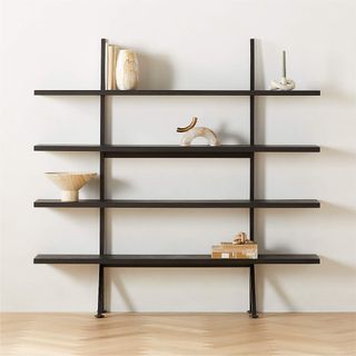
Shop the Shelving Edit
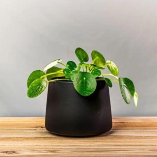
Introducing simple shelving with a houseplant and a piece of pottery will elevate your space without making it look overcrowded. These easy examples work to add a touch of unimposing color and would work especially well with natural wood shelves.
While there is a time and place for more maximalist decor ideas, minimalist shelf styling where you take a more slow and intentional approach, can still look just as beautiful. King's living room shows us the fewer decorative items on show, the more each one shines.
Sign up to the Homes & Gardens newsletter
Design expertise in your inbox – from inspiring decorating ideas and beautiful celebrity homes to practical gardening advice and shopping round-ups.

Sophie is a News Editor at Homes & Gardens, where she works on the Celebrity Style team. She is fascinated by the intersection of design and popular culture and is particularly excited when researching trends or interior history. Sophie is an avid pop culture fan. As an H&G editor, she has interviewed the likes of Martha Stewart, Hilary Duff, and the casts of Queer Eye and Selling Sunset. Before joining Future Publishing, Sophie worked as the Head of Content and Communications at Fig Linens and Home, a boutique luxury linens and furniture brand. She has also written features on exciting developments in the design world for Westport Magazine. Sophie has an MSc from the Oxford University Department of Anthropology and a BA in Creative Writing and Sociology from Sarah Lawrence College.
-
 Skyseed is a vigorous invasive weed that is becoming a problem in backyards – here's how to identify and control it
Gardeners in North America should keep an eye out for this vigorous perennial weed
By Thomas Rutter Published
-
 This simple closet swap doubled my cramped hanging space – professional organizers swear by it too
Velvet hangers have transformed my closet
By Eve Smallman Published
-
 Drew Barrymore's Beautiful collection embraces flower power – this one item literally lights up a room
The latest decor drop includes a vintage-inspired flower lamp, which retails for under $48 – and it was the first thing in our carts
By Hannah Ziegler Published
-
 Diane Keaton's new decor collection is a celebration of wit and playful irreverence – directly inspired by her quirky home
The collaboration offers a humorous twist to the most simple color palette of all – bringing Keaton's flare to our entertaining spaces
By Megan Slack Published
-
 RuPaul's kitchen is sleek and sophisticated thanks to this unexpected cabinet color
RuPaul's black kitchen cabinets are undeniably bold, yet have a surprisingly soothing effect that get the expert stamp of approval
By Hannah Ziegler Published
-
 Justin Baldoni's anti-trend kitchen cabinet color serves as the perfect 'blank canvas' – this style will never fade
The actor knows that this color transcends fads, so he used it for his kitchen cabinets - experts swear by the classic, calming shade
By Sophie Edwards Published
-
 Cynthia Nixon's sofa color is a 'cornerstone in modern interior design' – it's a classic for a reason
Cynthia Nixon's gray sofa proves that the neutral hue is anything but outdated, pairing the soft shade with some warm, natural materials for a trendy look
By Hannah Ziegler Published
-
 Pastry chef Dominique Ansel shares the 3 most useful appliances every home baker needs in their kitchen
The celebrity pastry chef swears by these pieces of equipment to level up your home baking - and explains the one item he can't live without
By Sophie Edwards Published
-
 Martha Stewart's dining room taps into this timely trend – here's how to recreate the look
Martha Stewart's Skylands property in Maine has been decked out with a summer-ready tablescape, featuring collectible plates and coveted glassware
By Hannah Ziegler Published
-
 Jamie Lee Curtis's luxurious bedding is a favorite among sleep experts – and it's surprisingly low-maintenance
Jamie Lee Curtis's bedding has benefits for skin, hair, and sleeping temperature - experts say it is exceedingly simple to care for
By Sophie Edwards Published
