What should I avoid in a small bathroom? 8 mistakes that are ruining your space – and how to fix them
Give the impression that your modest-sized bathroom is bigger with clever wall, floor and ceiling finishes
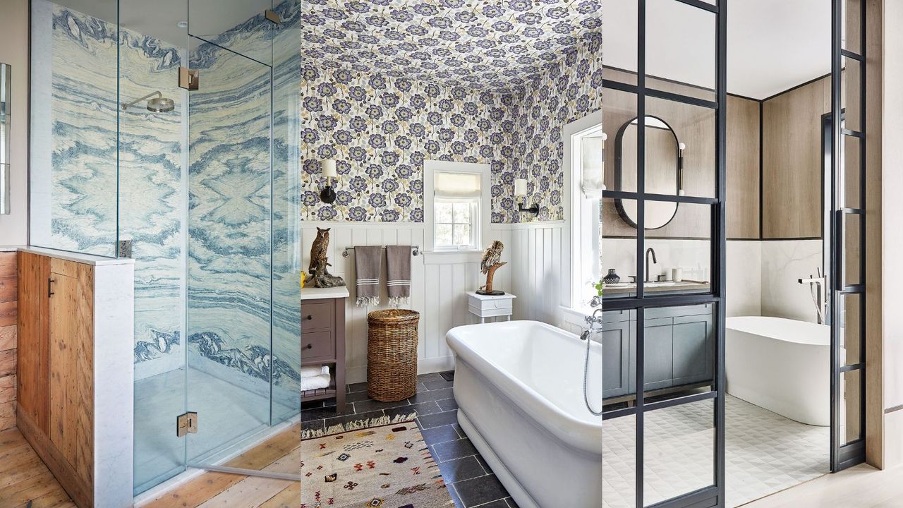

If you have a remodel on your mind for your small bathroom, it's just as helpful to know what to avoid as what to include. Whereas some bathroom design errors can be easily rectified or even ignored, small bathroom mistakes can be impractical to live with, disruptive, costly, and time-consuming to remedy.
When it comes to small bathroom ideas, clever planning – which includes everything from layout to fitting choices, to color and materials – is key to ensuring that even a tiny bathroom can still feel spacious, luxurious, and functional. So if you don't have an expert on hand to emphasize the importance of a well-planned bijou bathroom, it's easy to see how things unravel.
Small bathroom decorating mistakes to avoid
Below we've asked the experts to reveal what you should avoid in a small bathroom, plus advice on how to make a small bathroom look bigger.
1. Not considering tile finishes
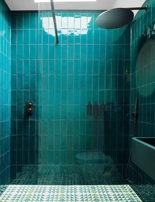
Just because you're limited on space doesn't mean that small bathroom tile ideas are in limited supply, too. The best small bathroom designs factor in tile finishes at the forefront.
‘Glazed tiles have a reflective quality, allowing light to bounce around, making the room look lighter and giving the impression of a more generous space,’ says Ruth Webber, creative director, Bert & May. ‘The jewel-toned tiles in this shower room maximize light from the skylight, while geometric floor tiles enhance the color and brightness levels.’
2. Not making the most of height
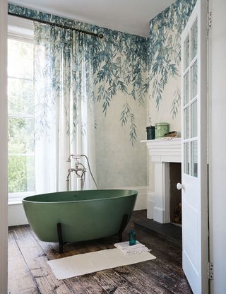
If you are lucky enough to have a bathroom with high ceilings, make the most of every inch and draw the eye upwards rather than downwards with height-boosting paper.
If your bathroom has decent height, find ways to celebrate it. ‘Wallcoverings are a great way to add depth and dimension,’ says Becky Brown, design manager, Romo. ‘To expand a room, the main criteria is to draw the eye outward. A design that gradually disperses as it goes downs the paper will ensure that the focal point is higher when entering a room, emphasizing the sense of space.’
3. Forgoing definition and textural elements
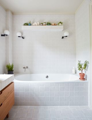
For many years, bathrooms have been all about ultra-practical smooth surfaces, however, tactile finishes please the senses and introduce visual style to a small bathroom.
Pale color schemes undoubtedly have an expansive effect, but, amid the hard surfaces of a bathroom, they can feel clinical. ‘Finding clever ways to create surfaces that can be used purely for lovely things, like this floating shelf, is so important,’ says Ellen Cumber, director, Golden Design. ‘Clad in the same tactile tiles as the surrounding walls, the shelf brings shape and definition without impeding the fresh, clean look.’
4. Skimping on statement materials
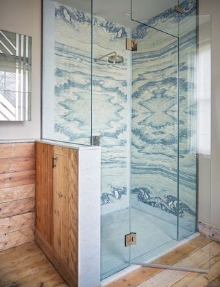
Designed to steal the show and provide a luxurious look, a well-chosen small bathroom floor, wall or backsplash will prove a seriously good investment in a luxury bathroom, especially one on the smaller side.
Book-matching is an elegant way to dial up the decorative impact of luxury stones, with space-boosting results. Here, eight pieces of stone, cut from the same block of marble, have been carefully book-matched to elevate this statement corner shower. ‘Using the marble floor to ceiling, without visible junction lines, helps pull the eye upwards and make the whole space feel larger,’ adds Maria Speake, founder, of Retrouvius.
5. Thinking pattern is a no-no
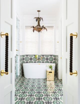
Small bathrooms are rife for decorative opportunity, so do consider introducing playful patterns that will add an element of surprise and unexpected intrigue.
More is always more, even in a smaller space like a bathroom. ‘I love a bathroom with patterns everywhere! Using the same bold tile on the floor, shower and part of the walls makes for maximum visual impact and camouflages the smaller footprint of the space,’ enthuses Courtnay Tartt Elias, principal, of Creative Tonic Design. ‘Without a strong delineation from floor to wall, the space appears more open and brighter.’
6. Not maximizing space with well-placed mirrors
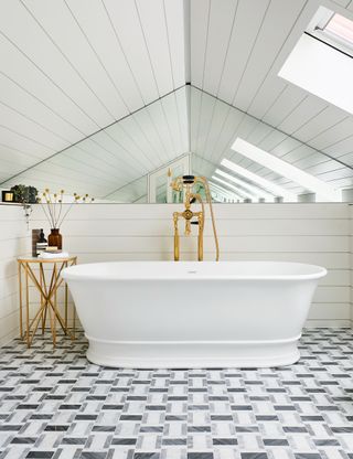
Embrace the space-boosting power of mirrors. Adding a bathroom mirror is not only an aesthetic choice, but it’s also a practical one too that can work wonders for the proportions of the space.
‘A full-width mirror with another mirror installed opposite will make the room appear to go on and on,’ says Emma Scott, director of design, C.P. Hart. ‘Here, the parallel paneled ceiling and opposing mirrors cleverly work this optical illusion, reflecting the skylights through the space.’
7. Forgetting about the ceiling
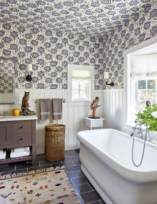
Bathroom ceiling ideas offer scope to expand your creativity beyond your four walls. Using bathroom wallpaper on the ceiling can help to extend the walls, and carrying the same wallpaper overhead is a sure way to pack plenty of punch in a small space.
While darker wallpapers on the ceiling is thought to be enclosing, choosing a design with a light background color has the opposite effect, as interior designer Philip Gorrivan demonstrates in this stimulating space. The crisp white tongue-and-groove paneling provides a visual rest to prevent pattern overload.
8. Sticking to one color or material type
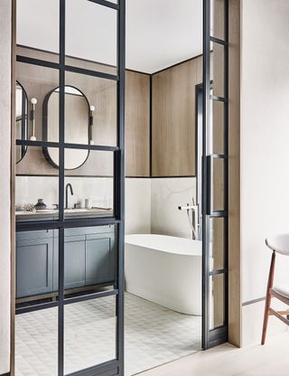
When space is tight, the key is to distract the eye, and this can be done by choosing an amalgamation of materials and colors. Switching tile formats and materials creates a more dynamic mood without overpowering.
‘Here we mixed large marble slabs on the walls to make the space look more expansive, then added warmth to the walls using bleached walnut veneer framed in liquid metal – a beautiful detail inspired by Chanel packaging,’ explains Irene Gunter, founder, Gunter & Co. ‘The small-scale pattern underfoot makes a nice change of pace.’
Sign up to the Homes & Gardens newsletter
Design expertise in your inbox – from inspiring decorating ideas and beautiful celebrity homes to practical gardening advice and shopping round-ups.
Linda graduated from university with a First in Journalism, Film and Broadcasting. Her career began on a trade title for the kitchen and bathroom industry, and she has worked for Homes & Gardens, and sister-brands Livingetc, Country Homes & Interiors and Ideal Home, since 2006, covering interiors topics, though kitchens and bathrooms are her specialism.
-
 3 must-read tricks to create a 'hero' focal point in any room that interiors' expert Hans Lorei says will 'make people stop in their tracks'
Simple, clever – and always successful
By Eleanor Richardson Published
-
 When do hummingbirds return from migration? Wildlife experts reveal when to expect them and how you can help
As hummingbirds return to North America, gardeners can play a part in caring for these weary travellers
By Thomas Rutter Published
