Outdated bathroom trends – 6 overdone looks that designers like to avoid, and here's why you should too
There are both practical and aesthetic reasons as to why bathroom designers are washing their hands of certain looks
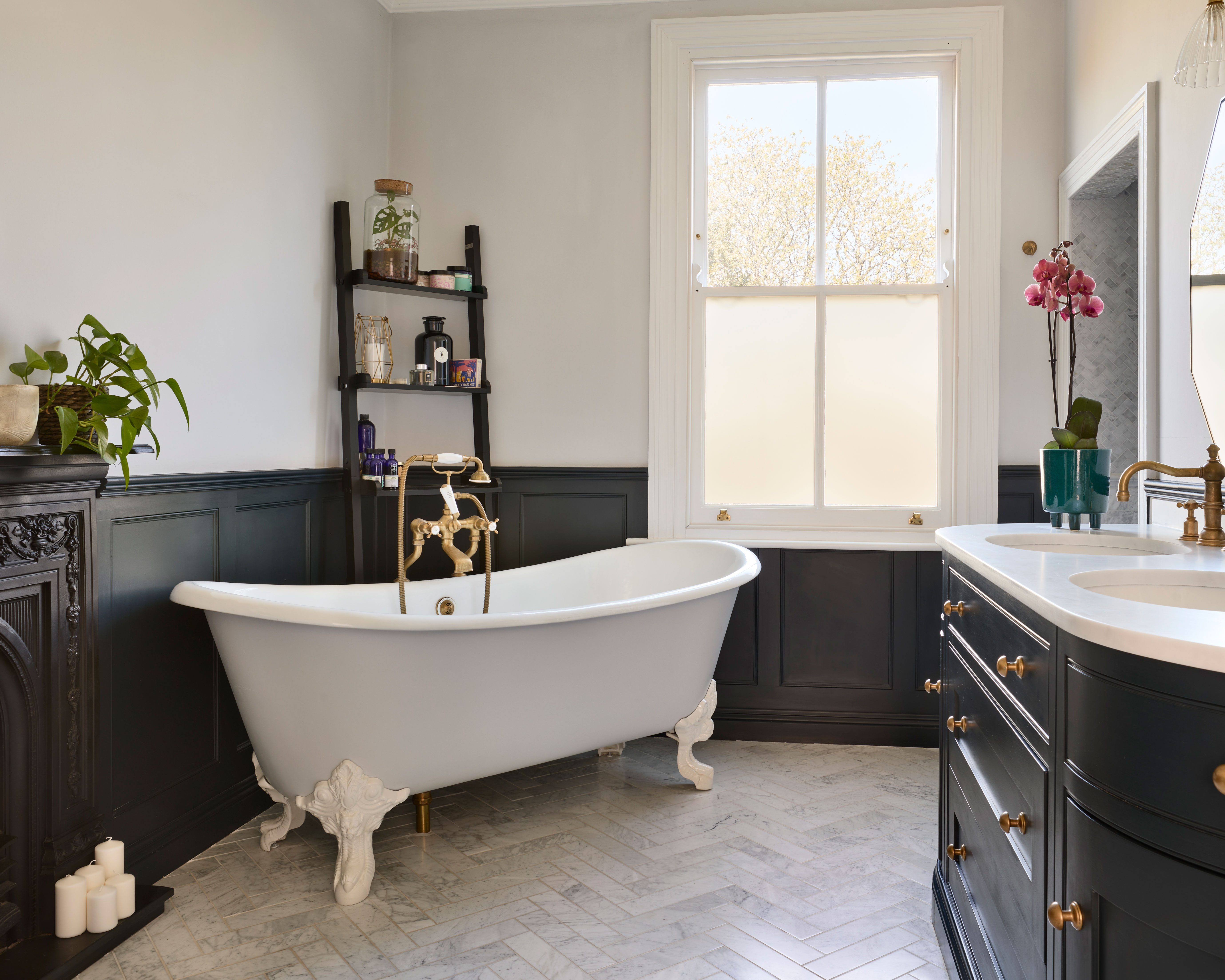

It's all too easy to fall foul of outdated bathroom trends, not least because you might not consider them as 'trends' in the first instance.
Perhaps the more obvious bathroom trends trap is to commit to a fashionable feature without factoring in its longevity. That statement tile or sanitaryware might be right for 'right now', but how will it fare in a few years? As Ripples bathroom designer Charlotte Ashfield warns, 'a bathroom generally only gets updated every 10 years, which is a big commitment to something, especially if you are not completely sold on it.'
The second is to eschew character altogether for fear that your bathroom will date. Ironically, avoiding certain trends can age a bathroom, too. The classic tile layout and minimalist looks that have made this list are proof that keeping it simple isn't always a good idea in the long term.
6 outdated bathroom trends to avoid
When it comes to designing a bathroom, almost anything goes, but our panel of experts advises approaching the following ideas and features with caution.
1. Minimalism
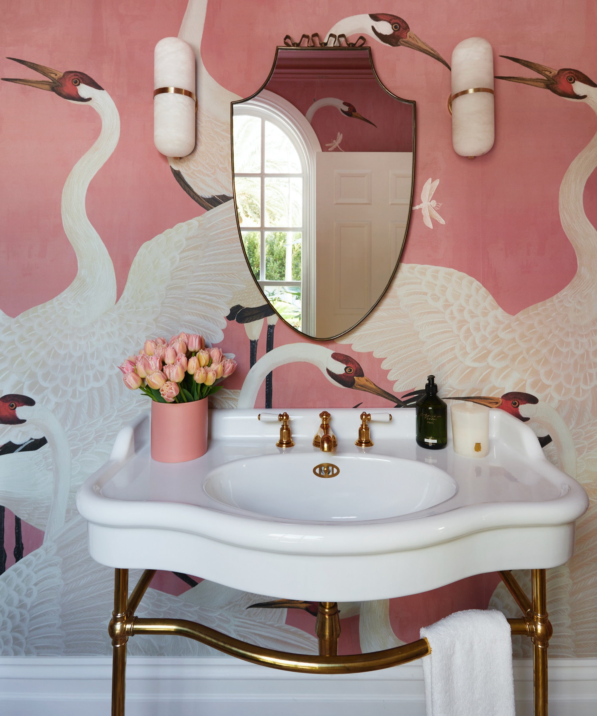
The clean lines and white fixtures of a bathroom may lend themselves to a pure, monochrome look, but it's one that designers are increasingly shying away from.
'Few designers now are going for a pure minimalist look,' reveals Emma Joyce, Brand Manager at House of Rohl. 'People are looking for greater comfort and a more personalised approach to bathroom design. If that means mixing styles, being bolder in colour and pattern, and embracing some level of propping, then so be it.'
This is especially true of half bathrooms. In this sensational powder room by Australian interior designer Kate Walker, Perrin & Rowe fittings pop against a dramatic Heron Wallpaper by Gucci.
2. Fussy tiling
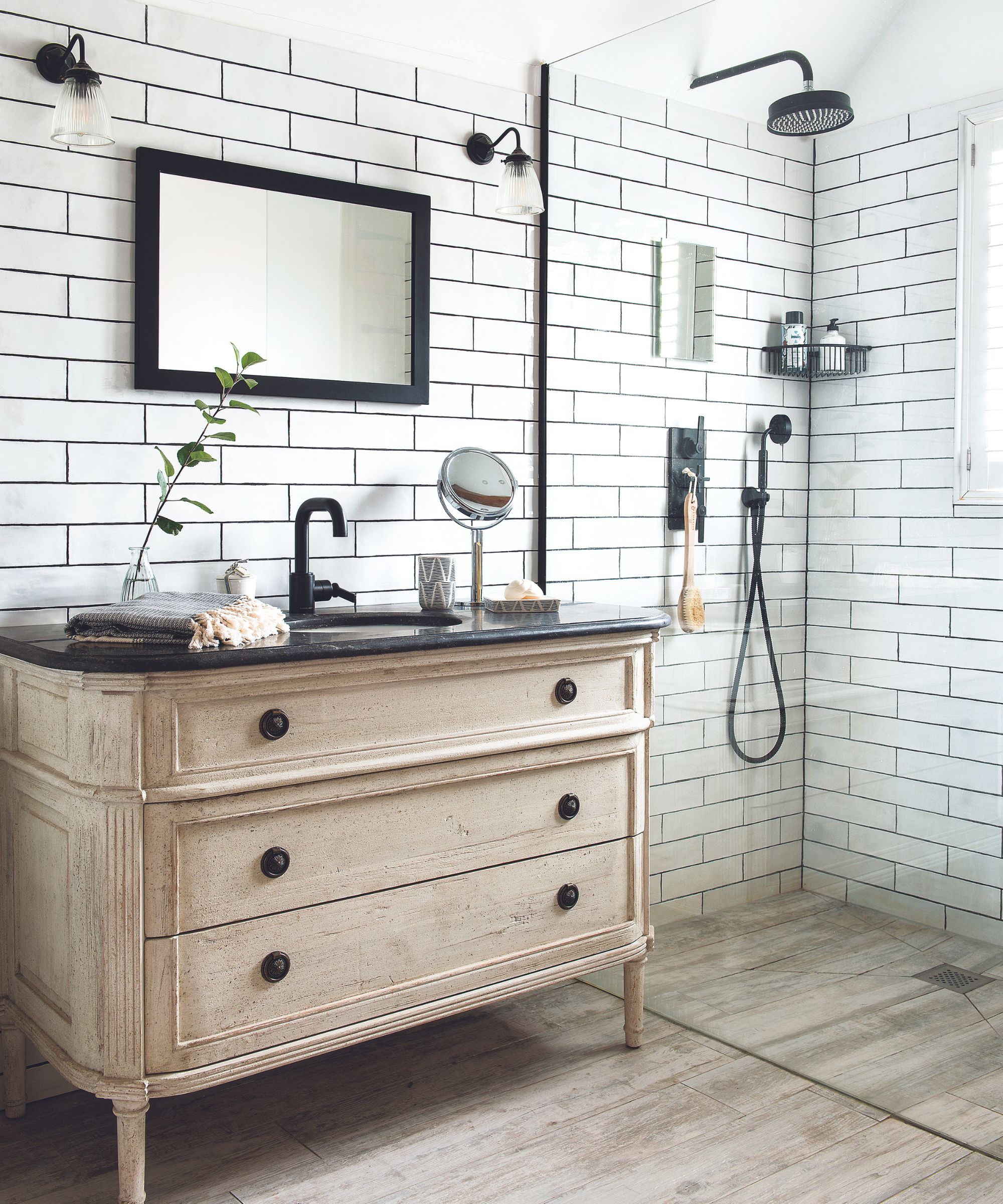
'Over the past couple of years patterned tiles have seen a huge resurgence since first gaining popularity in the '60s and '70s,' observes Ripples bathroom designer Charlotte Ashfield. 'Whilst they can make a beautiful statement in any bathroom and are very on-trend now, they could date your scheme in the long term.'
'I usually advise taking elements of the current trends, especially with tiles, but toning them down slightly by picking a neutral colorway, for example. Or choose a more timeless bathroom scheme and incorporating trends through blinds, towels and accessories.'
'If you've completely fallen in love with a heavily-patterned tile, perhaps consider half-tiling the room so you can update the scheme with a new bathroom color scheme to keep the space looking fresh in years to come.'
3. Vessel basins
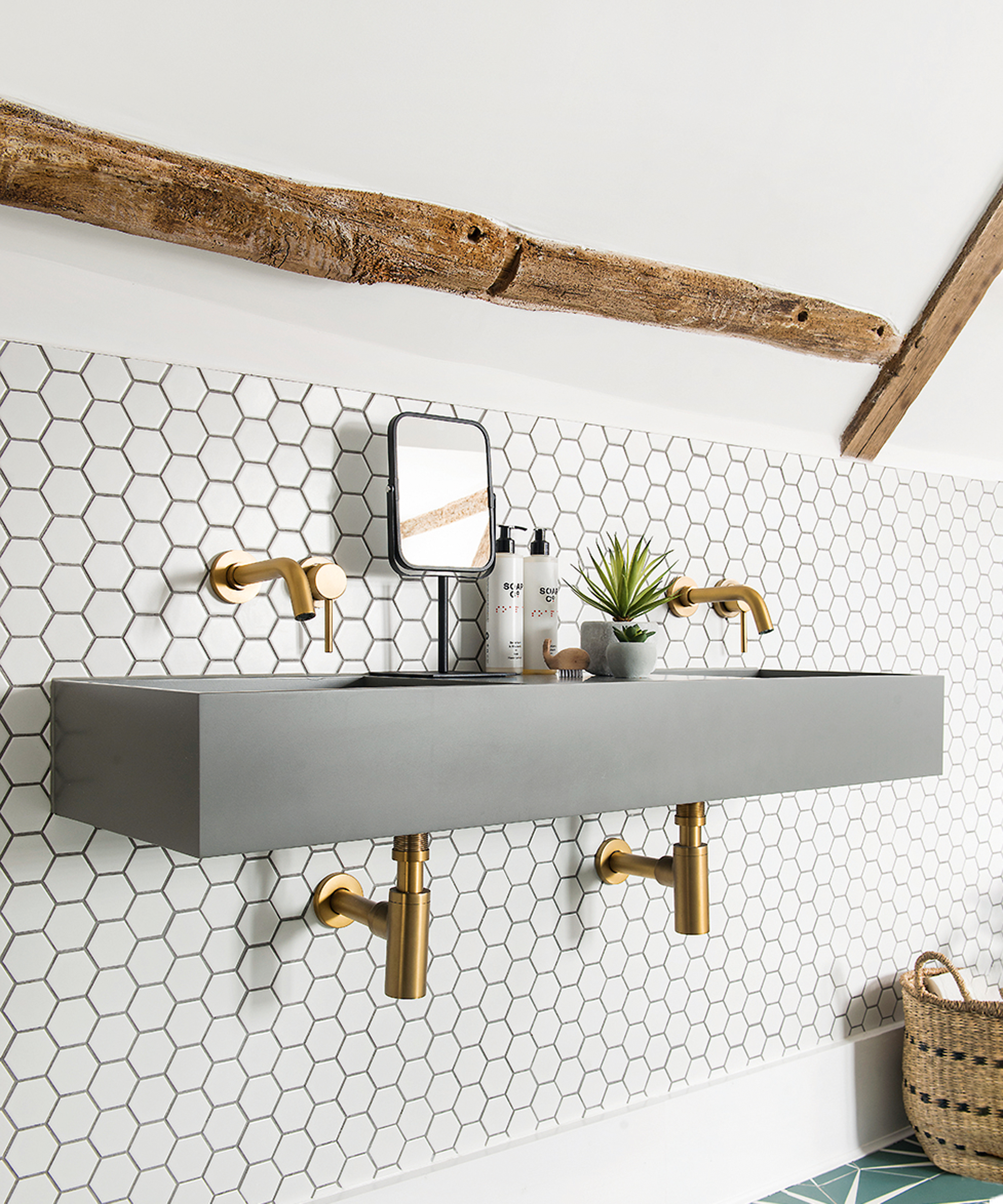
'We are steering away from the use of vessel basins – this is the style of the basin which sits on a countertop, quite often with visible plumbing underneath,' explains Josie Medved, design project manager at Symphony Group. 'They can look a bit untidy with visible plumbing, and they usually require a taller-than-standard tap to reach into the basin.'
Josie also cites vessel basins as being 'are harder to clean', especially around the area where the basin meets the countertop. 'The basin is also vulnerable to knocks.'
So what are the alternatives? Well, if you like the idea of exposed pipework, a wall-mounted option with no vanity beneath, such as the example above, will look less cluttered, and its wall-mounted taps are less restricting, design-wise. A pedestal basin is a timeless classic and is easier to clean thanks to its flowing form.
Countertop basins aren't ruled out, but a rectangular design that either covers the whole counter or sits at a 90-degree angle will be easier to look after. 'I think the style of a semi-recessed basin with an Integral countertop is very stylish,' says Josie. 'There are no joints and the countertop is so easy to clean, and there's no chance of dirt and soap residues building up in crevices.'
4. Brickbond subway tile layouts
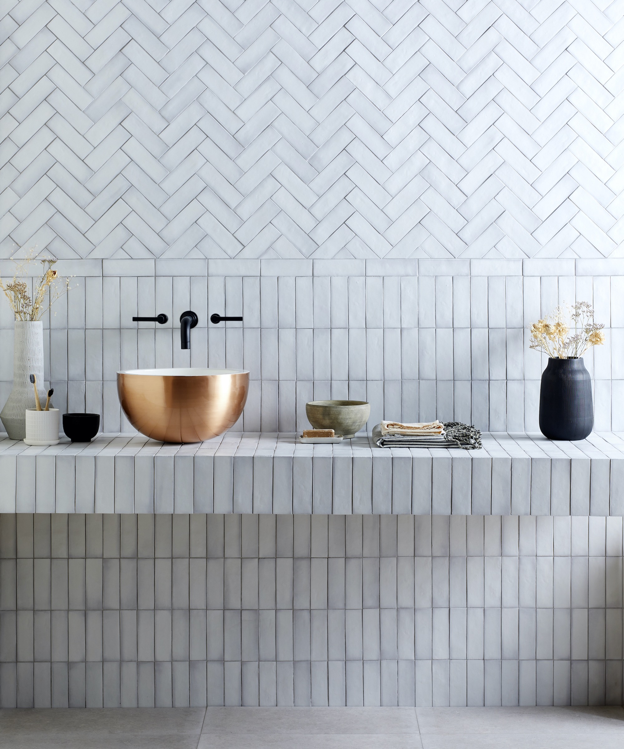
'Although you can't go wrong with classic subway tiles in a traditional brickbond layout – which is why the look has been popular for so long – today's bathroom designers don't want to play it safe and are coming up with subway bathroom tile ideas in increasingly creative formats and finishes,' says Colin Roby-Welford, Fired Earth's creative director.
'This is very much in keeping with the general trend for bathrooms that are eclectic, really personal spaces. With a little imagination and flair, even the simplest brick-shaped tiles can be used to create everything from eye-catching basketweave designs to herringbone patterns, really adding character to a bathroom and avoiding the risk of a formulaic look.'
'Mixing formats and finishes – perhaps combining subway tiles with mosaics, or glass tiles with terrazzo – is another fresh and inspiring approach to using metro tiles, ensuring that bathroom walls are a beautiful design feature rather than having a purely utilitarian or slightly unimaginative look.'
5. Hollywood-style bulb lighting
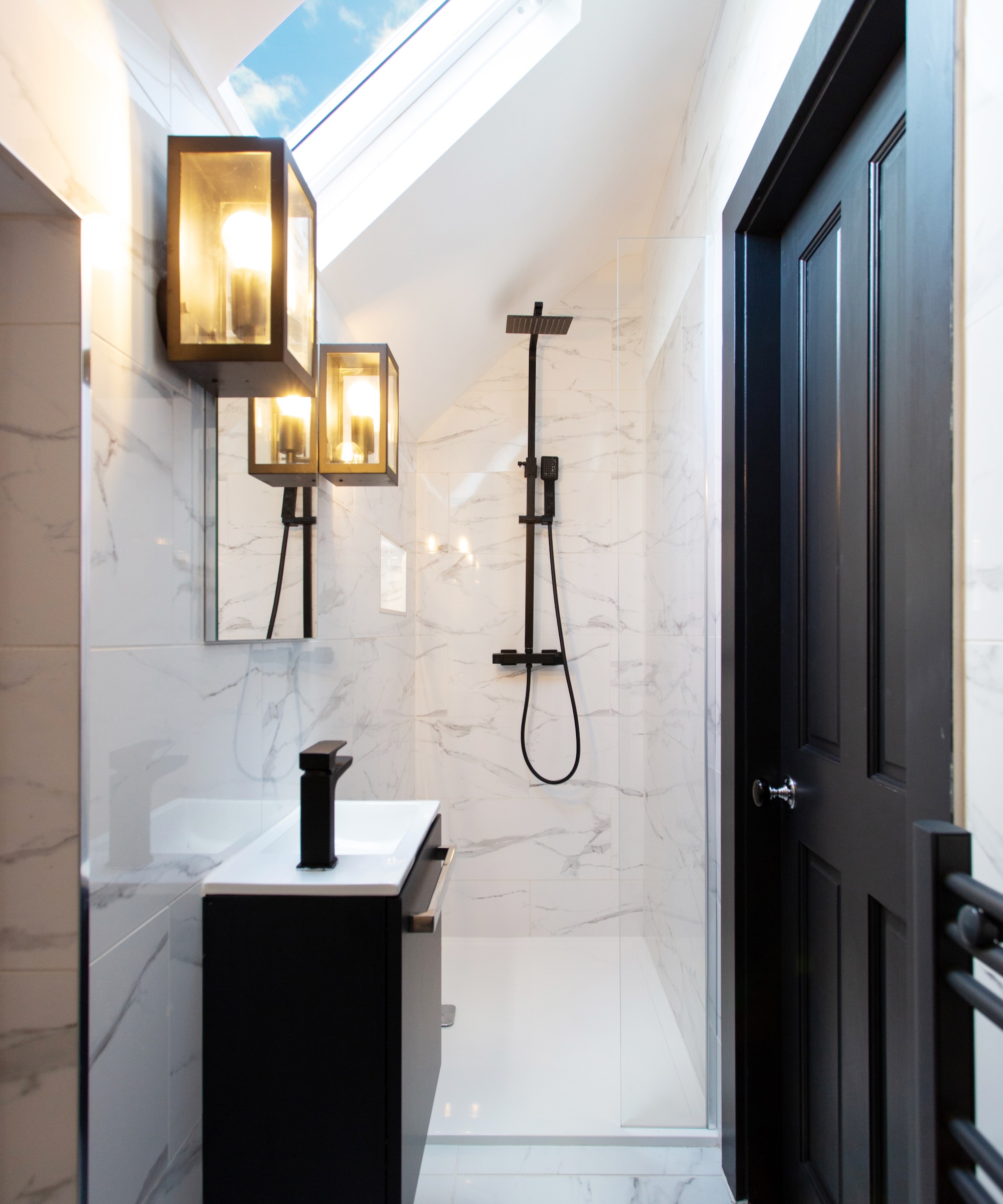
It's official – theatrical bathroom mirrors surrounded with bulb lights are not on designers' A-lists.
'Whilst Hollywood-style marquee lighting started off as fun and offered practicality, it wasn’t very attractive and soon became a trend that made the space feel unstylish and conventional,' says Ann Marie Cousins, Founder of AMC Design. 'Since dressing rooms have become more accessible, Hollywood mirror lighting has made a swift transition to that space — and let’s hope it stays there.'
'Following the popularity of stylized and spa-like bathroom ideas, lighting has become important in bathing spaces as it can add value to the ambiance and mood of the room. Consider opting for decorative wall lighting to frame and complement the mirror instead, it will be just as clear but isn’t so much of an eye sore. You can also have a separate task light like a built-in spotlight for when you need a clear view of what you’re doing in the evening.'
6. Shower curtains
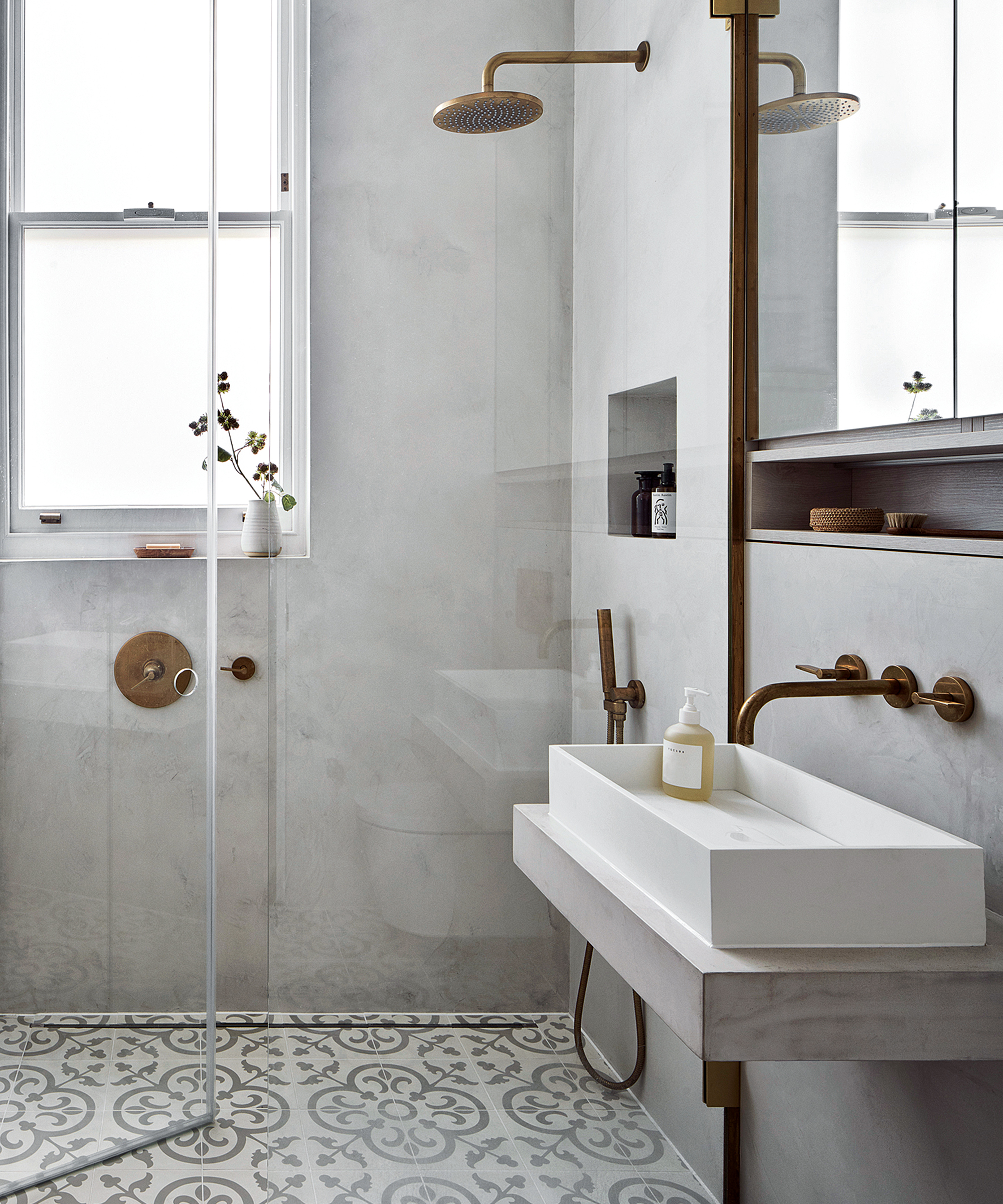
'Shower curtains were once a great way to add an element of personality to a bathroom, offering color and quirky design to the space,' continues Ann Marie Cousins. 'The only problem with shower curtains is that they often felt and looked cheap, and rarely offered longevity.'
'We would suggest that a basic glass shower frame is all you need to elevate your shower area. Simple yet effective, it provides a refined look and can also give the illusion of a bigger and more open space.'
Sign up to the Homes & Gardens newsletter
Design expertise in your inbox – from inspiring decorating ideas and beautiful celebrity homes to practical gardening advice and shopping round-ups.

Amy Cutmore is Editor-in-Chief, Audience, across Future's Homes portfolio. A homes and interiors journalist of 20 years standing, she has spent much of that time writing about technology, appliances and kitchens. While other people count how many countries they've visited, Amy tots up how many countries' washing machine factories she's toured (it's eight by the way, from South Korea to Slovenia). She can't leave the house without a decent pair of noise-cancelling headphones, and is always ready to explain an acronym – be it QLED, DAB or HDMI.
-
 5 range alcove ideas that turn this awkward feature into the heart of your kitchen
These ideas are the perfect way to make a feature of awkward kitchen spaces
By Molly Malsom
-
 Can you revive woody rosemary plants? Expert pruning advice from a professional gardener to save old, leggy herbs
With the right pruning approach, old and woody rosemary plants can be brought back to life
By Thomas Rutter