I've ripped out and redesigned 14 bathrooms – these are the 15 lessons I've learned
Layout mistakes, the wrong material choices and DIY mishaps have taught me valuable – and money-saving – lessons
- 1. Buy well, buy once
- 2. Don't DIY if you can't DIY
- 3. Plan for beautiful practicality
- 4. Get a great plumber, make a map of the pipework
- 5. Don't choose your bathroom design in isolation to the rest of your home
- 6. Always get in the bath before you buy it
- 7. Don't have an ensuite
- 8. Make the bathtub or vanity the focal point
- 9. Pay close attention to the bathroom lighting
- 10. Growing family? Plan for ridiculous amounts of storage, and know space-saving tricks
- 11. Choosing tile? Don't skimp on underfloor heating
- 12. Don't tile wall-to-wall
- 13. Choose the right color
- 14. Don't under-estimate ventilation
- 15. Maintain, maintain, maintain
- FAQs

As an adult, I've moved from rentals to house flipping to being a landlord, slowly trading up from tiny one bed apartment to my current home, a five bed Victorian. Each home I've had, I've renovated from top to bottom. When I was younger, and much poorer, I did all the work I could myself; as I've gotten older, and busier, I've employed professionals. My first home had a tiny over-bath shower room; my second apartment, a more generous bathroom. My current home has two full bathrooms and two shower rooms, plus a further two powder rooms.
In all, I count around 14 bathroom remodels, that I've done myself, excluding powder rooms. And that's not counting all those bathroom design ideas I've helped friends and family with. Home additions aside, remodelling a bathroom is second only to a kitchen for spend, necessary forethought and planning, so getting it right is vital.
Over the years I've made both good choices and bad, and every single bathroom renovation has taught me something new. I'd like to share the vital ingredients to a successful bathroom design with you here.

I have written about interiors, property and gardens since 1990, working my way around the interiors departments of women's magazines before switching to interiors-only titles in the mid-nineties. I was Associate Editor on Ideal Home, and Launch Editor of 4Homes magazine. In 2018, I took on the role of Global Editor in Chief for Realhomes.com, and was asked to repeat that success at Homes & Gardens, where I have also taken on the editorship of the magazine. I bring first-hand knowledge to the subjects I oversee, having flipped numerous homes.
1. Buy well, buy once
While it might only ever be you and your family that sees your bathroom(s), you will regret taking the 'out of sight, out of mind' approach to your budget. You don't need to devote a similar percentage of a whole house remodel to a bathroom as you would a kitchen (typically, real estate agents recommend a spend of 5 per cent of your home's value for a bathroom, 10 per cent for a kitchen), but you will regret not buying quality hardware.
This means ensuring a good quality bath material (cheap plastic scratches, discolors and stains, for example), and high quality faucets. Faucets can be shockingly expensive in comparison to the rest of your bathroom's fittings, but I cannot say this plainly enough: cheap ones will quickly become stubborn at being turned on and off, will wear more quickly than good quality ones, and will eventually need repairing or replacing more quickly, which will bring with it further costs. Save yourself the frustration and buy well-made pieces first time around, even if it means reducing costs elsewhere.
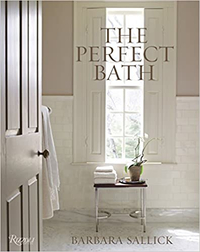
The Perfect Bath, Barbara Sallick | From $36.49 at Amazon
Learn more about the fundamentals of bathroom design in this bestselling book. Find practical advice as well as hundreds of images to inspire your own remodel
2. Don't DIY if you can't DIY
When I was remodeling my first bathroom, I did all of the tiling. I was pretty pleased with the results but they were incredibly amateurish (as was frequently pointed out by visitors). Over time, I've come to realize that my skills lie in conjuring up the concept, the color scheme, the bathroom layout, and that everything from tiling a wall to (even) hanging a picture is best left to a professional or – if I can pin him down – my partner.
Of course, if you're on a tight budget like I was, you may have to do much of the work yourself, but I would urge you to stick to the painting and to save hard to get a professional to do the trickier jobs that you may well make a mess of.
3. Plan for beautiful practicality
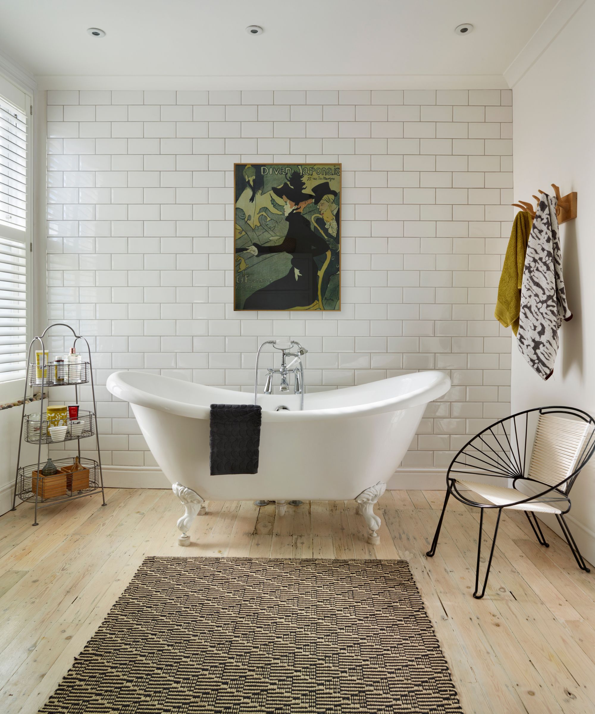
Bathroom number 11, above
If you're getting ideas from our pages, you will know that a bathroom can be as seriously beautiful and as 'soft' as any other room in your home. And you want this – this is the space that you might whizz through at the beginning of the day, but at the end, it's likely the place you'll retreat to in order to unwind before bed.
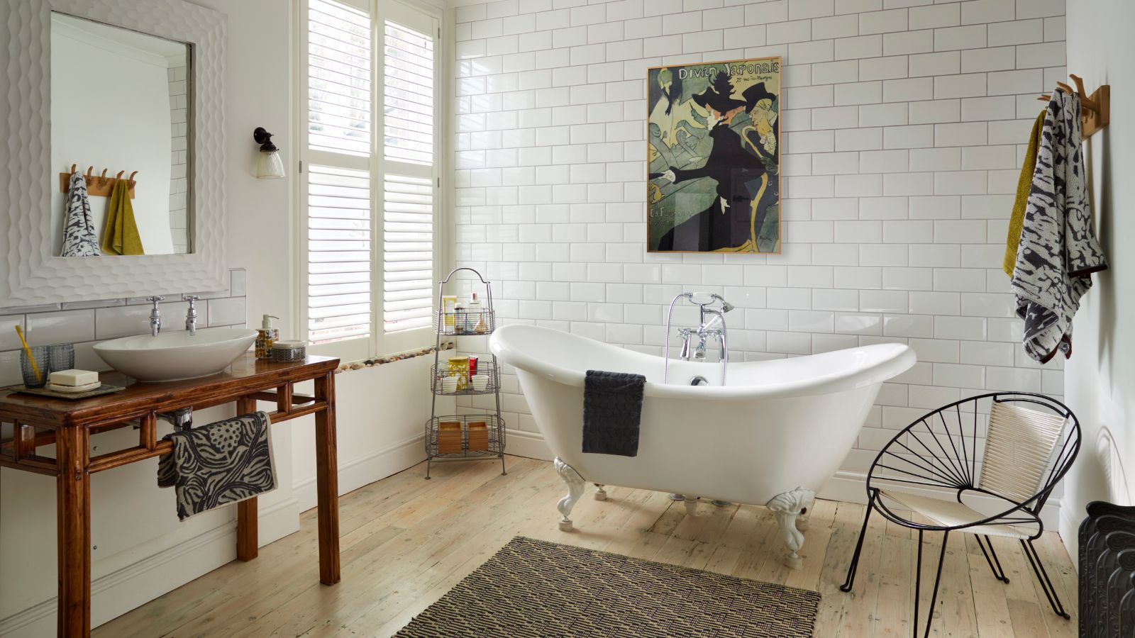
So, it's got to look good and feel luxurious. That, to me, means choosing a curvaceous, shapely free-standing bath; having a hand basin that sits on an antique vanity table, relying on an antique closet for linens, hanging artwork on the walls, a pretty cut glass light fitting from the ceiling, laying a gorgeous rug instead of a bathmat, and growing exotic plants. You'll have your own interpretation of what's beautiful for you – but know that your choices have to be practical too not to be frustrating.
So, my gorgeous bathroom rug is actually an outdoor rug that can take no small amount of splashing. My antique vanity table has been varnished as thoroughly as you'd varnish the hull of a yacht. My antique linen closet has been adapted inside to cope with the sheer amount of towels, toiletries, cleaning products, medications and hair/teeth/makeup gadgets my family has gathered. The pendant light is purposefully placed far enough from the bath to be safe from splashes, as has the artwork.
In the past? I prioritized looks over practicality (original Victorian wood floors under a bath frequented by toddlers). In the long run, I paid for that bad choice, twice. So mantra number three: it can be beautiful, but it's got to be practical.
4. Get a great plumber, make a map of the pipework
There is nothing worse than a water leak from upstairs, and while every plumber I've had work for me has had a mishap or two, the more experienced, better, and as a result, more expensive, plumbers are less likely to make costly mistakes. I shiver when I see local Facebook requests for a 'cheap plumber'. Yes, we all want to pay a reasonable price, but a cheap plumber who's available right away to fit a brand new bathroom may not be experienced or good enough. Always check references, and always be prepared to wait for a really good plumber. You can use the extra time to put more money aside for the job.
A good plumber will always install pipework and check and check it again before laying flooring back down. Because once flooring is down, it's often easier to go through the ceiling below the leak to rectify it than to pull up newly laid tiles. And no one wants that.
A good plumber won't cut corners. A case in point: if your hot water source is miles from your bathroom, ensure the plumber is going to chase the pipework up into the bathroom via the quickest, shortest route possible, otherwise you're going to be running cold water for ages while you wait for hot water to arrive.
A good plumber will take time to attend to fine detail. For example, let's say you have a wet room or low-profile shower tray. Has the floor been angled so that the water flows into the drain and not into the room?
A good plumber will also show you where your pipework is beneath floors and in walls. If they don't, make it your business to find out, because one day, and always when your plumber has moved on/retired/died of old age, you'll need to know for a repair, adjustment, or simply so that you don't put a nail through it.
A good plumber will also tell you when one of your ideas is a really bad one. You needn't agree, but at least you have been warned.
5. Don't choose your bathroom design in isolation to the rest of your home
Recently, I wrote about the 9 kitchens I've remodelled and the lessons learned, and in the piece, I made this point too.
This echoes point three, above, but it's trickier to achieve in a bathroom than it is in a kitchen because often the room's architecture is less interesting and there's the need for huge, practical pieces of kit (bath, shower, vanity) that don't leave much space for expression of your home's overall style.
The simplest way to get your bathroom's design just right, though, is to pick a bath, vanity and faucets that echo your home's period, or if you have a very contemporary interior, that aesthetic. So, perhaps you have a Victorian style home? A freestanding rolltop bath is perfect. A contemporary NYC apartment? Think the streamlined, sleek lines of a curvaceous freestanding tub.
6. Always get in the bath before you buy it
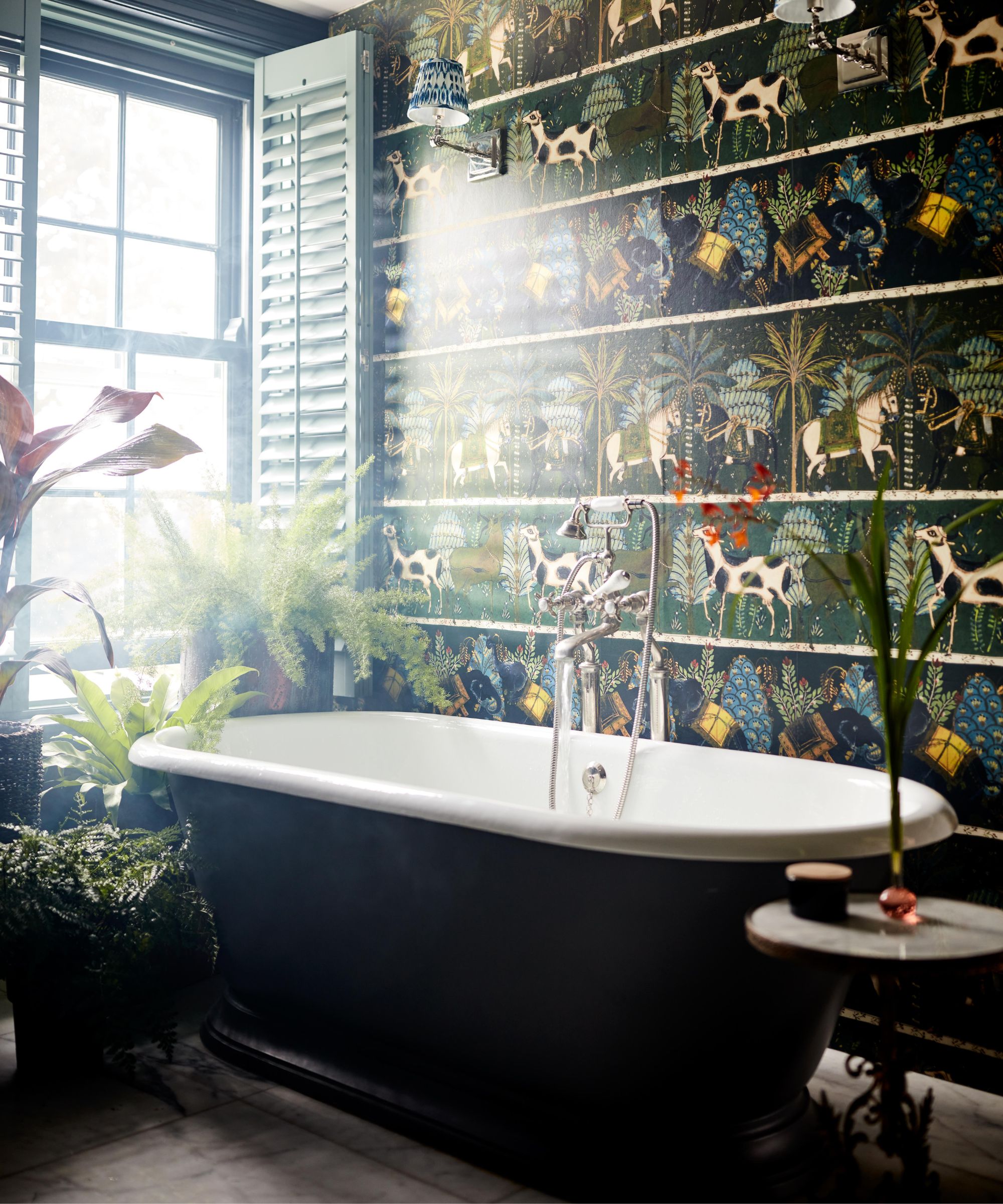
I like a long soak most nights and there's no better place for me to do that in my own bath, which I dry road-tested in the showroom before I bought it. I'm of average height (5ft 5in) and anyone of my height or shorter will tell you that a generous-sized bath is really uncomfortable to bathe in, just as, I imagine, a tiny bath is for a much taller person. So, I was careful to choose a bath that's long enough for me to brace my feet at the far end.
Of course, this is only not a problem because my partner is only 3in taller than me. If I'd married my former boyfriend (6ft 6in), we'd have to come to some kind of compromise (by which I mean, he'd have to take showers).
Ordering your bath online? Most baths are around or about 60in long and will suit you if you're of average height. If you're much, much taller or shorter, you might want to rethink.
Equally, think about the height/depth of your tub. Not only is it more difficult to get into if a freestanding bath is high-sided, it's back breaking to bathe a small child in. Plus, the deeper your bath, the greater the temptation to over-fill it, using more water than you need to.
7. Don't have an ensuite
This is going to be controversial for some of you, but I can't stand ensuite bathrooms. I'm very, very happy to have a bathroom connected to a primary bedroom if there's something in between (door, hallway, door, dressing room, door, anything) but I cannot bear having a bathroom that leads straight from the bedroom.
Why, when it's so highly desired? I'm not sure I need to spell it out but I don't find it relaxing, inviting or luxe to lie in bed listening to my partner's ablutions at night or first thing in the morning. Even separated by a length of hallway and a couple of doors, I want good ventilation and excellent sound-proofing.
8. Make the bathtub or vanity the focal point
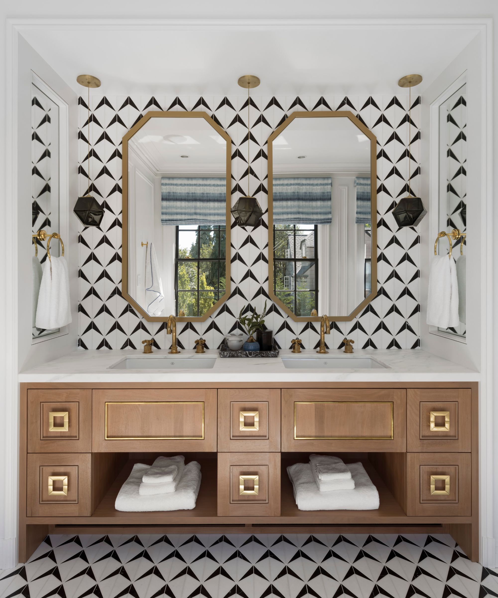
If you can, plan your room's footprint around the position of the bathtub or vanity. Both have a pleasing symmetry that, placed centrally on the focal wall (usually the one opposite the door), will look balanced and pleasing. And symmetry in interior design is one of the key tools that make your bathroom look more expensive.
This is something I learned quite early on when I was styling for photo shoots in some of the most glamorous homes in London. The bath was usually always the center of attention, and often framed by a wall of beautiful tile, wall paneling or bathroom wallpaper.
9. Pay close attention to the bathroom lighting
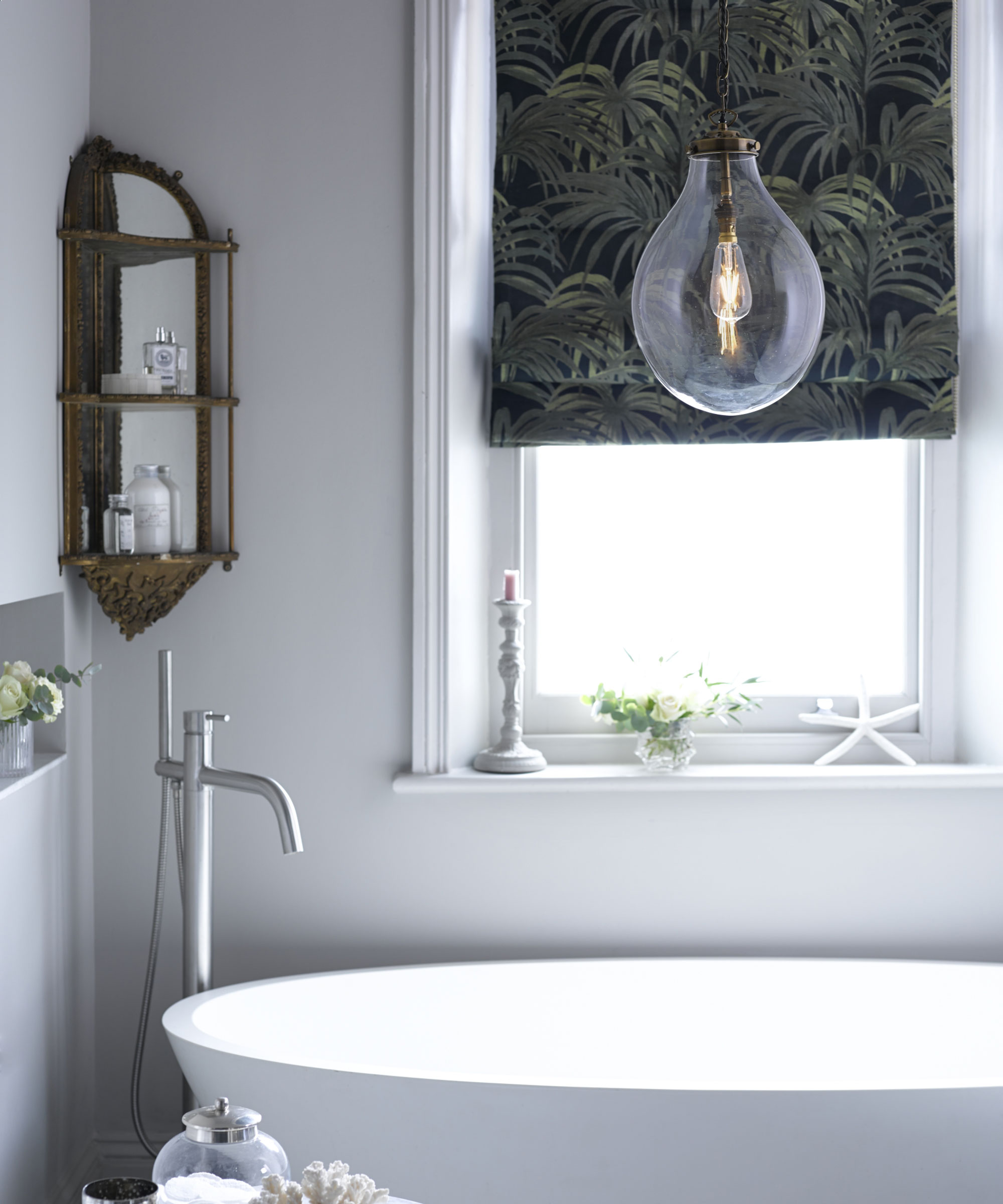
I cannot stress the importance of good bathroom lighting quite enough. So many people I know have one central light that's coolly lit and nothing else. It makes the bathroom feel cold and unwelcoming, which is only exaggerated if it's shining on hard, gleaming surfaces in cold colors.
Instead, plan bathroom lighting as you would other rooms', with a combination of lighting types with separate controls. My current primary bathroom is pretty big, so we have a pretty central pendant with wall lights either side of the vanity, both controlled individually. The wall lights give a much softer light which I prefer to bathe by; my partner prefers the overhead. I don't use the room for makeup, but if you do, you might need to ensure those wall lights are super bright and can be directed on to both sides of your face. And, consider doing what we did: swapping out the cold white LEDs the electrician left us with for warmer, yellower LEDs that make the room feel more welcoming.
10. Growing family? Plan for ridiculous amounts of storage, and know space-saving tricks
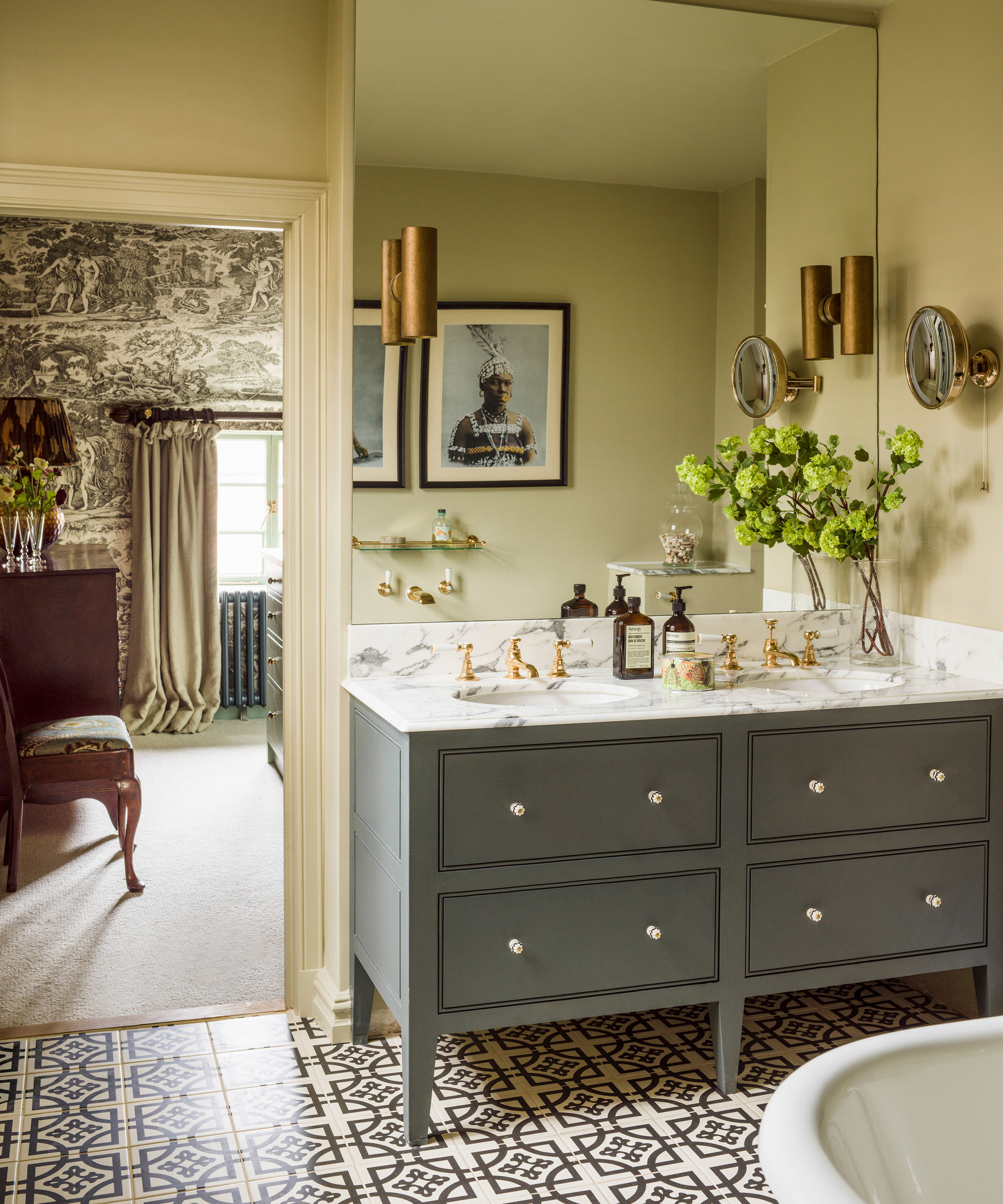
My first bathroom had a tiny wall-hung cabinet (painkillers, cleansers, toothpaste). The first bathroom I shared with my partner had a small but tall floor-standing cabinet (pain killers, cleansers, toothpastes x 2). One child in – we had to add a triangular corner cabinet (a space-saving shape, and the only corner available) to cope with all the extras. By the time we had moved to our next home, two children in, our bathroom had a wall of floor-to-ceiling mirrored cabinetry (pain killers, cleansers, toothpastes, baby towels, adult towels, guest towels, facecloths, nappies, medicines, creams, slings for fractures, equipment for braces, sun cream, and so on).
As time goes on, you will find you need more and more bathroom storage, so if you have space for it now, build it in now.
As for space-saving tricks: bear in mind that the more storage space you add in, the less floor space you will have or be able to see. This, in itself, can make a bathroom feel smaller. The simplest trick to get what you need while making a small bathroom look bigger is to include plenty of wall-hung or on-legs storage combined with wall-hung sanitaryware and a bath standing on legs. If you can see the floor to the edges of a room, that room will appear bigger.
11. Choosing tile? Don't skimp on underfloor heating
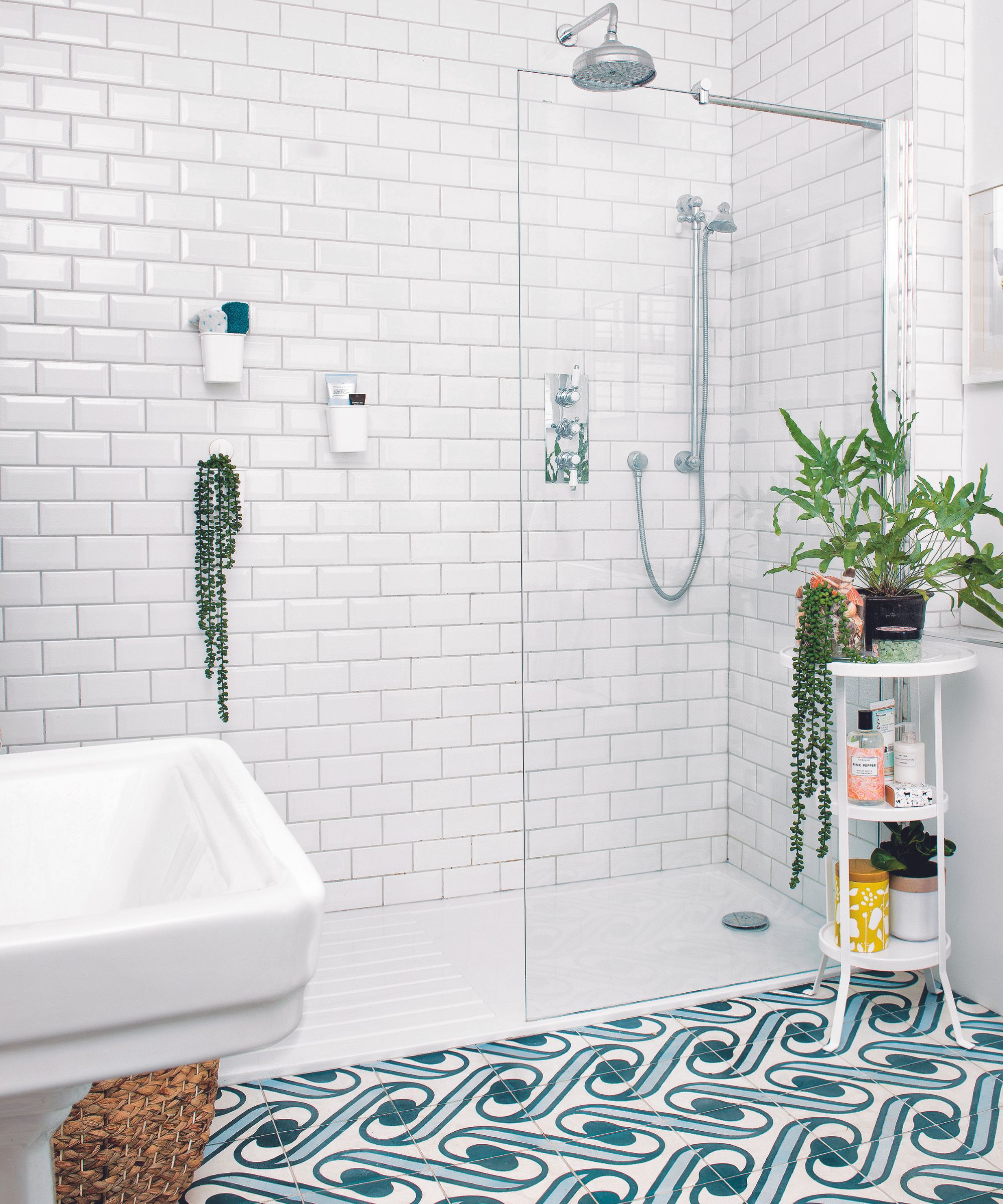
The indestructible shower room used by the teens
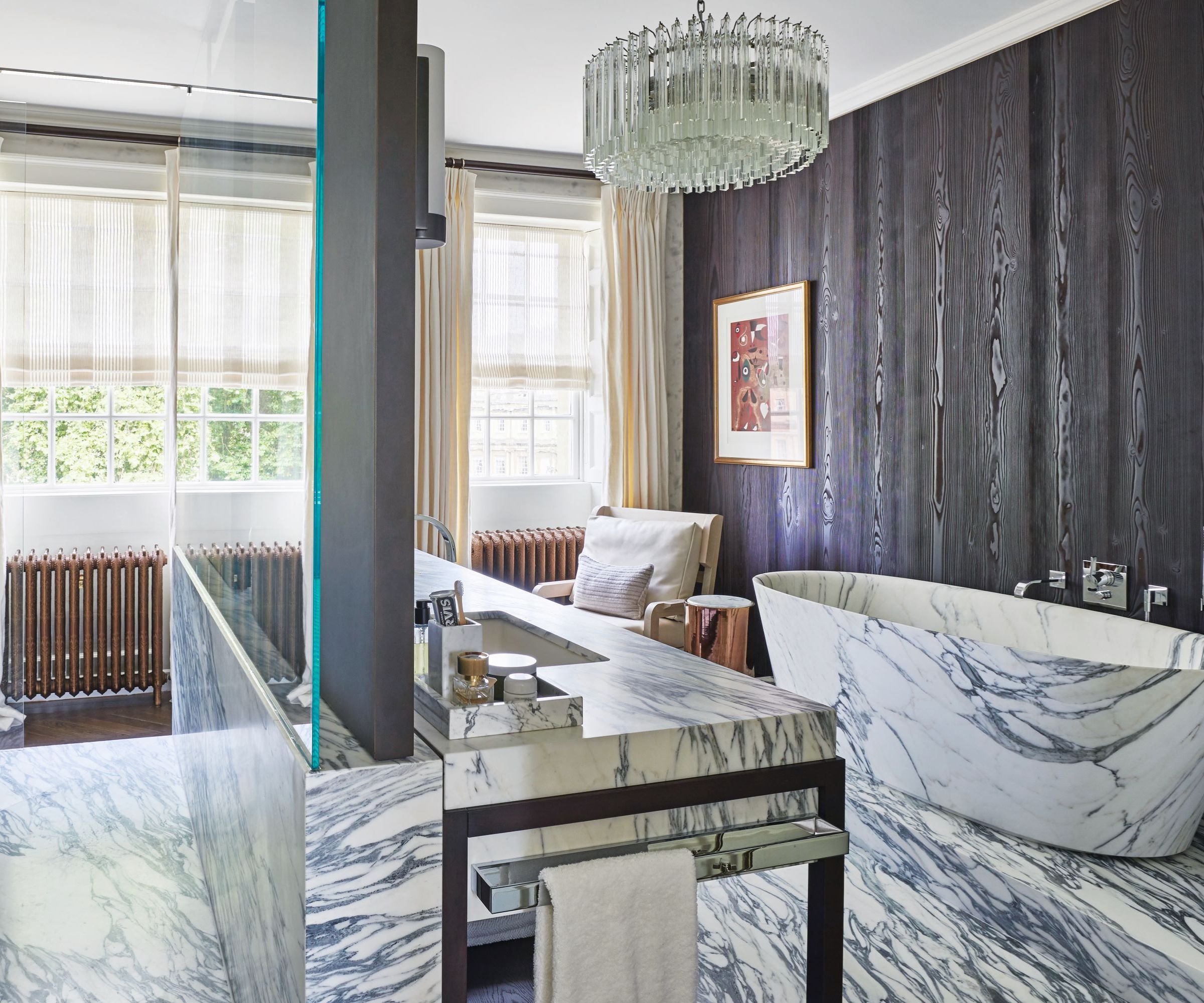
Bathroom flooring is key to how welcoming the space feels. I do prefer a wood floor (now that the toddlers have become teens and been banished to our indestructible shower room) because it looks and feels warmer than tile. However, bathroom number seven did have marble-look porcelain bathroom floor tile, which looked beautiful, but would have been cold underfoot, and therefore unwelcoming, without the underfloor heating switched on.
We had our underfloor heating installed with a timer, which came on around 6am until 8am and again just before bed time for an hour or so. It meant the room always felt warm, towels always felt dry, and the room felt inviting, just when we needed it to.
12. Don't tile wall-to-wall
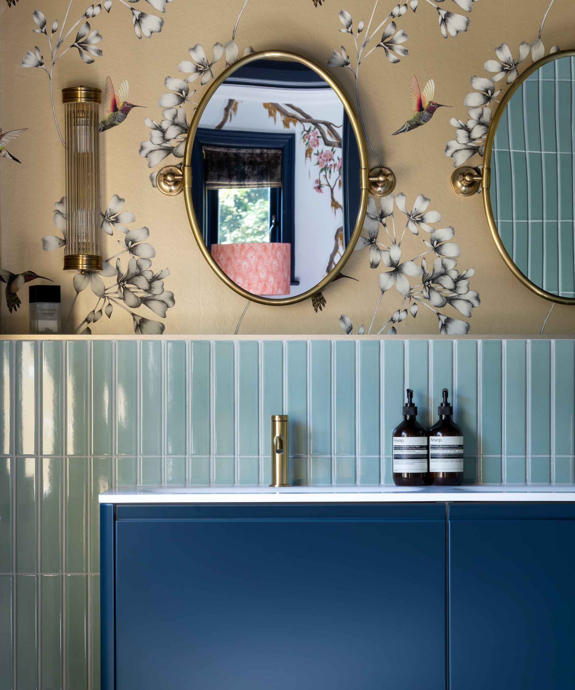
My first bathroom was tiled wall-to-wall, floor-to-ceiling. As I said, I was pretty pleased with it at the time, and it was tiny (4ft by 4ft), so it was practical. But it also felt like a prison cell, and tiling right up to the ceiling all round not only cost me more, but it had the effect of making the space feel smaller.
As my budget and bathrooms have grown in size, I have moved away from tile. There's still no substitute for it behind baths and showers (though I am eyeing the innovative waterproof wall murals from Wall e Deco for bathroom number 15); however, bathroom paint finishes and bathroom wallpapers have moved on in the 30 plus years since I designed my first wash space. So, I keep tile to a minimum and decorate the space more like I would a bedroom.
13. Choose the right color
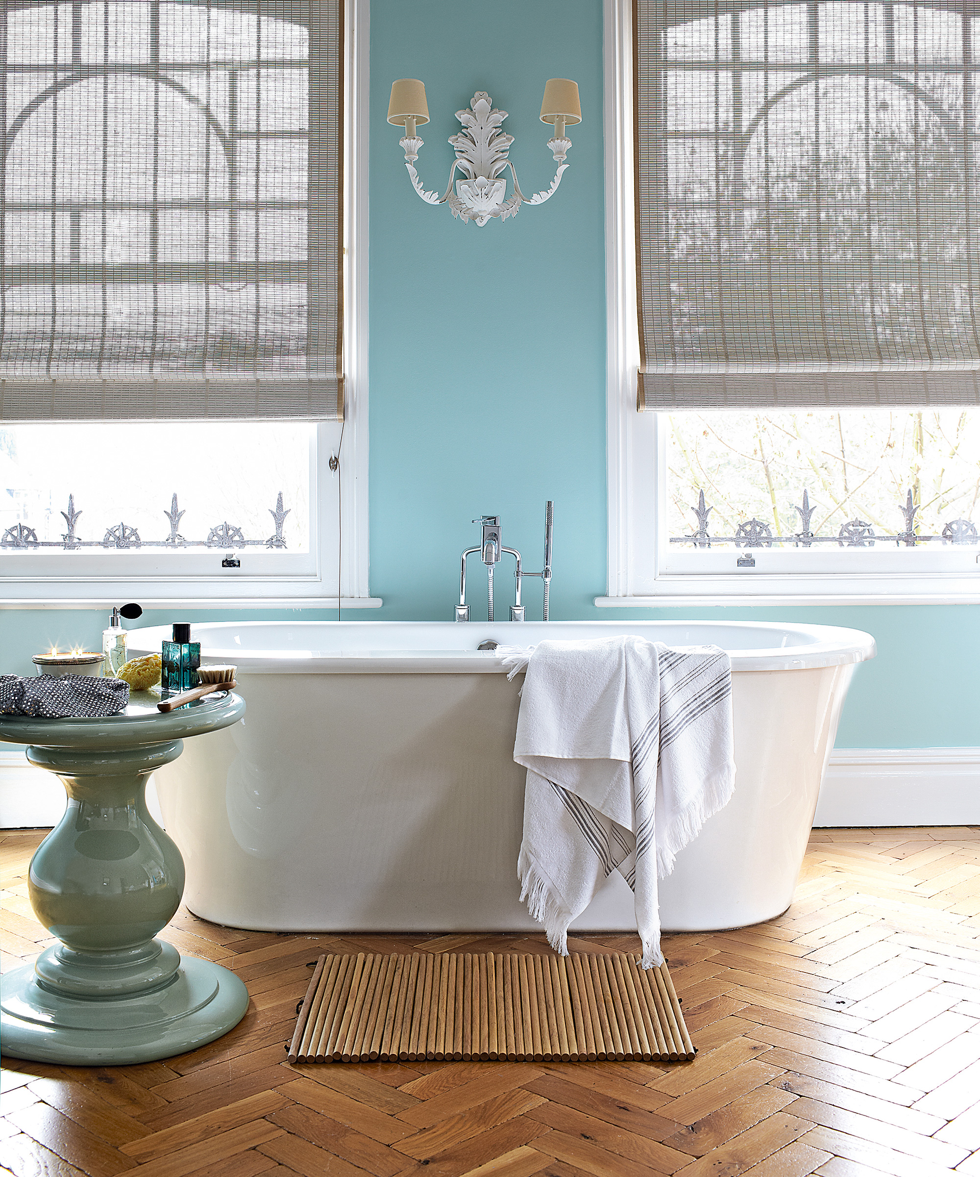
A word on bathroom colors: whatever you choose – from white to yellow to blue – I would ensure you pick a warm tone. And, bear in mind that, if you use your bathroom mirror for makeup, that wall color will, to a degree, be reflected on to your face. So if you choose an olive green, don't be surprised if you look a little green in the morning light.
14. Don't under-estimate ventilation
Any room with a shower has to have an extractor fan, but I would argue that any bathroom of any kind needs good ventilation, whether a fan – and always one on a timer that switches itself off a few minutes after you turn off the light and leave the room – or a window that opens easily. From keeping the room smelling fresh to warding off condensation and mold, both will give you good ventilation that you won't regret.
15. Maintain, maintain, maintain
I have a friend who is constantly complaining about leaks in her kitchen ceiling from her bathroom above. She asked me to take a look before she called a plumber and it was pretty obvious that the problem was caused by poor maintenance: quite simply, she hadn't been replacing, updating or even noticing frankly that the sealant around the bottom of the shower, where the shower tray met the wall tile, had broken down. However, having had it pointed out, she was able to do the fix herself, call off the plumber and safe herself a ton of money in professional call-out fees (and future redecorating downstairs).
And this is the point with bathrooms, and kitchens. Anywhere that water is involved is likely to degrade more quickly, especially if coupled with detergents. So, maintenance is key. If you can design your bathroom in the first place to be as maintenance-free as possible (ie, larger tiles = fewer grout lines = less maintenance), then you will not only ensure your bathroom continues to look as good as new, but that there's no knock-on effect elsewhere in the house.
FAQs
What is the average lifespan of a bathroom?
An average bathroom, if well-installed and well-maintained should last around 10 years. It's important that much-used fittings, such as faucets, are good quality: buying cheap is a false economy as they will fail more quickly. Equally the materials for your sanitaryware should be durable or they will start to scratch and mark long before the 10 years is up.
The greatest mistake you can make with a bathroom renovation is to plan poorly and shop badly. It's vital that you've thought of every possible eventuality for your family for the next five to 10 years, whether that be better ventilation, a double vanity rather than a single to cope with growing demand, or flexible storage that can be versatile. Then, maintain and care for your bathroom, and that initial investment will more than pay off.
Sign up to the Homes & Gardens newsletter
Design expertise in your inbox – from inspiring decorating ideas and beautiful celebrity homes to practical gardening advice and shopping round-ups.

Lucy Searle has written about interiors, property and gardens since 1990, working her way around the interiors departments of women's magazines before switching to interiors-only titles in the mid-nineties. She was Associate Editor on Ideal Home, and Launch Editor of 4Homes magazine, before moving into digital in 2007, launching Channel 4's flagship website, Channel4.com/4homes. In 2018, Lucy took on the role of Global Editor in Chief for Realhomes.com, taking the site from a small magazine add-on to a global success. She was asked to repeat that success at Homes & Gardens, where she has also taken on the editorship of the magazine.
-
 Nate Berkus says slipcovered sofas are back on trend – and I just found a way to create this designer-approved laid-back look from just $86
This classic style is making a strong comeback, but did you know you don't have to buy a whole new couch to get this Nate-approved look?
By Eleanor Richardson
-
 Gardeners are putting pasta in bird feeders this spring – but there is one important warning you need to know before following suit
Cooked pasta can be a nutritious snack for birds, but serving it in the wrong way could cause them harm
By Tenielle Jordison
