Emily Henderson just did something very unexpected in her recent bathroom remodel – breaking the rules paid off
A mirror in front of the window? Sounds like an interesting decision. But this bathroom proves why it can work


Design expertise in your inbox – from inspiring decorating ideas and beautiful celebrity homes to practical gardening advice and shopping round-ups.
You are now subscribed
Your newsletter sign-up was successful
Want to add more newsletters?
Designing a bathroom requires a careful balance of functional layout and stylish features. The plumbing has to be considered when choosing the location of the shower, bathtub, and sinks, yet you also want them to look visually appealing, too, which sometimes means thinking outside of the design norms.
That's exactly what Emily Henderson had to do in her latest project – the renovation of her sister-in-law's bathroom. The long, rectangular room features more windows than the average bathroom, which meant the designer had to come up with some rather unexpected solutions to make the bathroom function well whilst also maintaining the style and visual appeal she's renowned for.
Here, we take a closer look at the newly revealed bathroom and its more surprising design features.
Article continues belowA post shared by Emily Henderson (@em_henderson)
A photo posted by on
Described by Emily as a 'serene airy bathroom', the space is filled with neutral colors, natural wood tones, and elegant gold hardware. Zoning comes into its own here, with the first half of the room dedicated to the vanity, while the far end focuses on the shower and bath, almost like a mini wet room separated by a glass screen.
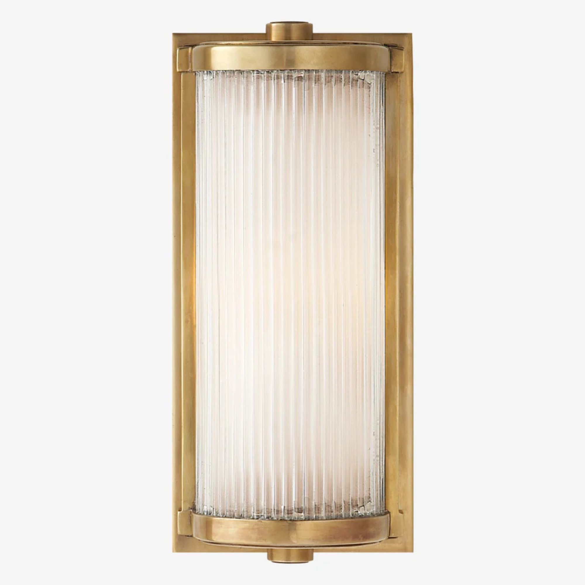
There's a decidedly different feel to the wet room portion of the bathroom. White tiles have been applied to all the walls, while gray-toned tiles create a herringbone flooring design. The two zones are still cohesive, though, thanks to the matching wall lights and the gold hardware throughout the bathroom.
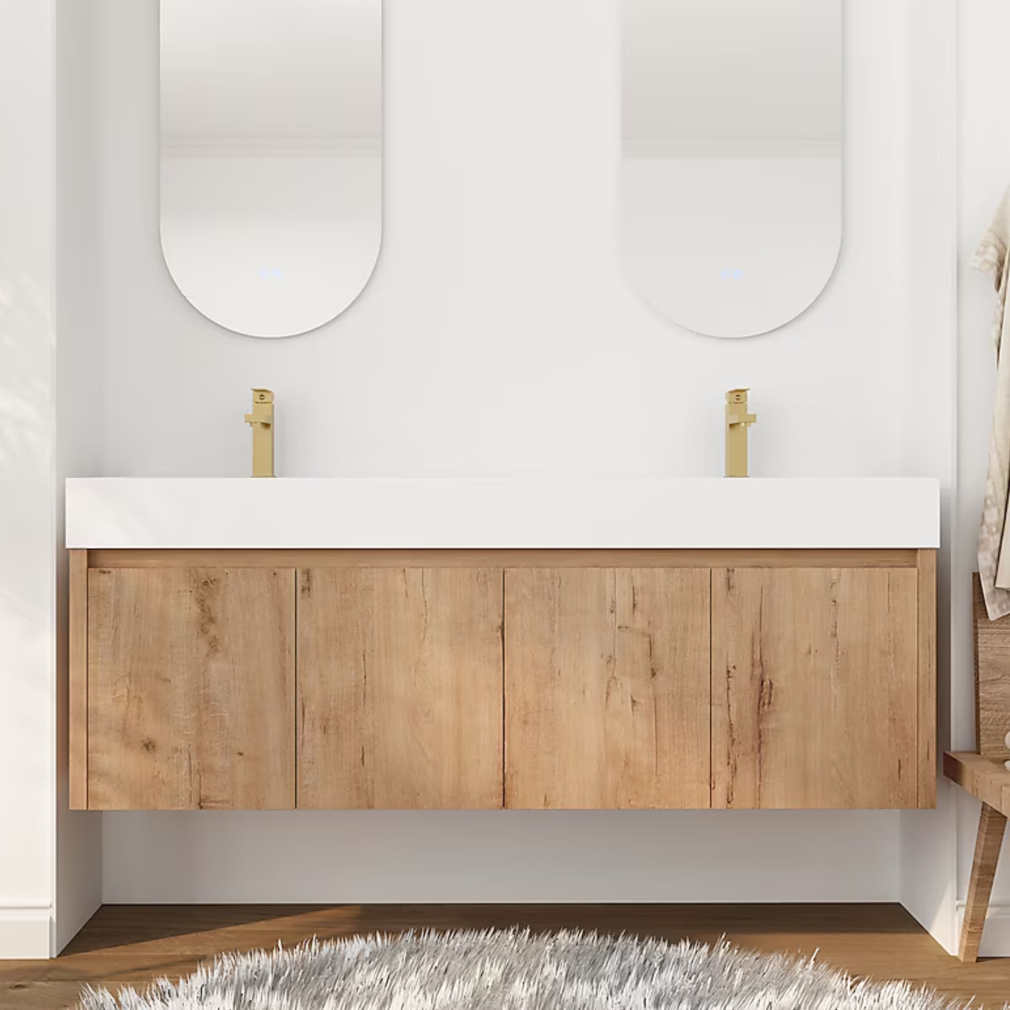
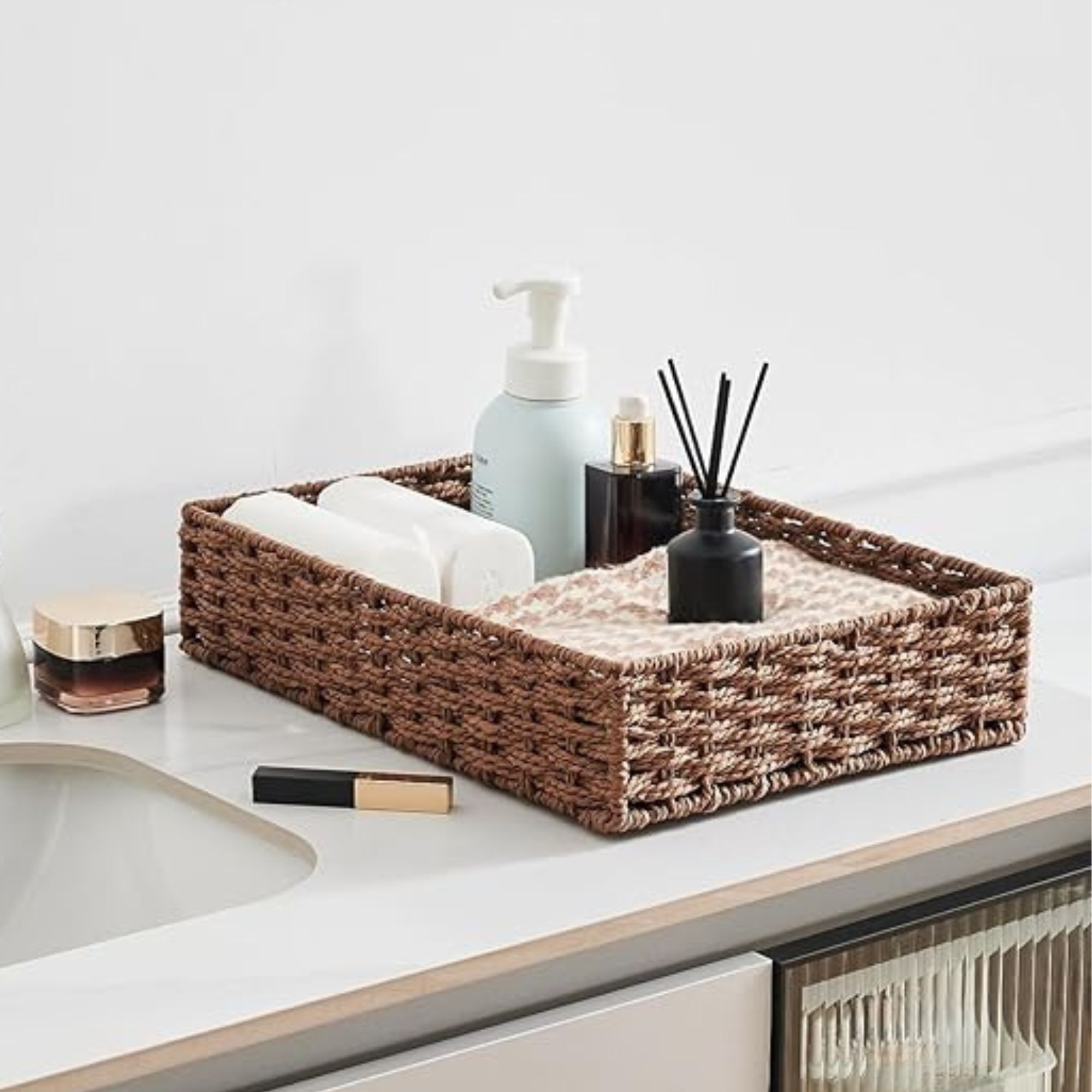
While it exudes elegance and luxury, it's the vanity area that really catches your eye. A wood double vanity is topped with an extra thick quartz countertop from Caesarstone with integrated sinks, creating a truly elevated look. The wall-mounted design not only gives the illusion of a larger bathroom but it leaves plenty of space for woven baskets filled with linens and essentials.
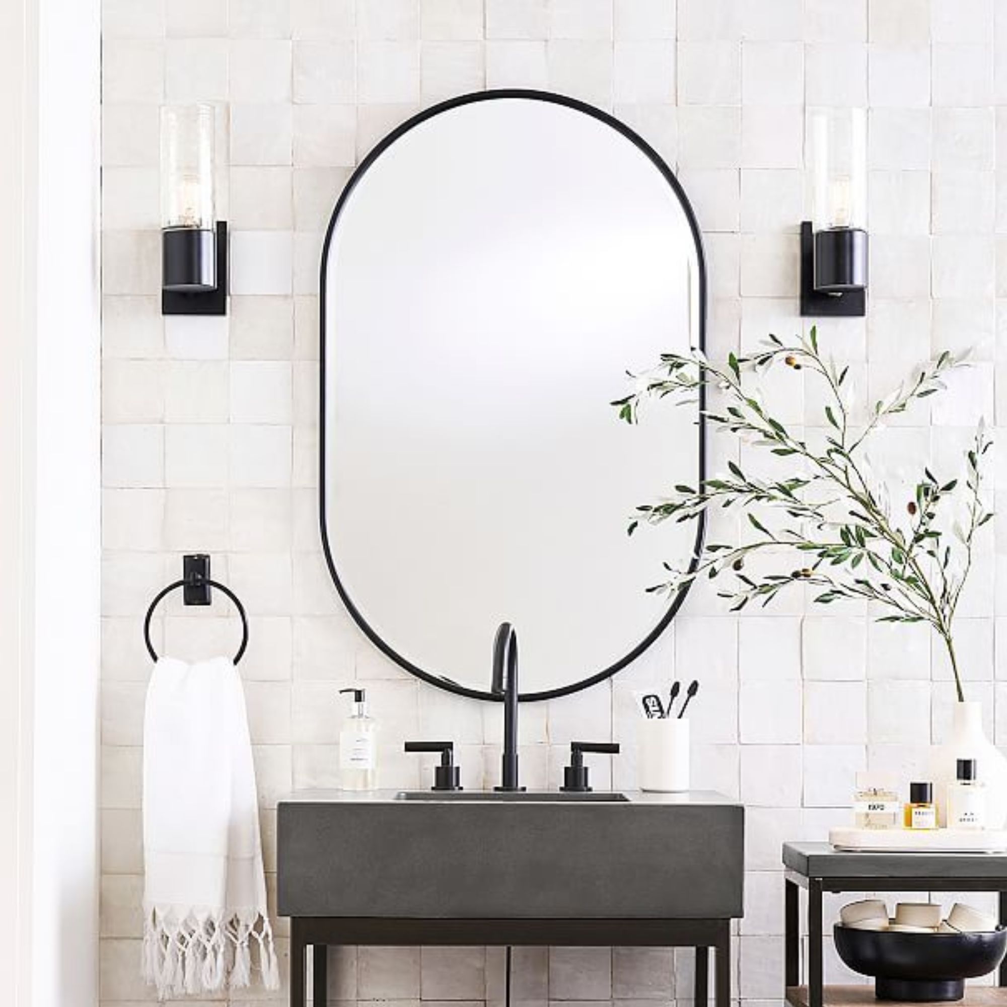
But it's above the vanity the most striking unique feature of the bathroom is found. The upper portion of the wall is filled with windows, which in any usual circumstance might be an inconvenience. But here, Emily has decided to embrace them by installing pill-shaped vanity mirrors over two of the windows.
Design expertise in your inbox – from inspiring decorating ideas and beautiful celebrity homes to practical gardening advice and shopping round-ups.
While it might sound like a method that blocks out natural light, it's done quite the opposite. The mirror style means natural light can flood in around it, and a central window left open means there are still uninterrupted views of the natural landscape. It's also incredibly practical paired with the vanity lights attached to the ceiling – the homeowners can benefit from the natural and artificial light sources when using the mirrors to get ready (or unready) day and night.
Shop the look
If this bathroom design by Emily Henderson proves anything, it's that sometimes the most unexpected features can pack the most impact – and the mirror placement certainly catches the eye.

I’ve worked in the interiors magazine industry for the past five years and joined Homes & Gardens at the beginning of 2024 as the Kitchens & Bathrooms editor. While I love every part of interior design, kitchens and bathrooms are some of the most exciting to design, conceptualize, and write about. There are so many trends, materials, colors, and playful decor elements to explore and experiment with.
