Awkward bathroom shapes – 7 expert solutions and ideas for odd layouts
If your bathroom is an awkward shape, there are clever fixes. Here, bathroom and interior design experts offer their hard-won advice
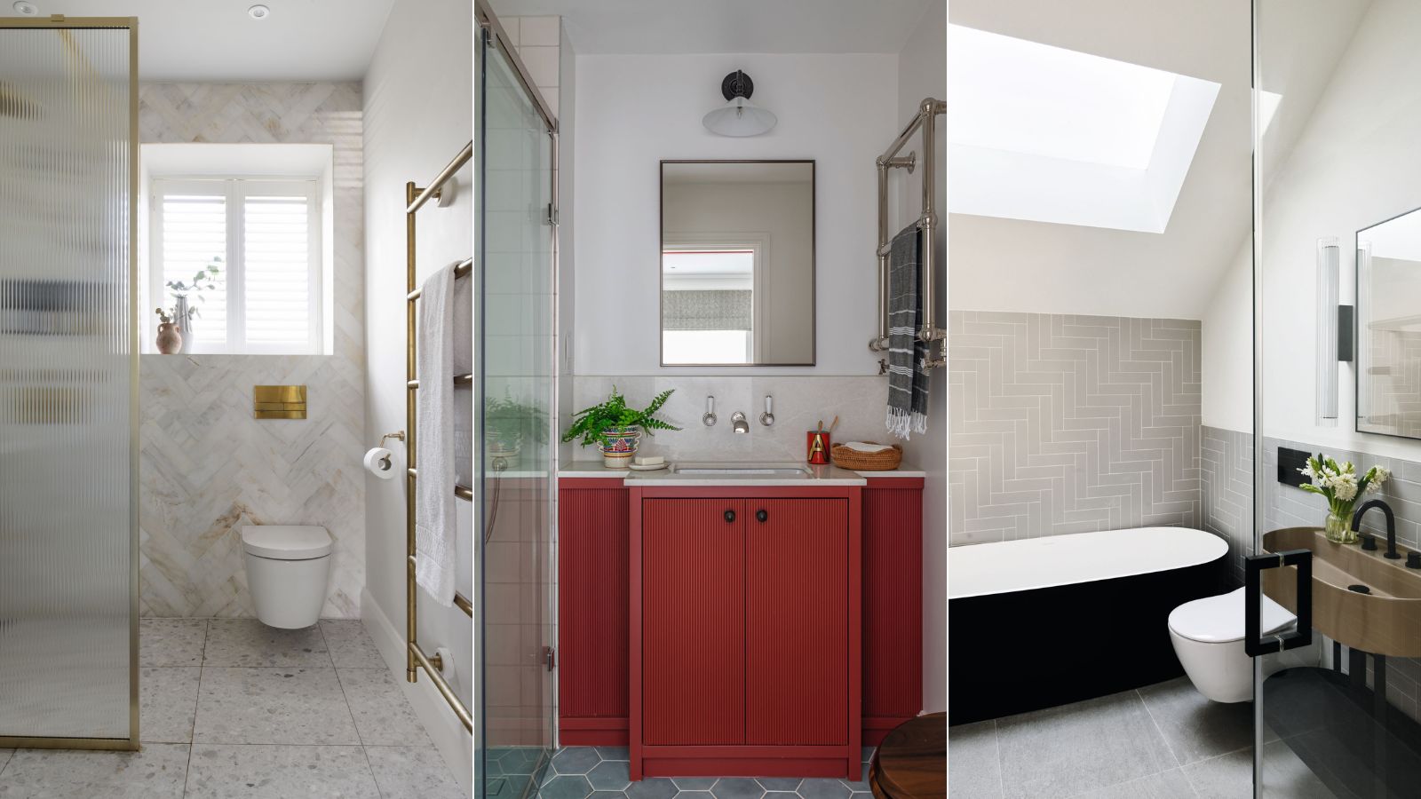

Odd or awkward-shaped bathrooms can be incredibly difficult to furnish and the best solutions will often be bespoke.
We asked design experts for the bathroom ideas they employ when laying out awkward rooms, whether they have difficult floor shapes, sloping ceilings or architecture that would be better corrected.
'Often, tiny bathrooms or just small bathrooms have the double jeopardy of being awkwardly-shaped,' says Jen Ebert, Deputy Editor, Homes & Gardens, 'which means the challenge is even greater. However, there are some simple measures you can take with layout to maximize your space.'

Jen is the Deputy Editor (Digital) of Homes & Gardens online. Before starting this position, she had completed various interior design courses at KLC Design School, as well as working across Ideal Home, LivingEtc, 25 Beautiful Homes and Country Homes & Interiors as an interiors writer.
1. Focus on interesting colors and finishes
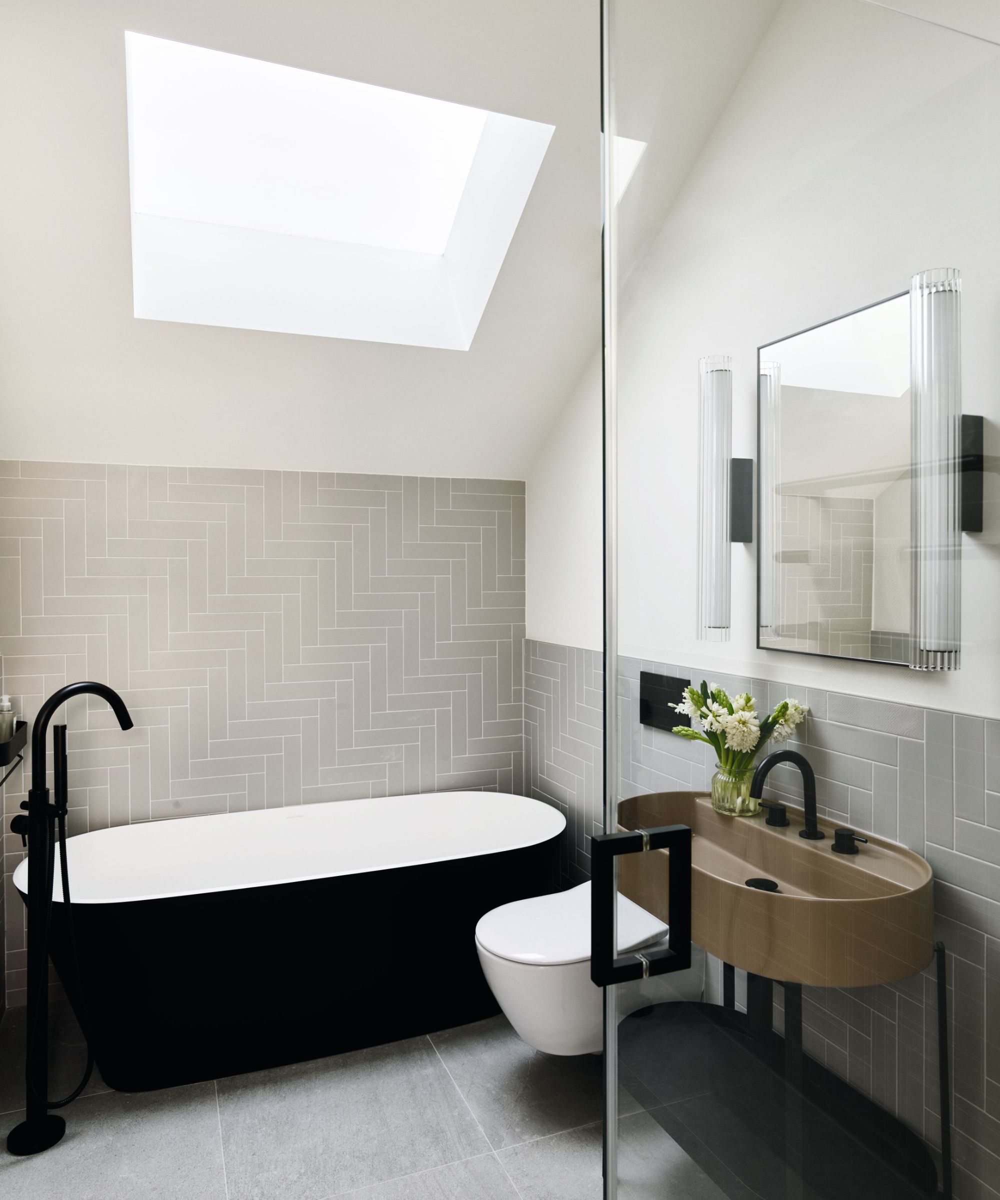
The size of your bathroom, plus the location of windows, doors and sloping ceilings, may dictate your bathroom layout ideas, including where there is sufficient head height for a shower, enough wall space to hang bathroom storage units and sanitaryware and whether there is room to include a bathtub.
Less flexibility with the layout may make it better to focus energy on interesting bathroom colors and finishes instead.
Interior designer Eleanora Cunietti of Carden Cunietti added bold accents to a recent project (above). ‘Working with the shape of the room, the freestanding black bath fits perfectly into the width, leading you into the center of the room,’ she says.
‘Having an open washstand and wall-mounted WC creates the illusion of more space than typical floor-mounted designs.’
Putting a window into a sloping ceiling will instantly lift the room visually, shedding light and saving wall space elsewhere.
2. Choose wall-hung designs
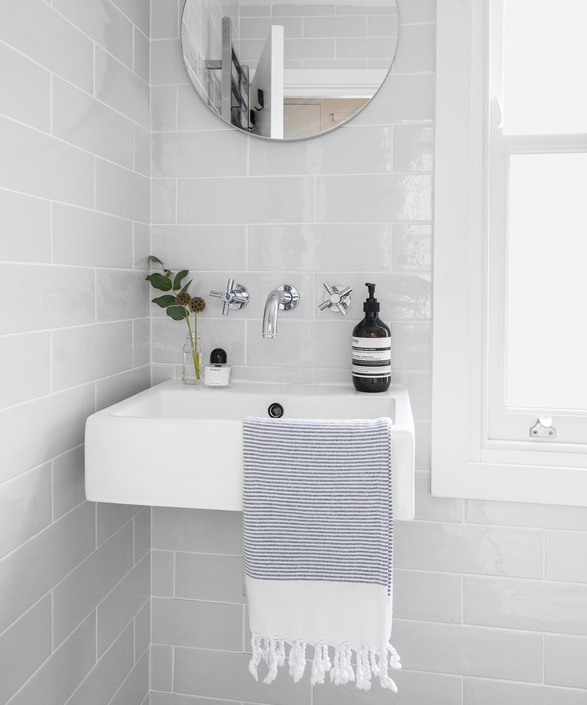
While a ‘standard’ wall-hung basin is often too large for an awkwardly shaped bathroom, there are smaller models. Choose a deeper basin if you want to wash your face as well as hands.
Standard toilets can also be too big. Natalie Bird, brand marketing manager of UK bathroom company Roca, says: ‘The most compact models in terms of projection are wall-hung designs; you need to allow for the frame to support the WC and boxing, although a compact frame would only be around 3in deep.’
These designs won't just save space; they will make a small bathroom look bigger.
3. Purpose build storage tailored to your space

Good storage can boost the sense of space by keeping surfaces clear and clutter out of sight. Bathroom vanity units come in many sizes, including shallow-depth, corner- and wall-hung solutions, or you may prefer to have furniture custom made, as director Alex Keith of Otta Design chose to do in a recent project.
‘The vanity was designed wall-to-wall to maximize storage,’ she says. ‘It is set back on both sides so that we could increase the size of the shower screen, not overwhelm the space and still have a good-sized, usable basin. Wall-mounted, rather than deck-mounted, taps also help save space.’
Note, too, the position of the heated towel rail, wall-mounted above the vanity to be space-efficient.
4. Look for made-to-measure solutions
‘To ensure enough space and comfort in a shower room, we’d recommend a minimum size of 27in wide for the shower tray,’ says Amit Malhotra, co-founder, Aflux Designs.
‘This will allow enough room for you to get in and out of the shower, as well as open and close the door of the enclosure.’
Some shower manufacturers offer made-to-measure solutions, allowing you to create a showering zone in an otherwise redundant space, such as in a recess.
5. Maximize square footage with a wet room
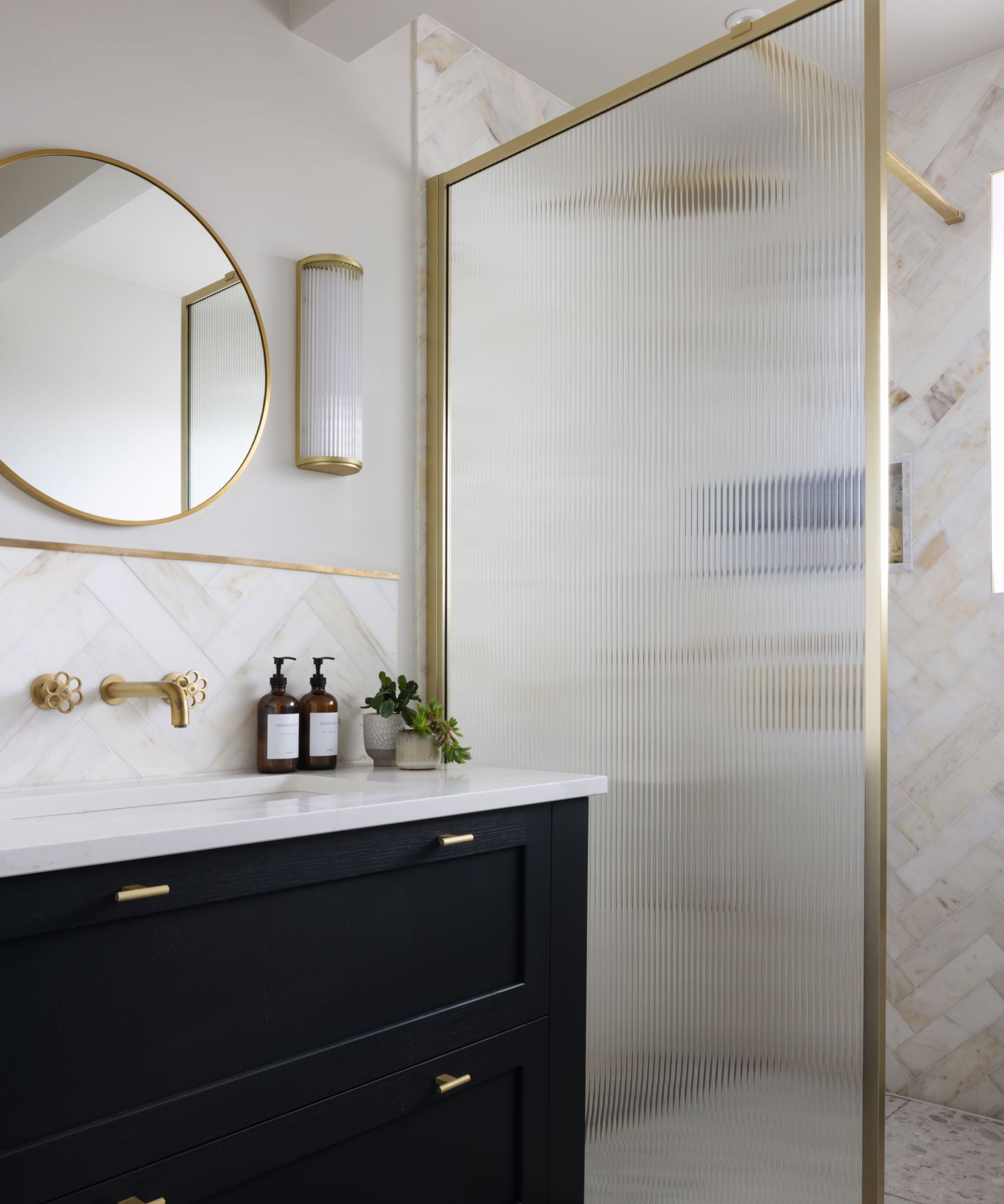
As an alternative to an enclosure, you may wish to consider a level access wet room.
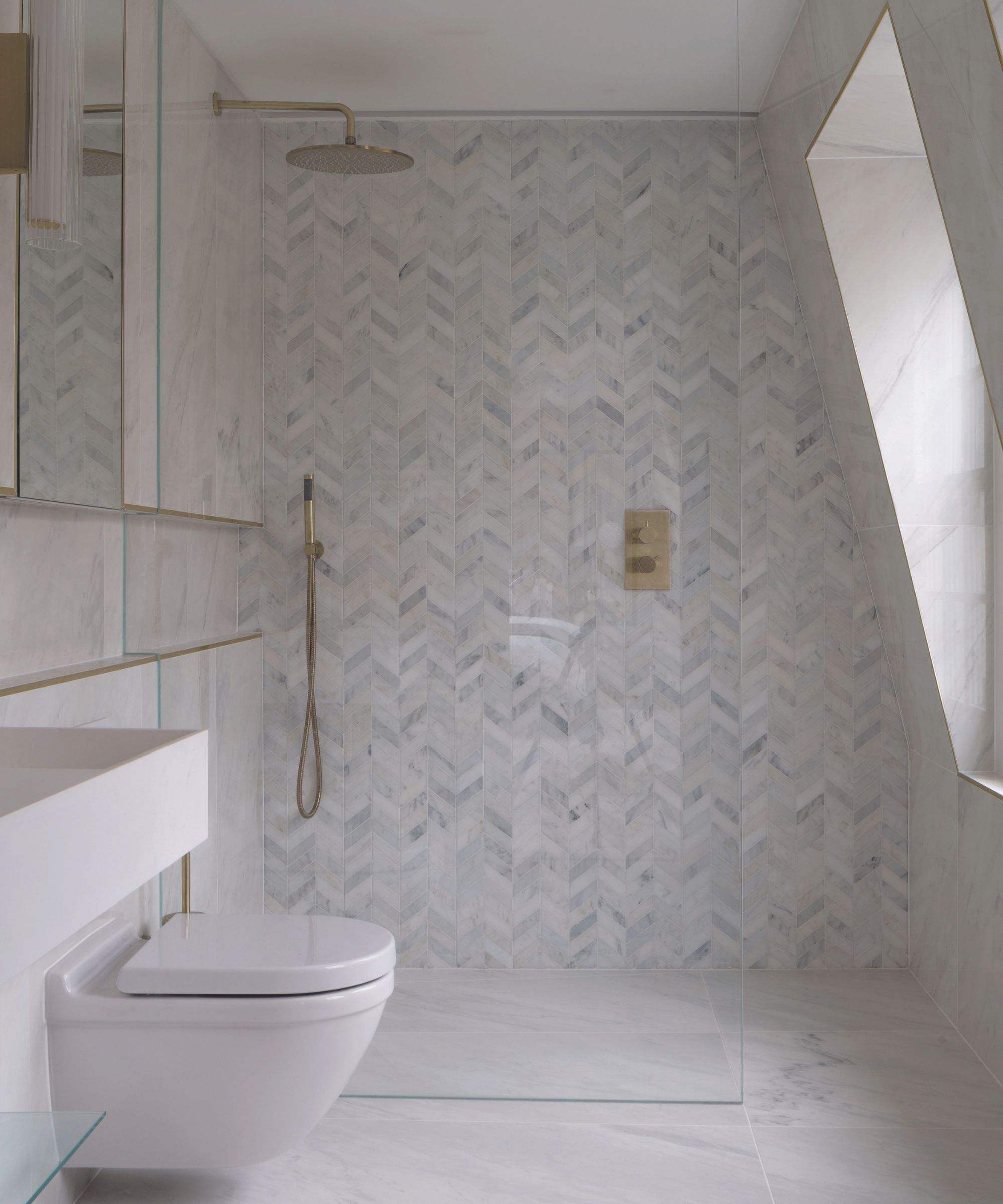
‘The same bathroom floor tile used throughout makes the space feel larger,’ says designer Susan Roach of West One Bathrooms of the bathroom above (and top, left). ‘A single fixed screen avoids the need for hinges and handles, creating less visual distraction to enhance the feeling of space.’
6. Invest in a compact bathtub

While a bathtub is typically the largest item in the room, many manufacturers offer smaller designs. Offering more of a ‘sit-up’ style bathe, they can still provide a surprisingly luxurious experience, especially if deep.
‘Or, if space is tight, you may prefer to go without a bath and have a more generous showering space instead,’ says John Naughten, managing director of Bathroom Design Studio London.
7. Bring the bathtub and shower together
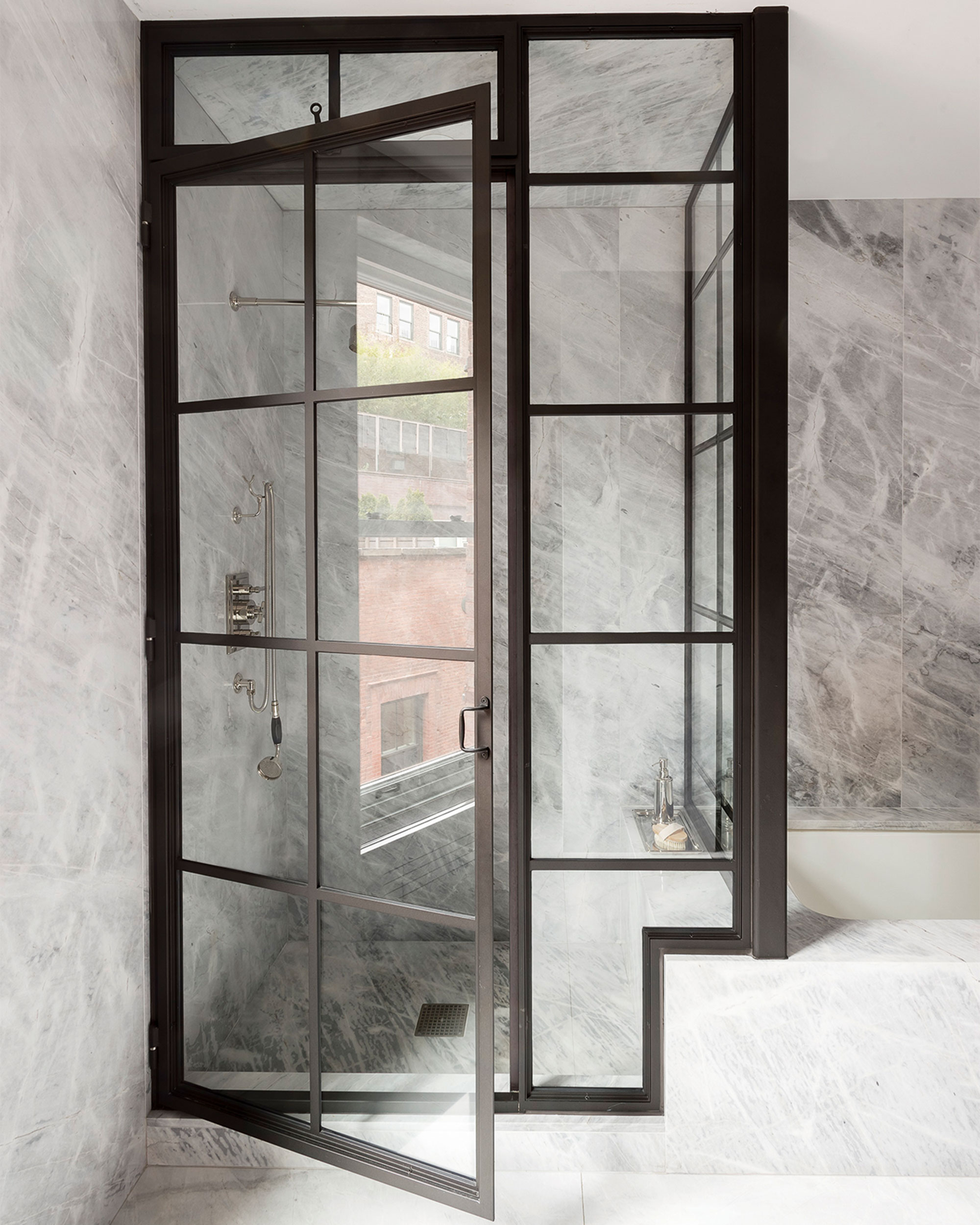
The shower cubicle can become the back wall of the bathtub to save floor space and to allow you to fit everything you want into the room; having it glazed rather than solid will help to open the room up visually and to emphasize the feeling of space.
'There are many ways to do this,' says Lucy Searle, Editor in Chief of Homes & Gardens, 'and this will largely depend on your bathroom's shape. One that's wide enough can include a simple glass screen along the length of the bathtub with entry to the shower at either end.'

Lucy Searle has written about interiors, property and gardens for over 30 years, starting within the interiors departments of women's magazines before switching to interiors-only titles in the mid-1990s. In 2018, Lucy took on the role of Global Editor in Chief for Realhomes.com, taking the site from a small magazine add-on to a global success. She was asked to repeat that success at Homes & Gardens, where she has also taken on the editorship of the magazine, which is the UK's oldest interiors magazine at 103 years old. Lucy is a serial renovator and also owns rental properties in the UK and Europe, so brings first-hand knowledge to the subjects she oversees.
FAQs
How do you fix an odd bathroom layout?
Fixing an odd bathroom layout is somewhat limited by the plumbing, but assuming you have some freedom with the position of the toilet, for example, always start by prioritizing the position of the bath or, if it's a shower room, the enclosure. If these, or perhaps a vanity unit, can be made the focal points of the room, often centrally or under a window, the rest of the layout should fall into place.
When you are designing an odd-shaped bathroom, it's always important to consider functionality, ensuring that, whatever the layout, the towel rail is within easy reach of the bathtub or shower, for instance, or that the sink and toilet are conveniently close. Aesthetics are important, but bathrooms must be practical, too.
Sign up to the Homes & Gardens newsletter
Design expertise in your inbox – from inspiring decorating ideas and beautiful celebrity homes to practical gardening advice and shopping round-ups.

Amelia Thorpe is a specialist interiors and design journalist, covering every topic to do with homes from fabrics, furniture and lighting to surfaces, kitchens and bathrooms.
As the daughter of an antique dealer and a lifelong collector of old cookery books and vintage graphics herself, she also has a particular expertise in antiques, mid-century and decorative arts of all kinds.
Drawn to homes because of their importance in the happiness of our lives and the enjoyment they can bring, Amelia has been writing about the topic for more than fifteen years. She has interviewed some of the most influential designers of our time, from Piero Lissoni, Antonio Citterio, Jaime Hayon and Arik Levy to Nina Campbell and Robert Kime.
-
 Designers share how to make your outdoor living room look more expensive – and the affordable products to get you there
From layered lighting to luxe-looking textiles, these simple swaps made all the difference
By Charlotte Olby Published
-
 5 surprising but brilliant ways to clean with old socks – from perfectly buffing stainless steel to deterring pests naturally and more
Tackle dust in tricky corners, clean your mirrors and even banish bad odors with those rogue single socks
By Andy van Terheyden Published