The golden ratio in interior design – how to use this formula to create balanced schemes
Using the golden ratio in your interior design can ensure success – this is what it is and how to use it
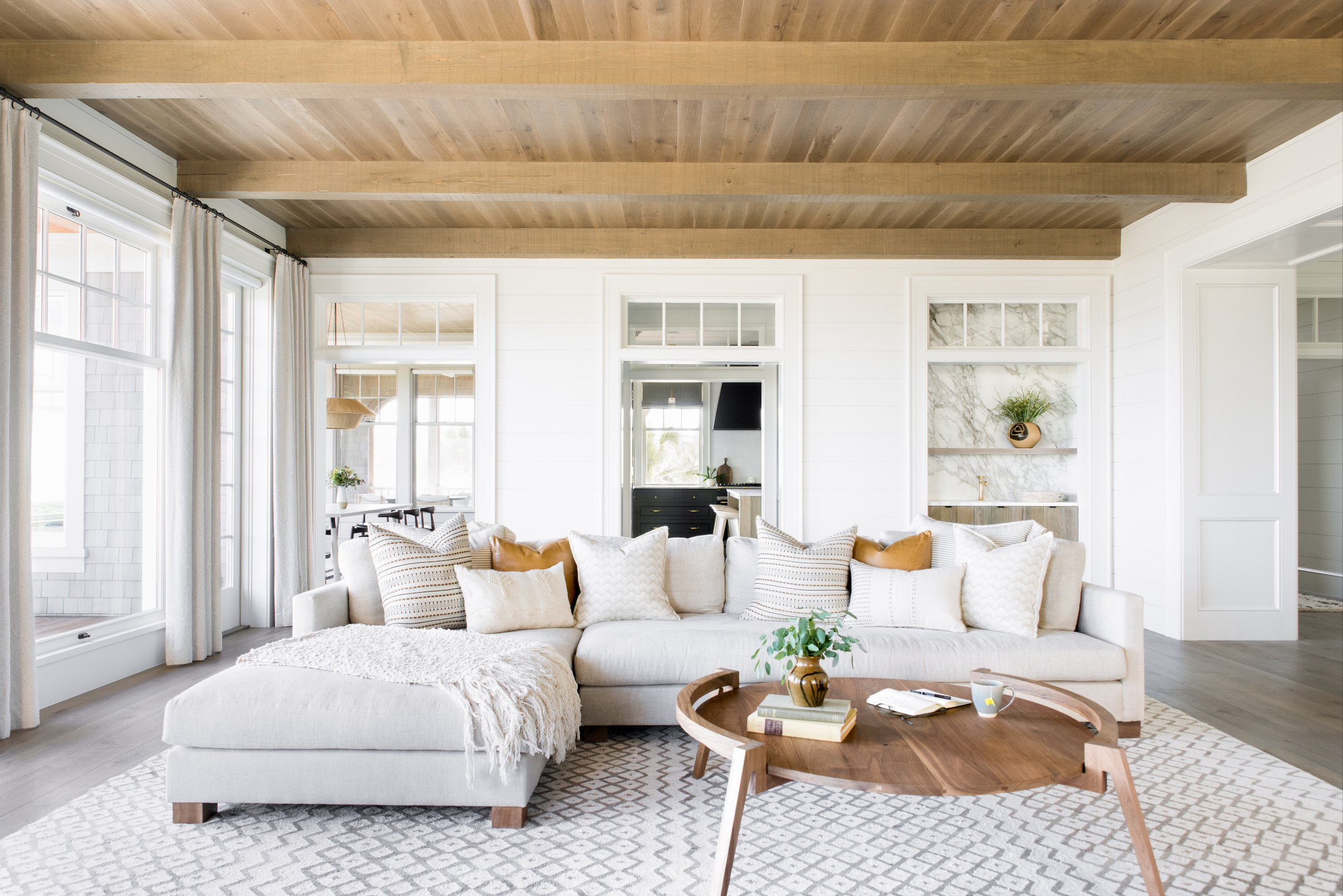

The golden ratio is one of those design rules that are really helpful to use when creating a room scheme from scratch – or rebalancing an existing one. If you are just starting out in interior design or just need help creating balanced spaces, it's one of those design formulas that is worth referring to.
But what is the golden ratio, and how do you apply it to real spaces? Well, it's not a new fad – in fact, the golden ratio – also known as the golden mean or golden number – has been used for over 2,500 years as a mathematical sequence (1:1.618 to be exact). It occurs multiple times in nature, from the proportion of human bodies to the spiral of seashells, and is thought to be perfectly pleasing to the eye.
We're aware that 1:168 is way to complicated for most of us to comprehend, so swap that out for a ratio of 40:60 instead, and it becomes that much more useful for interior design – as we explain below.
What is the golden ratio in design?
Martin Waller, founder of global design company Andrew Martin, says: 'People often talk about the rule of symmetry within interiors and although important, there is another guideline that top designers use to create their impeccable yet seemingly effortless schemes. The golden ratio is the theory of thirds and exists as a natural phenomenon in nature, using the Fibonacci sequence to explain why things look so pleasing to the eye. For example the elegant twirl of a fossil or delicate unfurling of rose petals.
'Applied to interior design the golden ratio can be a great tool to use in creating a cohesive and comforting living area.
'Some call it the 60/30/10 rule, which is based off the ratio, making it much easier to apply practically as you consider each element of your room using this ratio, from the scale of your furniture and structural details, right down to the color scheme and textural components.'
How to use the golden ratio in interior design
Let's start with the 1:1.168 – or 40/60 – formula to break this down into a simple explanation – then show you how to apply it.
1. The golden ratio for color scheming
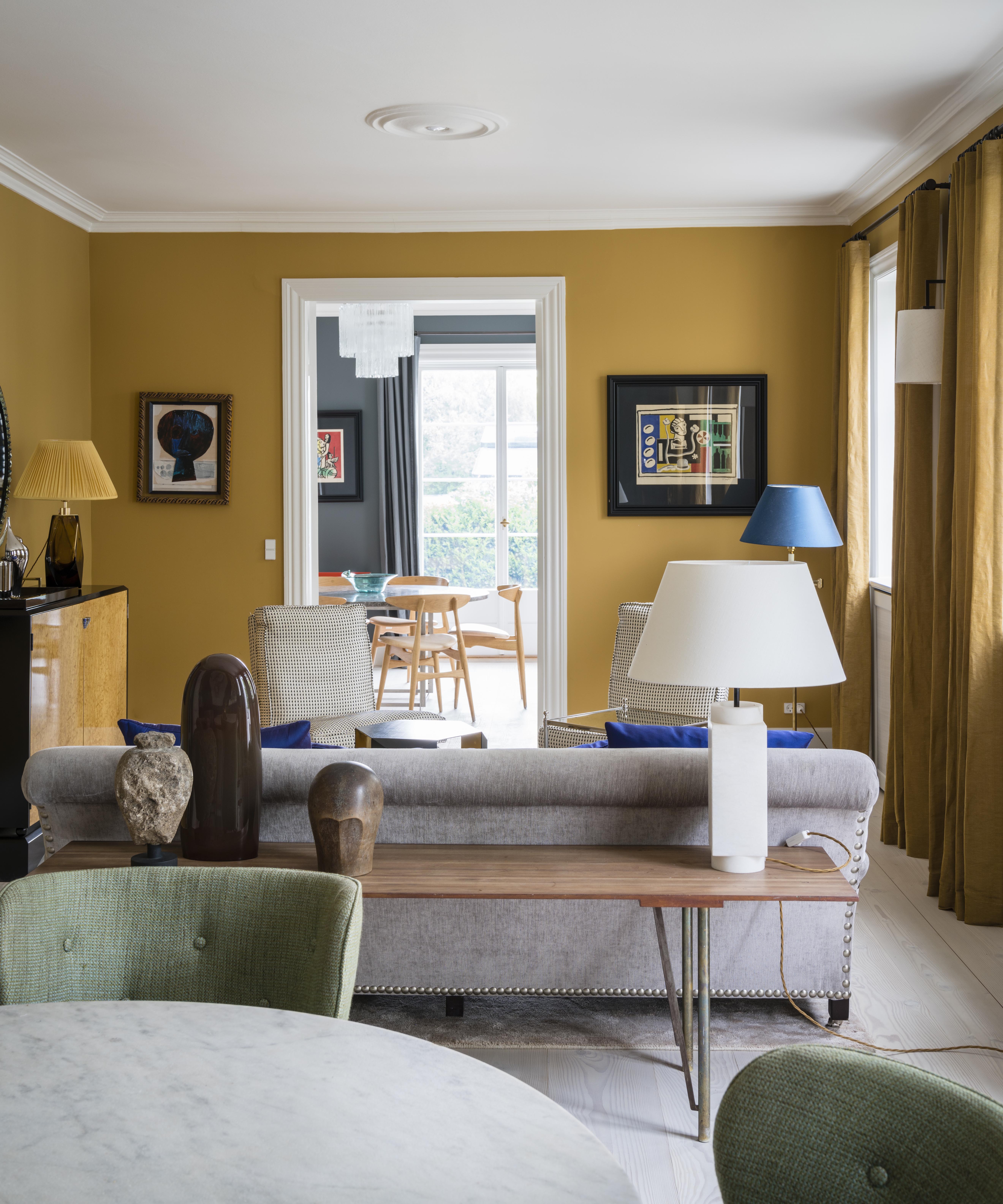
Any balanced room scheme needs to have good proportional representation of colors, textures and pattern.
For example, in a two-color room scheme, the dominant color will cover around 60% of the surfaces, while the complementing secondary accent color will cover around 40%.
You can, of course, break this down further, so that 60% is the dominant color, 30% is the secondary color, and 10% the tertiary.
'Color is a great way to get started with this theory,' says Martin. 'Choose your three tones and split them into these ratios, 60% of your space should be one color, perhaps through the paint on your walls and larger pieces of furniture.
'Choose another shade to be your 30% color and apply it through textiles such as curtains and rugs.
'Finally use your third color throughout accents and accessories, using it across 10% of your space to create a balanced and well thought out look that will appear almost effortless.'
2. The golden ratio to introduce pattern
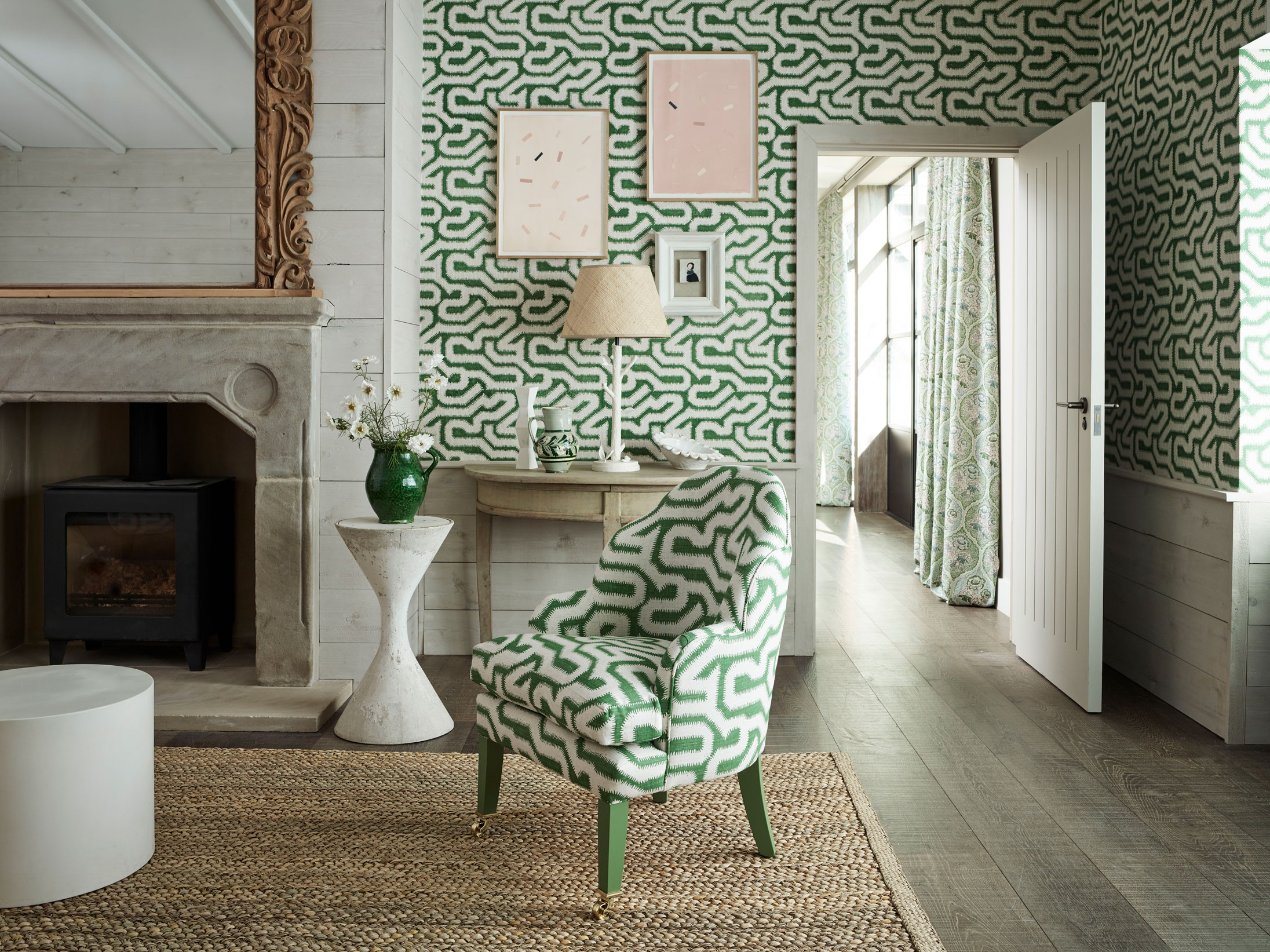
The golden ratio is really useful when introducing pattern to a scheme. Let's say you want a space with three complementing patterns, but don't know how to get the balance right. Well, the principles above are the same: the pattern you want as your main choice will cover 60% of surfaces designated as patterns (perhaps a sofa); 40% of surfaces (think: cushions) will be covered in your second pattern.
Again, you can scale this up and break it down so that 60% represents a patterned wallpaper, 30% represents a sofa fabric, and two sets of 5% represent different patterned cushions. Knowing how to mix patterns in a room successfully can help you to get this right.
3. The golden ratio to get a balanced room layout
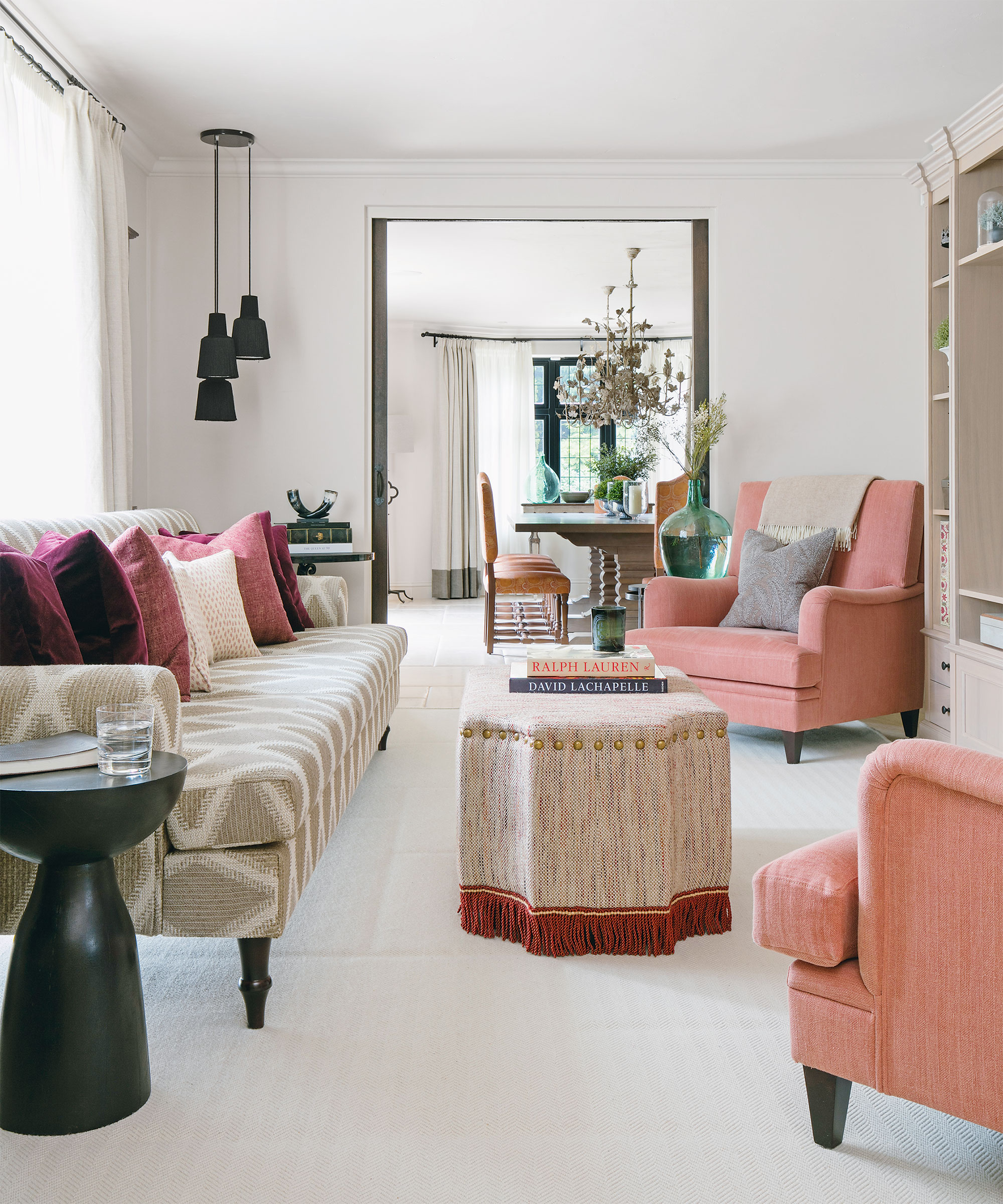
Ever been struck by living room layouts that seem either under-furnished or cluttered with furniture, and felt the lack of balance? The golden ratio can help you strike the right note.
Using the 60/40 formula, measure up floor space then take measurements of the floor space covered by furniture. If the furniture fills more than 60% of the area of the floor, the room is over-furnished. If it's much lower than 60%, it's likely to feel on the unfriendly side of minimal. So, ideally, aim for a layout that leaves 40% of the floor clear.
4. The golden ratio for choosing furniture
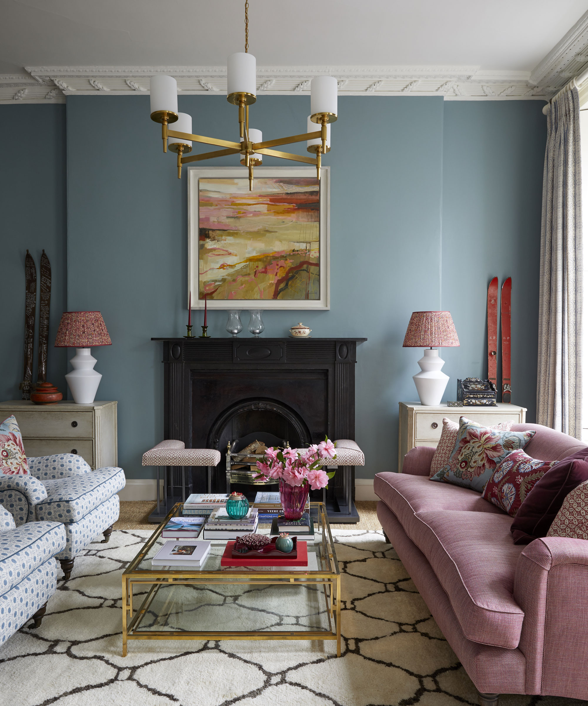
The balance of positive space (furnished) and negative space (unfurnished) in interior design that we talk about above will also help you choose furniture that's the right size, allowing you to scale up or down a sofa or coffee table so that it's in proportion not just to the room's floor area, but to other items of furniture, too.
Let's take a typical seating grouping in a living room, like the one above. The sofas each represent around 60% of the space, the smaller coffee table is around 40%. So, if you are choosing a sofa, you will want to look for a coffee table that's around two thirds its length for a balanced feel. Any larger and it will feel too big; any smaller, it will feel more like a misplaced side table.
5. The golden ratio for displaying accessories
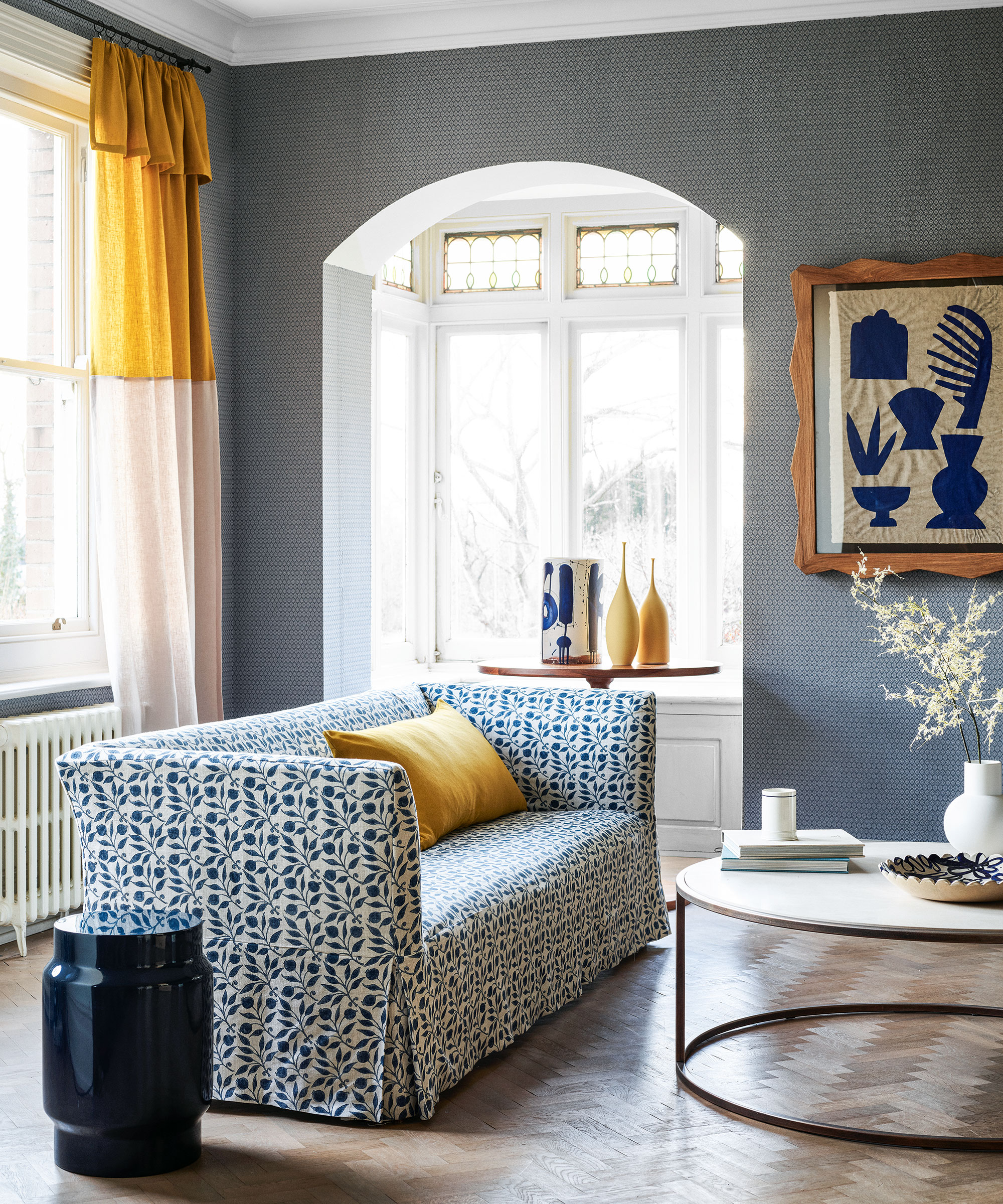
Let's talk about coffee table styling ideas as a great example of how to apply the golden ratio here. Ideally, whatever you are displaying on the coffee table's surface should take up no more than 40% of the space to look neat.
Similarly, cushions on a sofa should leave 60% of the seating area clear. Perhaps you want to furnish shelving with books and objets to display? Devote 60% to the books and 40% to show off your favorite items and you will have the balance right.
6. The golden ratio for hanging art
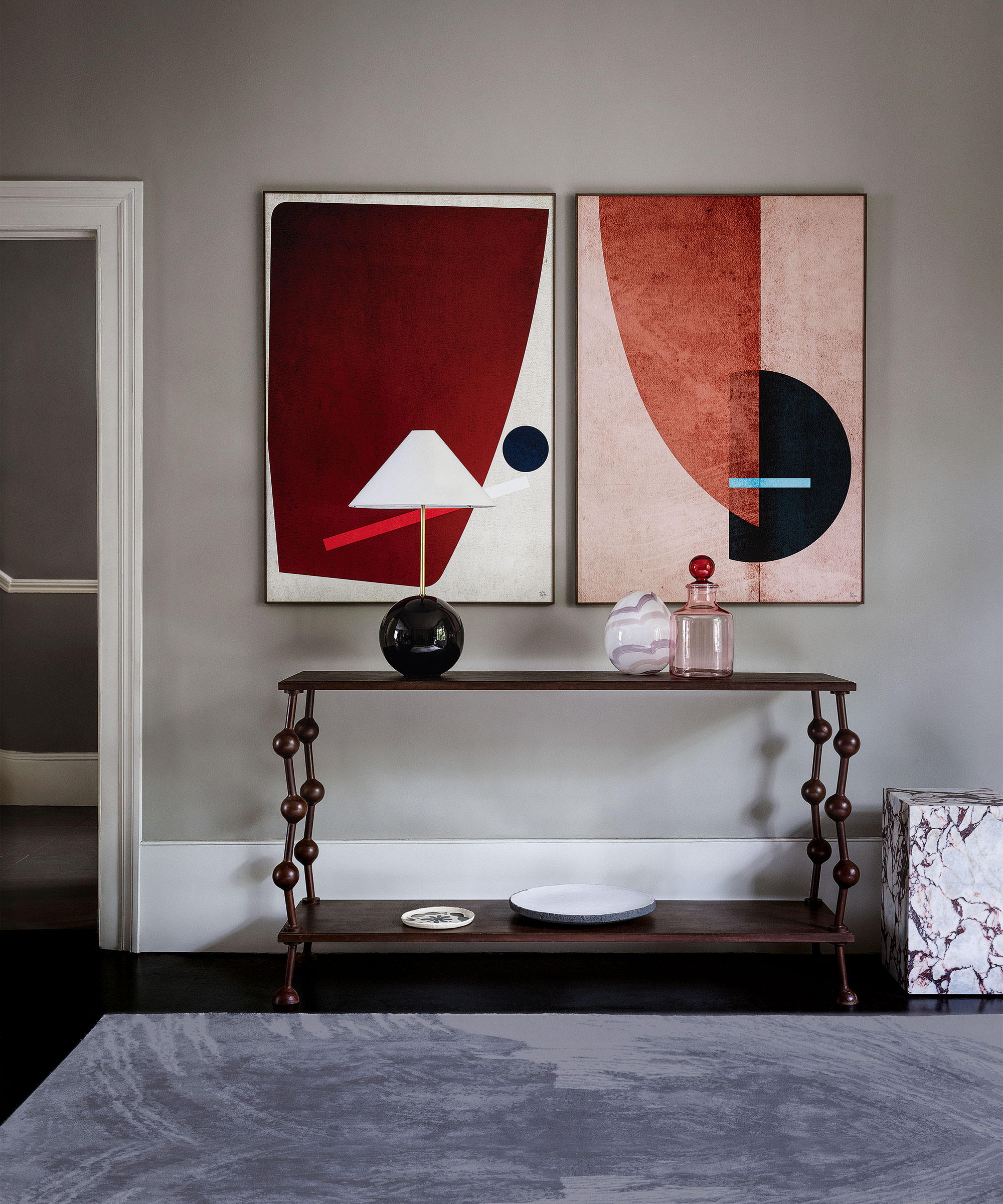
When considering which pieces of art to display in a space, think about the golden ratio to get the perfect proportions.
Look at investing in a piece that's one-third or two-thirds the size of the wall space for brilliant balance. If you like large pieces of statement artwork, choose the latter.
'You can use the golden ratio to get the picture height right, too,' says H&G's Editor in Chief Lucy Searle. Pictures need to be hung nearer the furniture below them than the ceiling above – think 40% of blank wall below, and 60% above.
What is the golden ratio of a room?
The golden ratio of a room can refer to its proportions, ie, height, width and length, which is often used to ensure not only visual balance but good acoustics, too. In theory, a room should be 1.6 times wider and 2.6 times longer than it is taller to achieve perfection... but of course, this is not always practical or possible. Often, however, great room proportions are just something we get a feeling for when we enter them for the first time.
Sign up to the Homes & Gardens newsletter
Design expertise in your inbox – from inspiring decorating ideas and beautiful celebrity homes to practical gardening advice and shopping round-ups.

Lucy Searle has written about interiors, property and gardens since 1990, working her way around the interiors departments of women's magazines before switching to interiors-only titles in the mid-nineties. She was Associate Editor on Ideal Home, and Launch Editor of 4Homes magazine, before moving into digital in 2007, launching Channel 4's flagship website, Channel4.com/4homes. In 2018, Lucy took on the role of Global Editor in Chief for Realhomes.com, taking the site from a small magazine add-on to a global success. She was asked to repeat that success at Homes & Gardens, where she has also taken on the editorship of the magazine.
-
 5 surprising but brilliant ways to clean with old socks – from perfectly buffing stainless steel to deterring pests naturally and more
Tackle dust in tricky corners, clean your mirrors and even banish bad odors with those rogue single socks
By Andy van Terheyden Published
-
 How to grow astilbe – expert advice on cultivating this shade-tolerant flowering perennial
Shade-tolerant and pest-resistant - astilbe are hardy and tough perennials that can thrive in many settings
By Ellen Wells Published