The rule of thirds – how experts use this design trick for successful schemes
This is how to apply the rule of thirds for balanced room schemes, according to interior design experts

Design expertise in your inbox – from inspiring decorating ideas and beautiful celebrity homes to practical gardening advice and shopping round-ups.
You are now subscribed
Your newsletter sign-up was successful
Want to add more newsletters?
The rule of thirds is a design device that interiors experts use to ensure that the spaces they create are perfectly balanced, and therefore visually pleasing. The good news is that it's not complicated – you can use this trick in your own interior design at home.
Below, we explain how.
What is the rule of thirds?
The rule of thirds is a technique of dividing a frame – or in this case the view of a room – into a even three-by-three grid, so that there are two horizontal lines and two vertical lines dissecting each other to create a frame – like you would for noughts and crosses.
Article continues belowInterior designer Mindy Kelson O'Connor explains how to apply it to a room scheme:
'The rule of thirds can be an effective tool in creating or checking for balance in design. You can use the grid lines as a means to establish or edit your proportions and define the arrangement of a spatial composition, especially when thinking about views – looking inside and out.'
Mindy explains that placing objects at the intersecting points of the grid can create a perfectly balanced outcome. She says:
'Consider where the vertical and horizontal grid lines intersect as focal points for views and positioning elements of interest.
Design expertise in your inbox – from inspiring decorating ideas and beautiful celebrity homes to practical gardening advice and shopping round-ups.
'In interior rooms the workplace countertop often runs along the first third horizontally like a horizon, and elements that intersect with it can vertically define the space. Window lines may stop along the upper third horizontally setting the parameters for views to the exterior and emphasizing the space of the ceiling above.'
Still need help in understanding? We don't blame you – it's best understood visually. Below, we show you how designers use the rule to fabulous effect.
1. Understand the rule of thirds frame
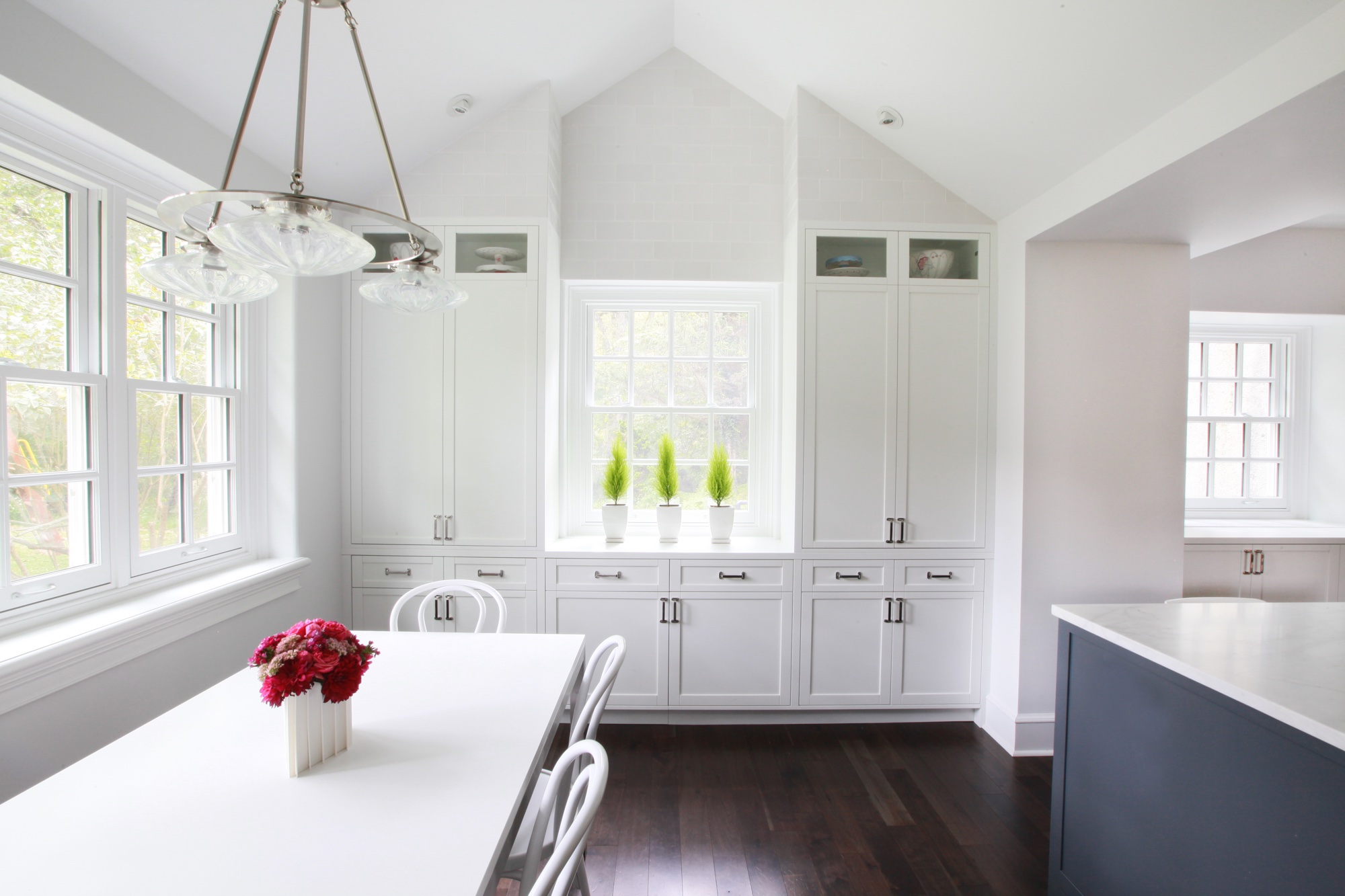
Considering kitchen ideas? Use your windows and built-in cabinetry to create perfectly positioned framework for the room. Mindy says: 'Here, a grid in thirds frames the central window and creates balance within the built-in cabinetry piece and under the two halves of the symmetrically gabled ceiling.'
2. Use your kitchen island as a central point
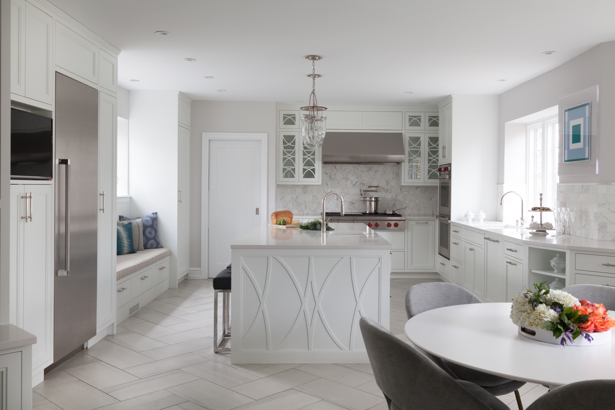
'A grid of thirds creates aisles for workflow around the room and around the central kitchen island which occupies the middle third,' explains Mindy.
'The countertop sets the work plane horizon and the hanging lighting fixtures define a line of upper horizontal space acting as a focal point for the eye, in addition to lighting the room and adding visual punch.'
3. Define the rule of thirds grid with a backsplash
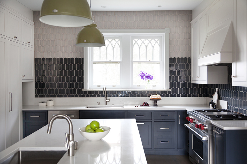
Backsplash ideas can also be used as part of the rule of thirds grid.
'Look to the finish materials like backsplash tile to visually organize the wall, create interest along the upper grid line and elongate the feeling of space in a smaller room,' says Mindy.
'It can be very stylish too, offering an opportunity to introduce more than one color onto the surfaces. Introduce an additional pop of color with hanging fixtures. Notice how the light fixture hanging down at the intersecting grid lines really draws the eye into the photo.'
4. Use statement lighting in the rule of thirds
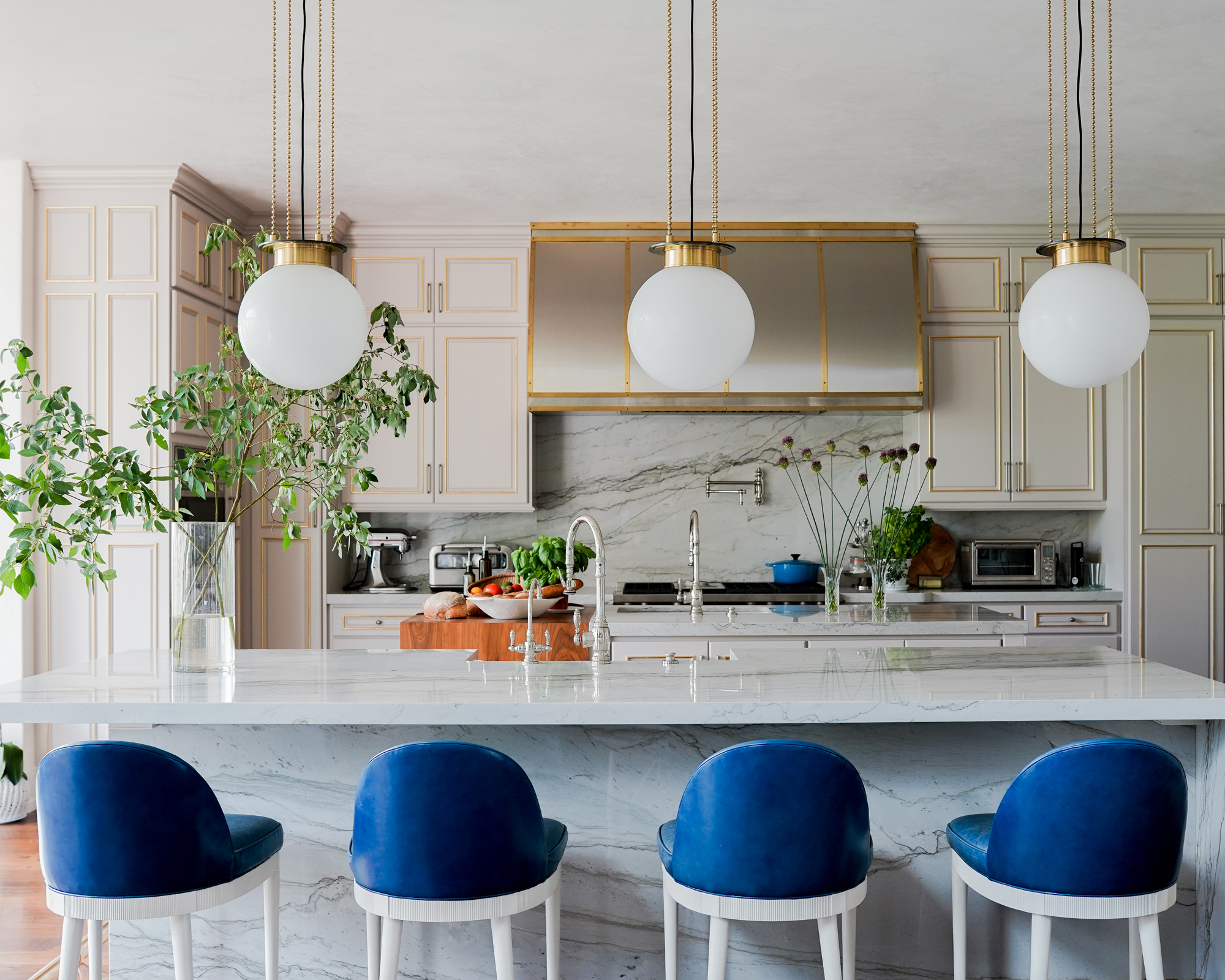
Interior designer Alice Lane employed the rule of thirds in this kitchen with kitchen lighting ideas. Notice how the countertop creates a horizontal line at the first third, and the cool pendant lights are positioned at the intersecting line points for visual interest and perfect balance.
5. Opt for open shelving
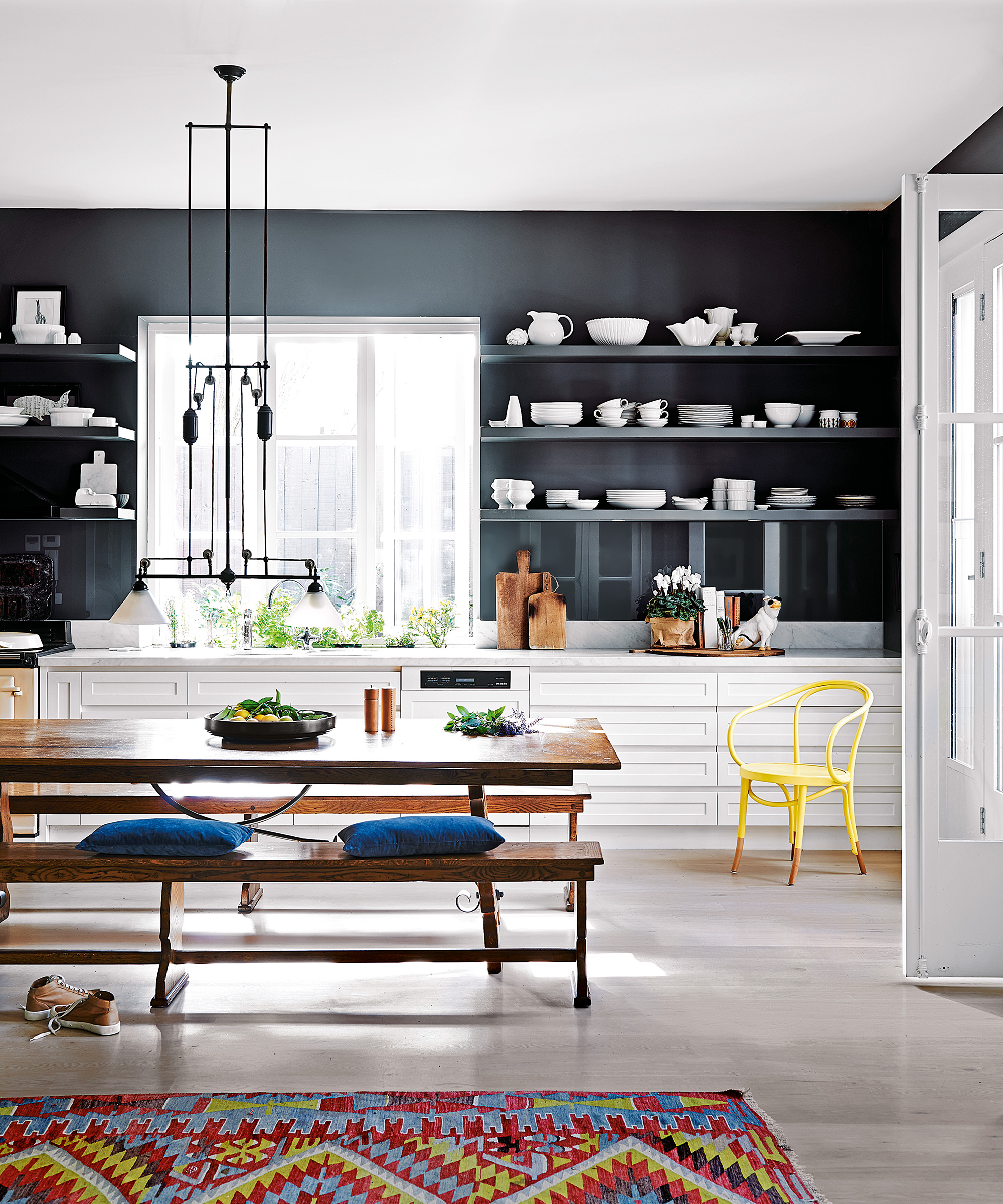
Open kitchen shelving ideas are not only on-trend, but also an easy way to apply the rule of thirds. In this example, the shelves delineate the top horizontal, and the two stylish wall lights sit at the grid's top intersections, creating that ideal balance.
6. Perfectly place artwork
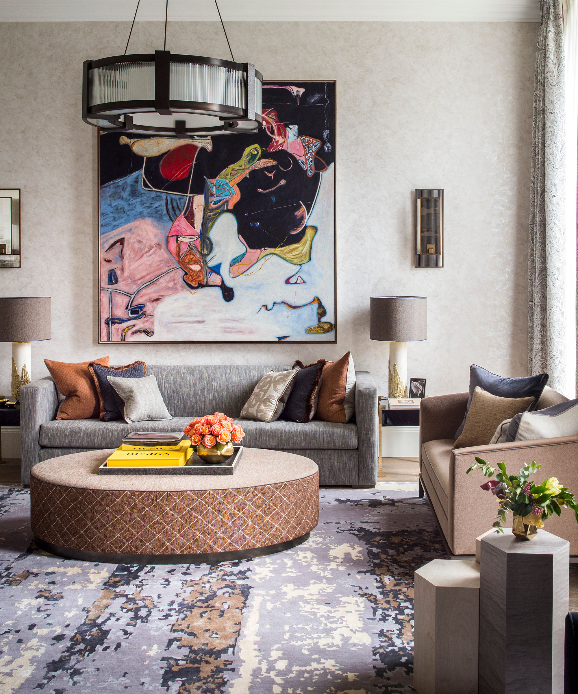
Living room ideas can be used in the rule of thirds – and this one shows how to utilize your artwork for the perfect placement; each end of the piece sits just outside the vertical intersection lines on the hypothetical rule of thirds grid.
7. Use a mantelpiece for the rule of thirds

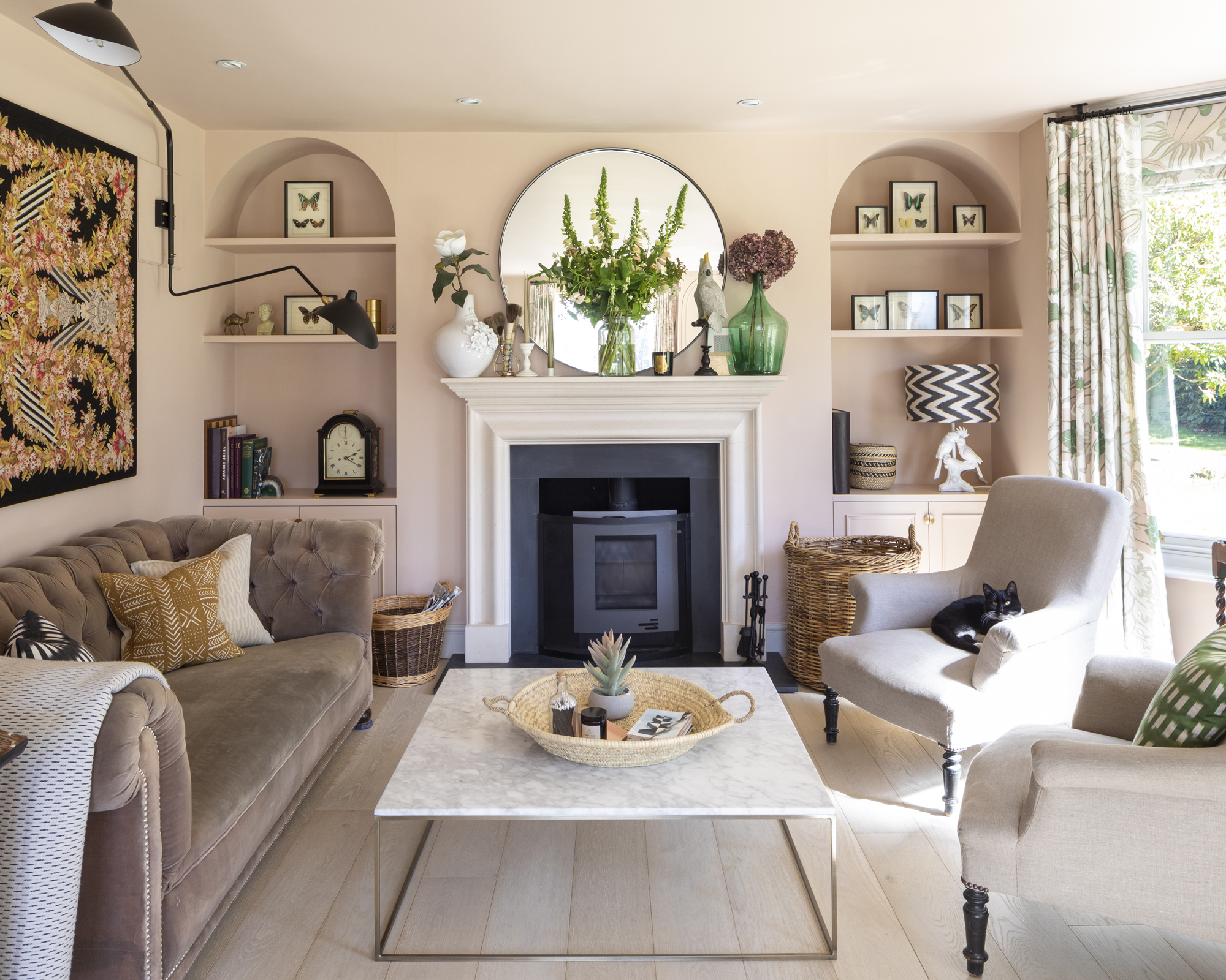
A living room is often easier to split into a grid of 9 evenly spaced boxes. Here, the fireplace is the central point of the grid, with the mantelpiece and upper shelves of the alcoves the upper third of the grid, and everything below the hearth the lower part of the grid.
8. Work the rule of thirds with wall lights
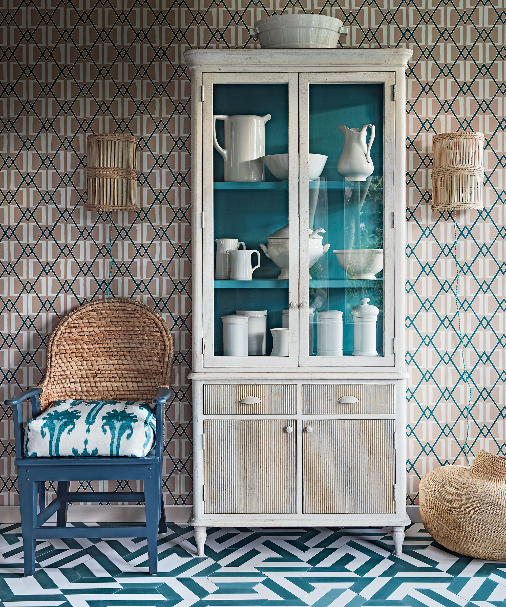
We're in love with this pretty arrangement – but what's noticeable is the rule of thirds being utilised to perfection. Notice how solid doors of the cabinet create the lower horizontal line, while the lights are perfectly placed at the intersections between the upper horizontal line and the two vertical lines. So visually pleasing to the eye.
9. Create balance in a bedroom with the rule of thirds
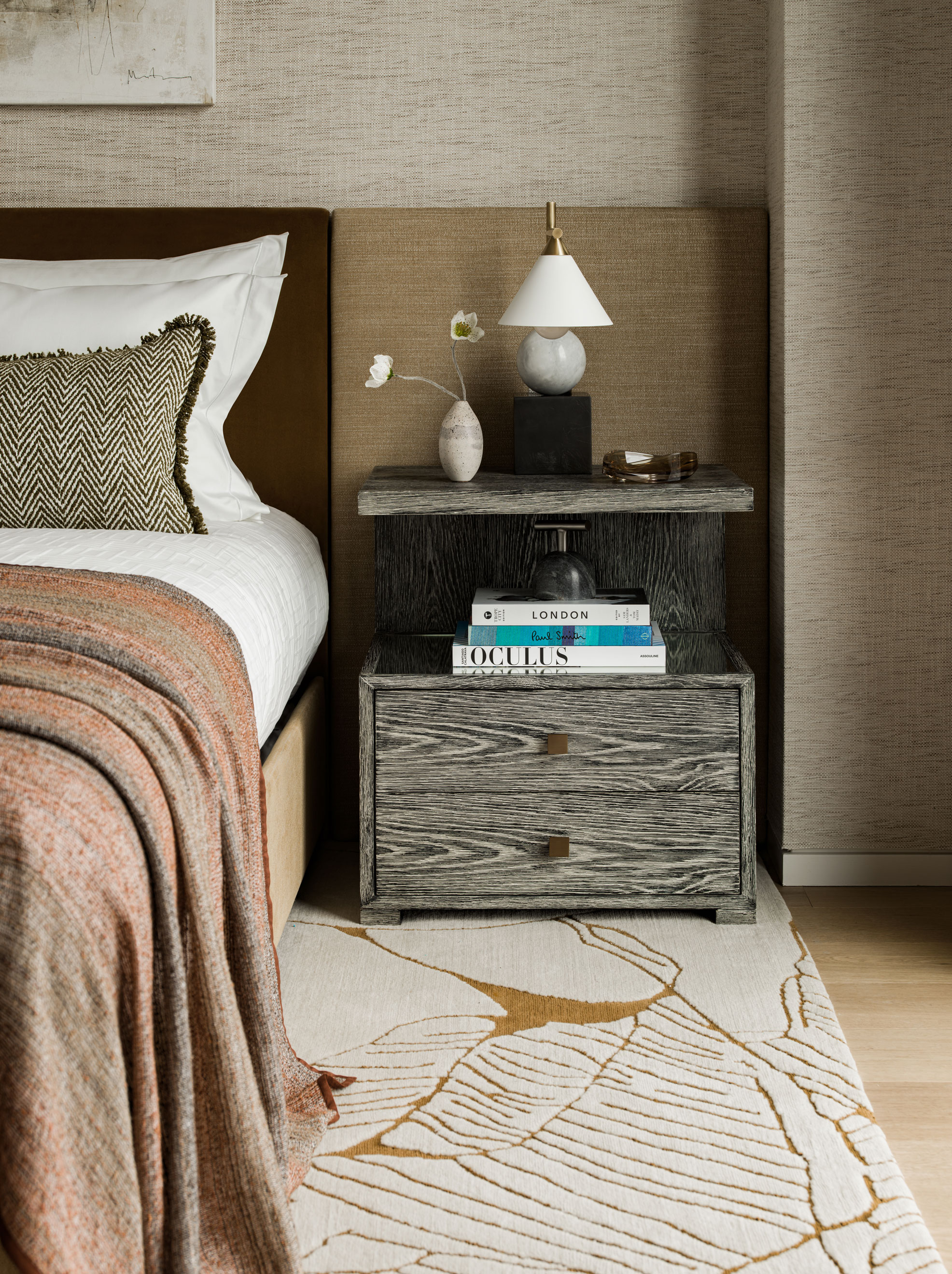
Interior designer Charu Gandhi of Elicyon also shows us the importance of considering the height of your bedside and side table accessories, in this case the bedside lamp.
In the picture above, you can see how the rug forms the edge of the lower horizontal rule of thirds grid line, while the height of the lamp is so spot-on it's perfectly positioned on the upper horizontal line. Its placement in relation to the bed also puts it firmly on the right hand vertical line, too.
The bedside table arrangement and lamp/headboard combination are also a neat rule of thirds example in itself.
Is the rule of thirds important in interior design?
As with all the interior design tips we offer, the rule of thirds is a guideline. However, it is important if you are designing your first few projects and are finding it hard to get the balance of a decor scheme just right. It shouldn't be adhered to mechanically – your eye will often offer a far better alternative to the grid approach – however, it can help to bring balance when a room's layout isn't working.

Ruth Doherty is an experienced digital writer and editor specializing in interiors, travel and lifestyle. With 20 years of writing for national sites under her belt, she’s worked for the likes of Livingetc.com, Standard, Ideal Home, Stylist and Marie Claire as well as Homes & Gardens.