Positive space in interior design – what it is and 5 ways to use it for impact
Using positive space in interior design will make a room cozy and characterful yet also functional
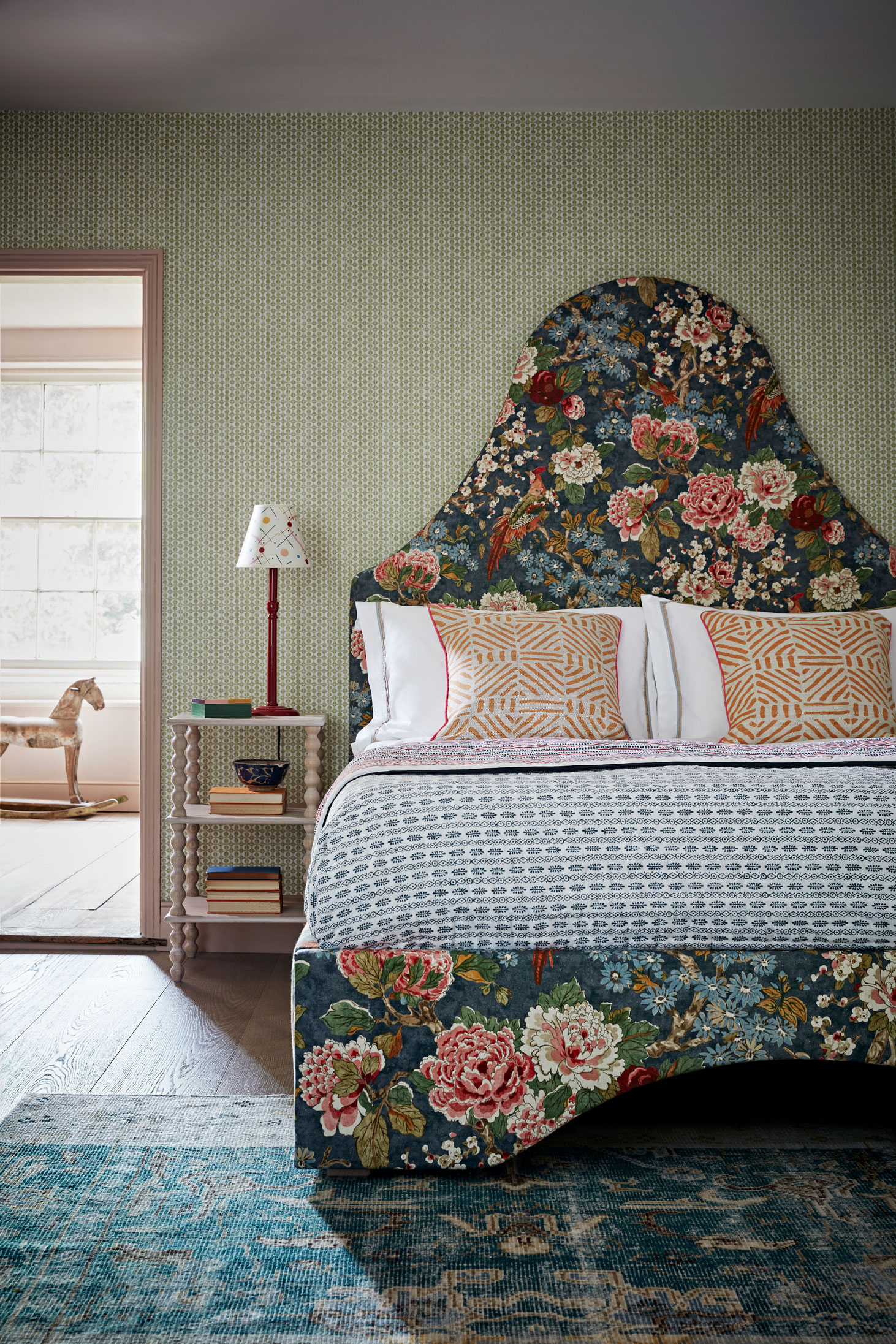

What is positive space in interior design – and why consider its impact in a room's design? Positive space is the space that is actually occupied by objects, materials and 'things', so can be a combination of your home decor elements, like furniture, artwork, accessories and lighting. How you use this space when designing a room can determine how it feels, whether it's cozy and embracing or sleek and minimal.
Positive space really only makes sense in the context of negative space – that is the space surrounding – or gaps between – the objects, and a clever use of both works towards creating a well-balanced room, visually and atmospherically.
Here, we explain how.
See: Interior design tips – decorating secrets for the world's top experts
What is positive space in interior design?
Having an eye for positive space in rooms is just one technique interior designers use to create perfectly balanced schemes that are neither too crowded nor too minimalist.
'In interior design there is positive and negative space, and both play important roles when it comes to how a room's scheme works,' explains Barrie Cutchie, Design Director at BC Designs.
'Positive space is where the actual objects are; in bathrooms it is the bath, toilet, basin, lighting, etc, while the negative space is the empty space around and in between everything else, more often than not highlighting and showcasing everything next to it.'
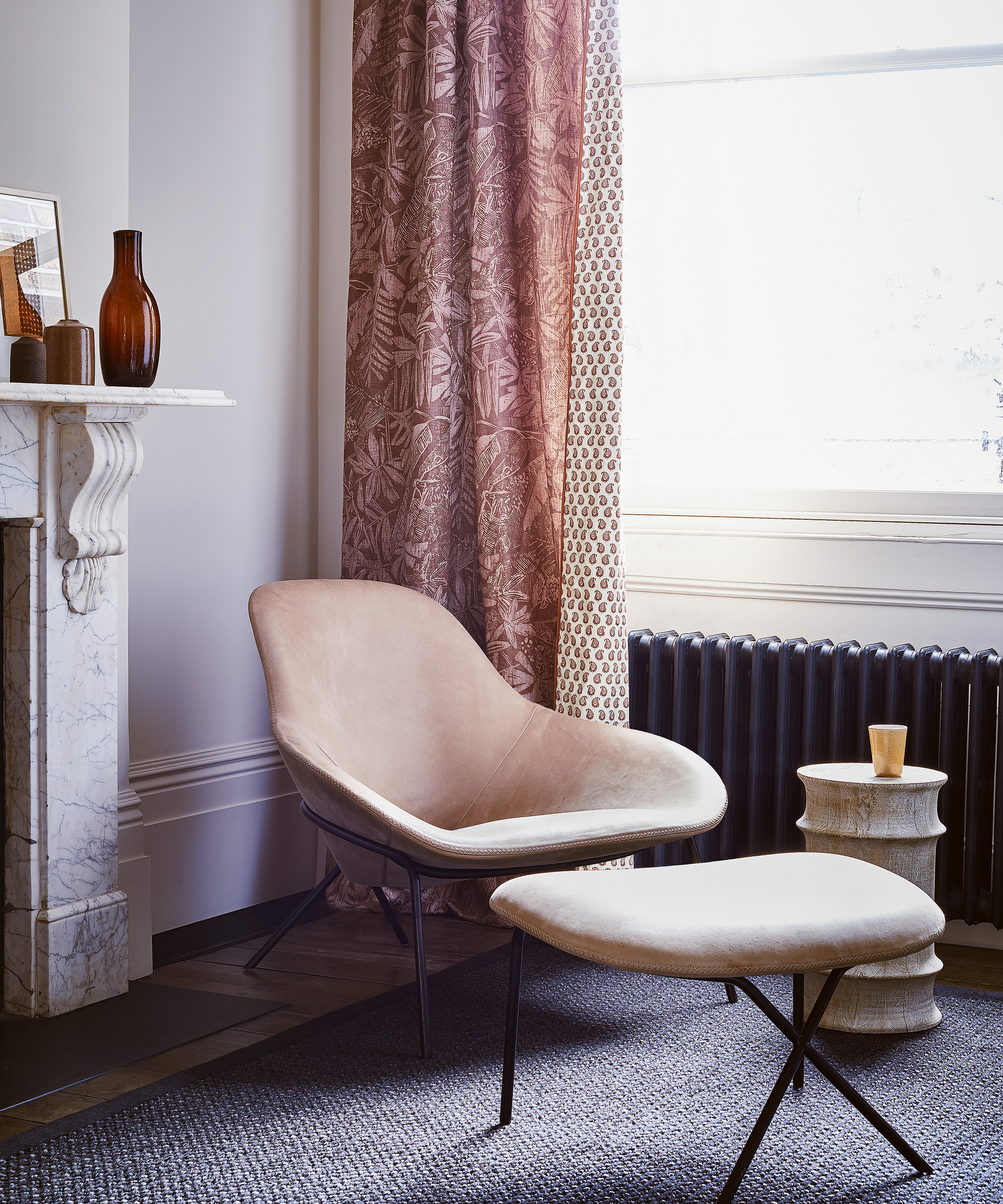
Embracing positive space is all about giving the pieces you choose room to breathe and shine – for example, a shapely armchair like the one above needs (negative) space around it so that its curves can be appreciated; crowd it with other furniture, pile on throws and cushions, and its impact will be lessened.
How is positive space used in interior design?
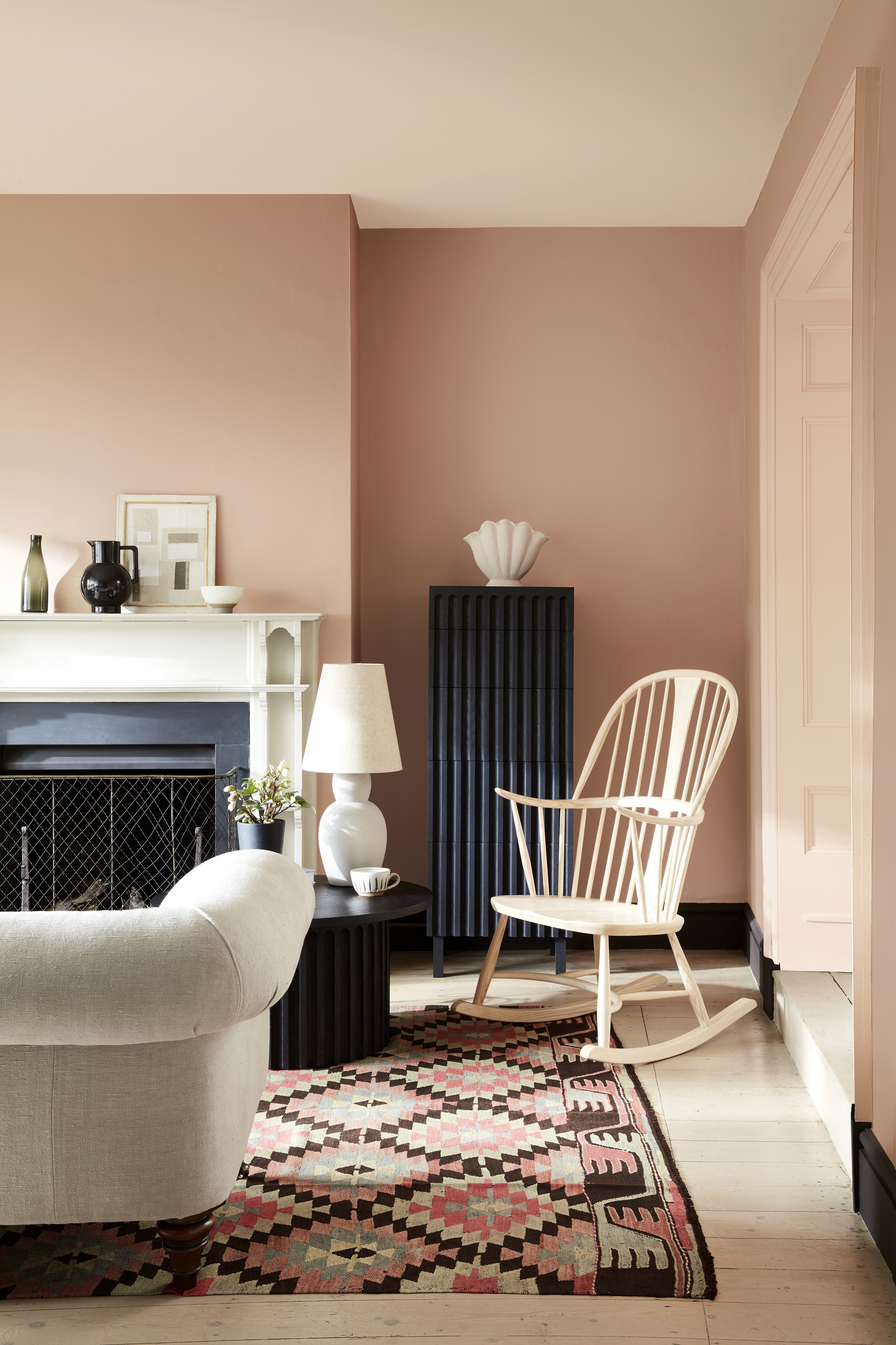
Striking a balance between positive and negative space is key to creating a well-proportioned room, ensuring it's not too crowded but not too soulless or sparse either.
If a room is completely full of objects taking up positive space, it could lead to a cluttered feeling, so balancing the space scales is key to a visually pleasing room.
Positive space needs to be filled to a point, for reasons of functionality (everybody needs a bed, for example), but can also be used to make a statement or add character and texture with a beautiful piece.
Using texture in interior design – how professionals harness it to add depth and dimension to a room
See how to use positive space for well laid-out rooms below.
1. Use positive space to add a modern farmhouse feel to your kitchen
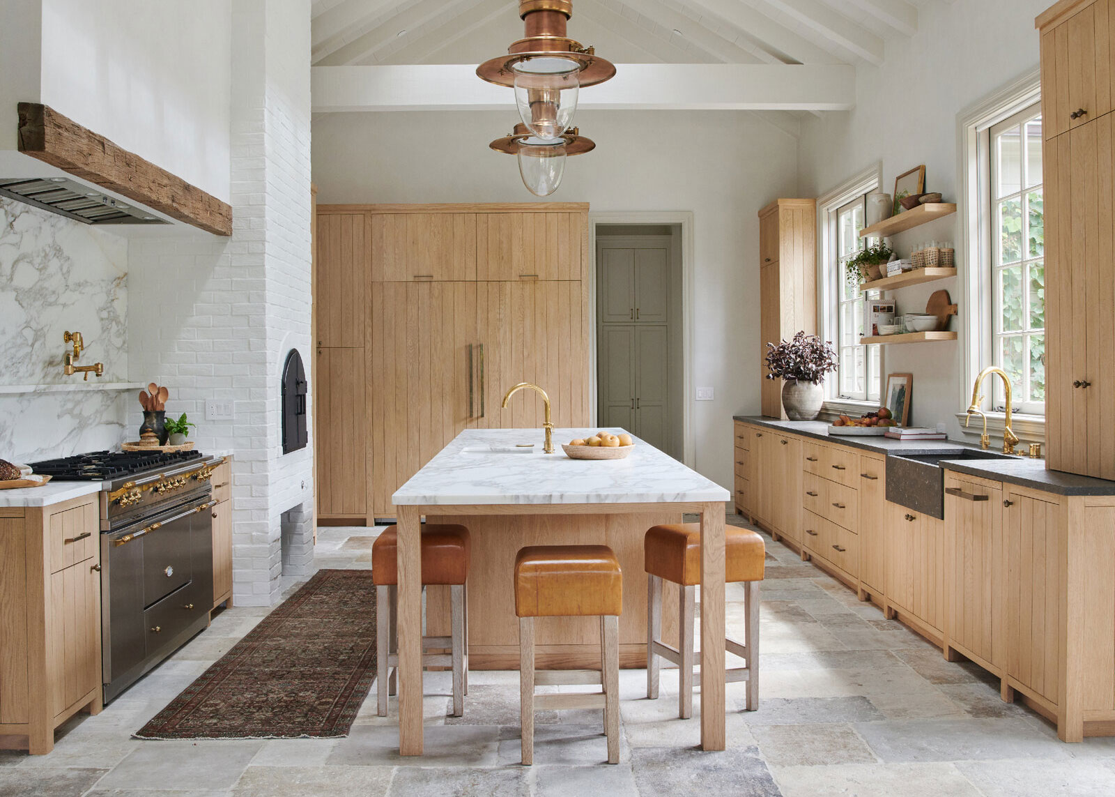
'Positive space, the space occupied by objects, is made up of things like furniture, art, and other decor elements,' say the experts at Frontier Designs. 'For example, modern farmhouse decor tends to be relatively balanced in spacial use, though sometimes it's a little heavier in positive space use. Not to the point of being cluttered, but to create a cozier, homey feel. '
In the kitchen above, you can see how a rustic farmhouse-style kitchen island has been used in the positive space to add an earthy, warm feel, as well as cleverly serving as a dining table.
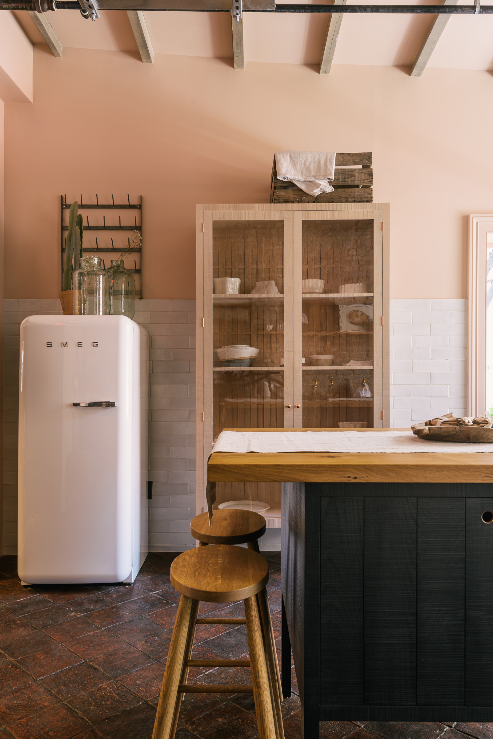
You can also add texture through positive space in your kitchen cabinets. The beautiful Sebastian Cox kitchen by deVOL below shows how a timber island and cabinetry, along with a Smeg fridge and wooden dresser, fill the positive space with functional yet organic textures, and there's enough negative space left around them so the room doesn't feel cluttered.
Even the dresser is filled with just the right amount of ceramics to strike the perfect balance of characterful but not overcrowded. A few decorative objects, like wooden boxes and trugs, and glass bottles, finish the look.
2. Fill positive space with one statement piece for an elegant bathroom
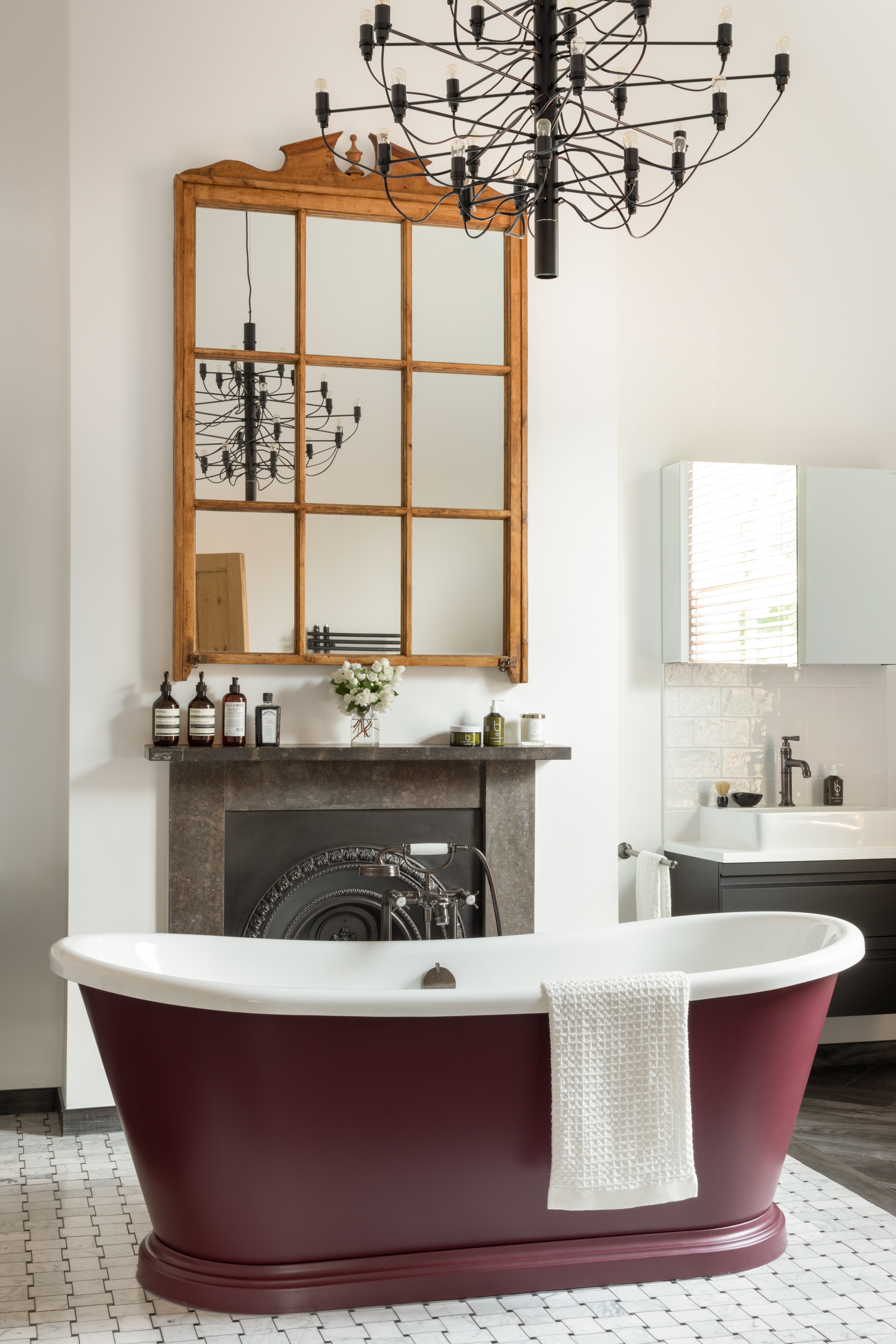
The bathroom is often where we retreat for some essential me-time, and should be a luxurious yet tranquil sanctuary. Positive space will be filled by essential sanitaryware items like the toilet and sink, but you can also elevate these pieces. An easy way to create a beautiful bathroom is by adding an indulgent freestanding tub. Then use negative space and circulation space (that needed for navigating through the room) to keep it clean-lined and uncluttered.
Barrie Cutchie, Design Director at BC Designs, says: ‘In bathroom design, positive space could be a freestanding bath which is used as a focal point of a room, but in order to showcase the bath and really create wow factor, designers will often leave space around it so as not to take focus away from the star of the show.'
The image above also shows how, if you have the height, you can add a statement chandelier to inject grandeur without taking up positive space on the floor.
3. Add color in the dining room with positive space
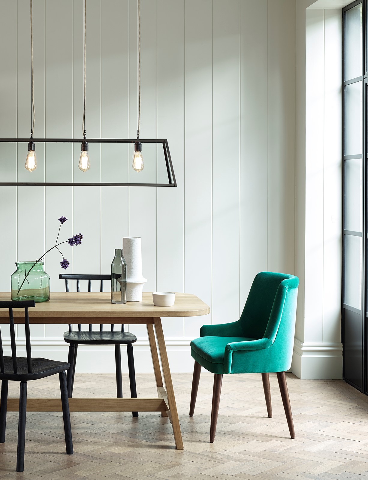
If you don't want to make a statement with a bold hue all over the walls, you can use your positive space to add color to a room. Whether it's through jewel-toned velvet dining chairs or well-placed, curated decorative objects, use your positive space to add furniture and accessories to bring life to the space.
4. Create a contemporary country living room with positive space
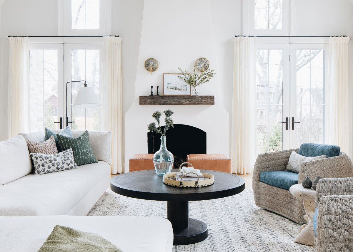
We love how the positive space has been filled with carefully curated pieces to create a specific design scheme in this room by Kate Marker Interiors. The coffee table in particular is given room to breathe (negative space) – and a color contrast – to really make the most of its shapely form (positive space).
See: Living room ideas – clever ways to decorate living spaces
5. Make a style statement using positive space with patterned headboards in the bedroom
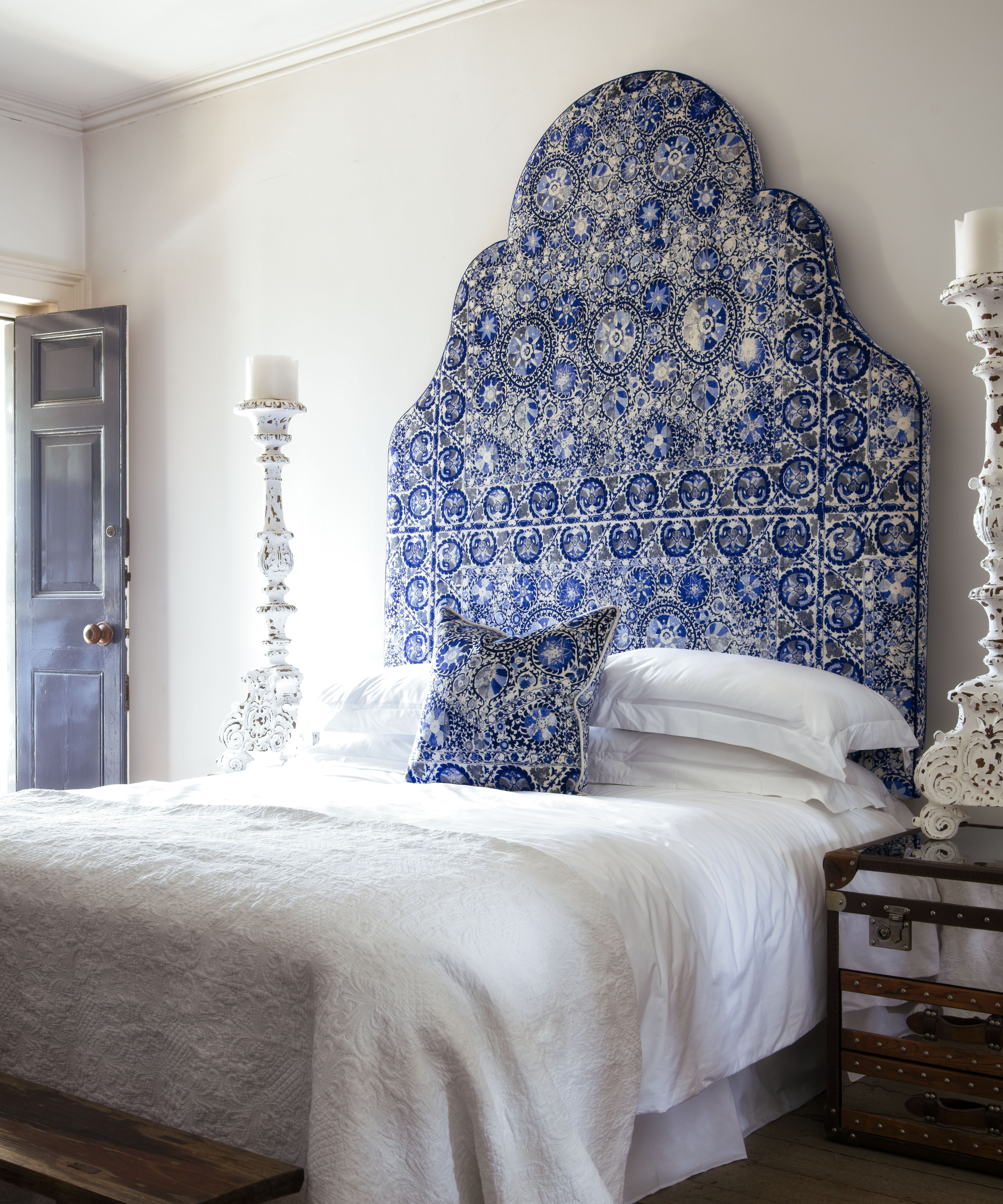
Take a leaf out of Kit Kemp's design book, and use a printed headboard to fill positive space in the bedroom for an exciting, welcoming and bright look. You can go as bold as you like, with strong fun florals or keep the print more low-key, like the pretty Clemmie from Neptune below.
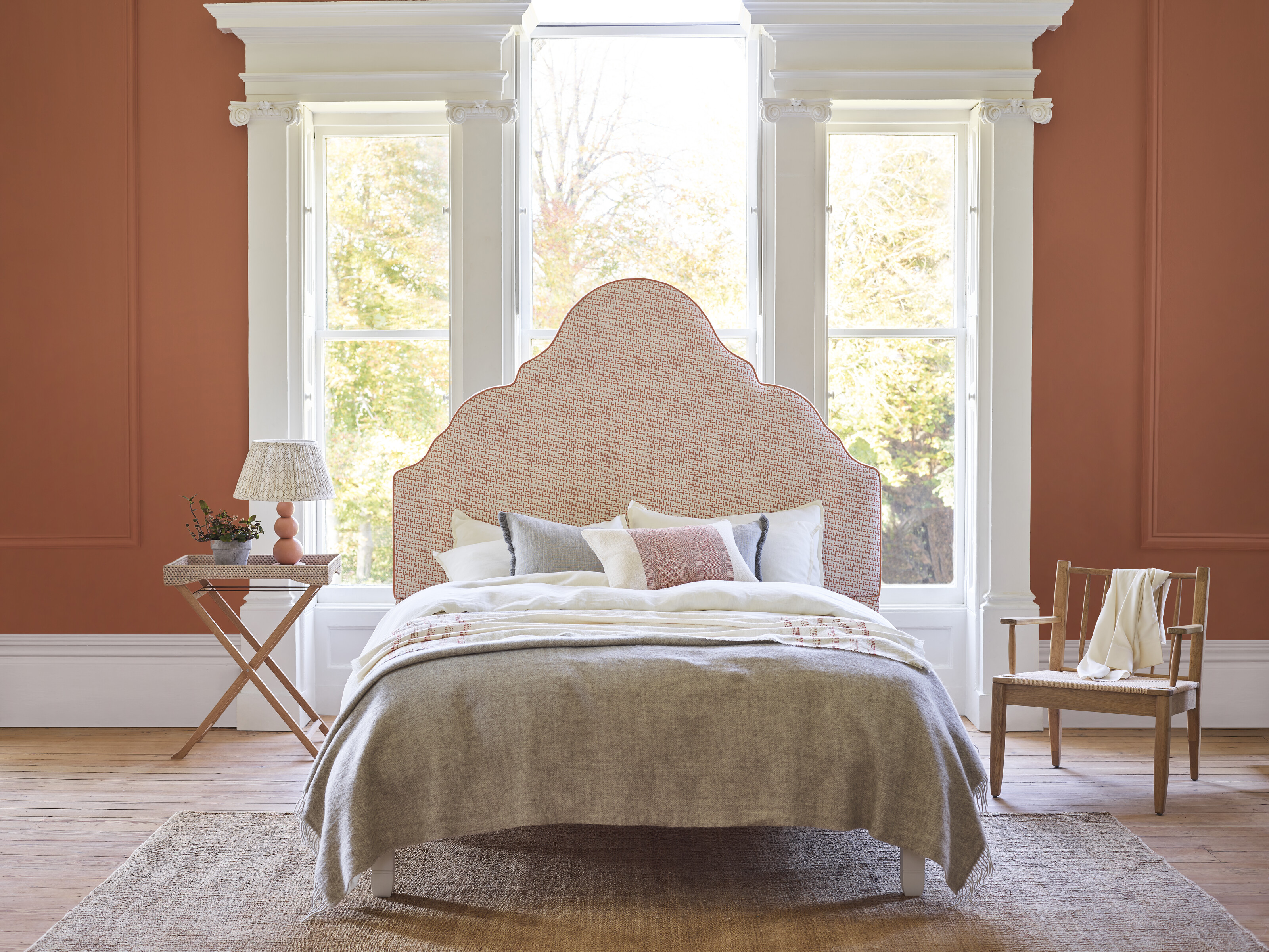
How clear you keep the negative space is up to you, but if you want the headboard to be the main focus, keeping it relatively clear is a good idea.
Sign up to the Homes & Gardens newsletter
Design expertise in your inbox – from inspiring decorating ideas and beautiful celebrity homes to practical gardening advice and shopping round-ups.

Ruth Doherty is an experienced digital writer and editor specializing in interiors, travel and lifestyle. With 20 years of writing for national sites under her belt, she’s worked for the likes of Livingetc.com, Standard, Ideal Home, Stylist and Marie Claire as well as Homes & Gardens.
-
 Martha Stewart's tips for arranging daffodils are unbelievably simple and effective – it's the only flower advice you need this springtime
Martha shows us that we can create gorgeous bouquets of this seasonal flower by simply trimming the stems and placing them in specific vases
By Hannah Ziegler Published
-
 Designers share how to make your outdoor living room look more expensive – and the affordable products to get you there
From layered lighting to luxe-looking textiles, these simple swaps made all the difference
By Charlotte Olby Published