Mass in interior design – 6 ways visual mass can determine a decor scheme
Why visual mass in interior design is important for navigating a room from minimalist to maximalist...
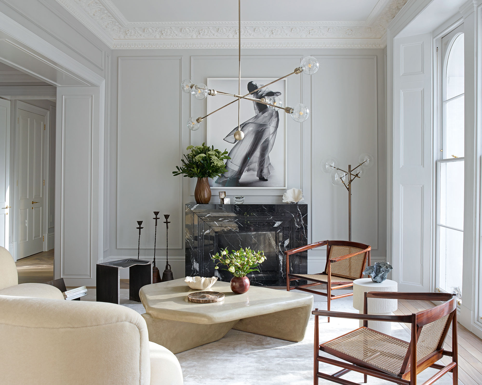

Mass is an important element in interior design, and can refer to actual mass – the density and solidity of a form – as well as visual mass, which is the materials used to fill a space that may not have actual mass present – such as wallpaper.
You can add visual mass with pattern, color or materials (perhaps a sofa skirting or curtains), and it can help to focus your attention to a particular area; so it directs the eye without necessarily possessing much actual physical weight.
See: Interior design tips – decorating secrets for the world's top experts
What is mass in interior design?
The perception of mass and its visual weight depends on how strongly the element pulls your eye towards it. You can add visual mass and weight to an element through color, prints, texture and size.
The term 'high mass' in interior design refers to a room that is visually packed with lots of elements, a maximalist's dream. 'Low mass', on the other hand, is space that is functional and visually uncluttered, think Scandi-style design.
Barrie Cutchie, Design Director at Bayswater Bathrooms, says: 'Mass is an important feature of interior design and centers around how much of an object uses a particular space. It helps to inform the finished look: think maximalism vs minimalism design. Minimalism design may use less mass in order to create much more space.'
Discover how mass can inform the scheme of a room below.
1. Use bold wallpaper to add visual mass to a bathroom
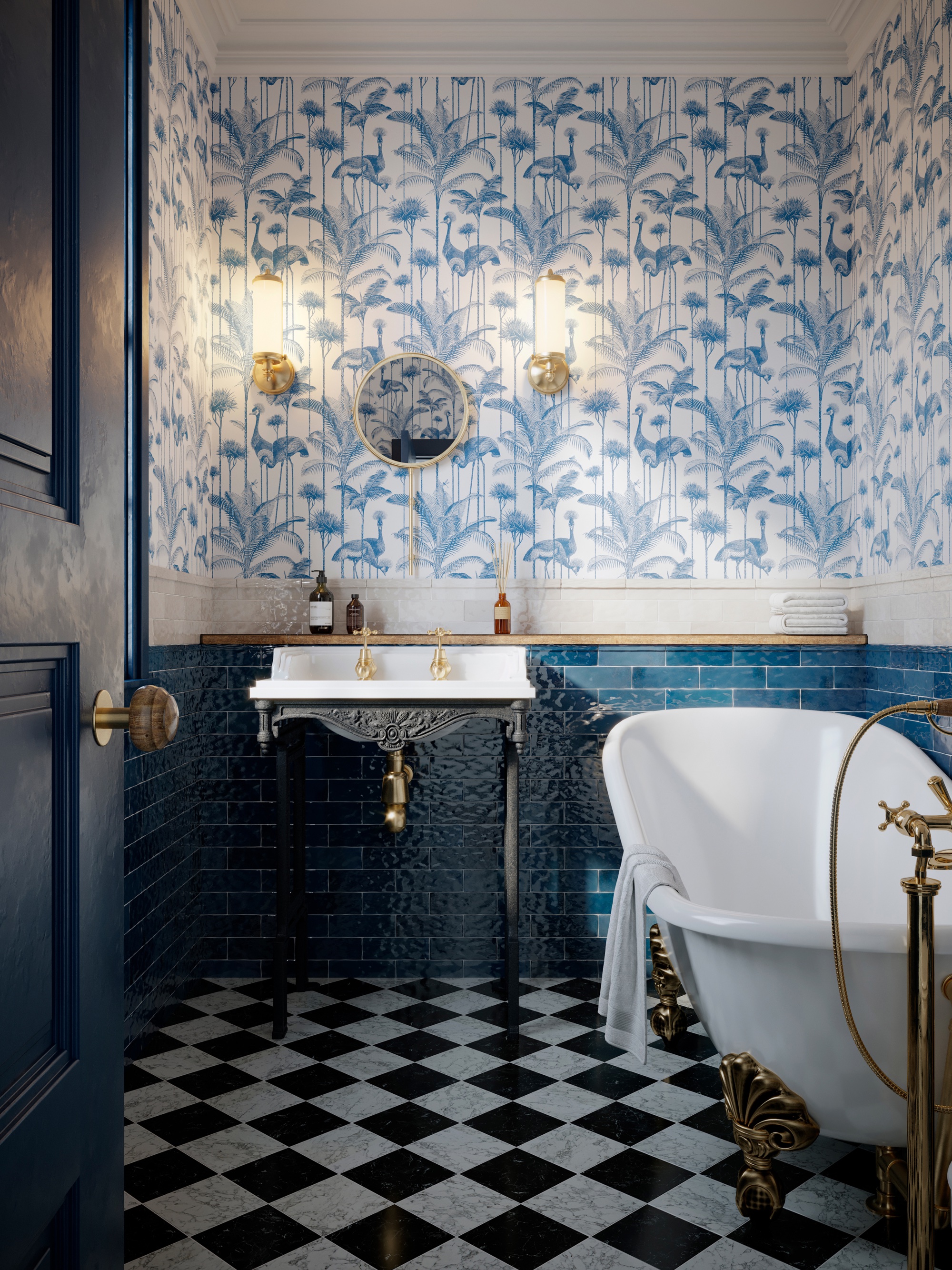
'Mass can be a solid body of an object or visual mass, and we’re seeing the latter being created regularly with the use of wallpaper in the bathroom,' says Barrie Cutchie. 'There is such a huge demand for busy wallpaper that brings to life the maximalism trend we’re seeing dominate bathrooms at the moment. The mass cannot be touched in the way an object can be, but it creates a sense that the room is full.'
Top tip? It's a great trick for making small bathrooms feel bigger. The room above, featuring wallpaper by Divine Savages, is a good example of a high mass room, with its tropical print wallpaper, colorful metro tiles, elaborate clawfoot tub, and heritage check floor.
2. Create a dramatic living room with strong colour
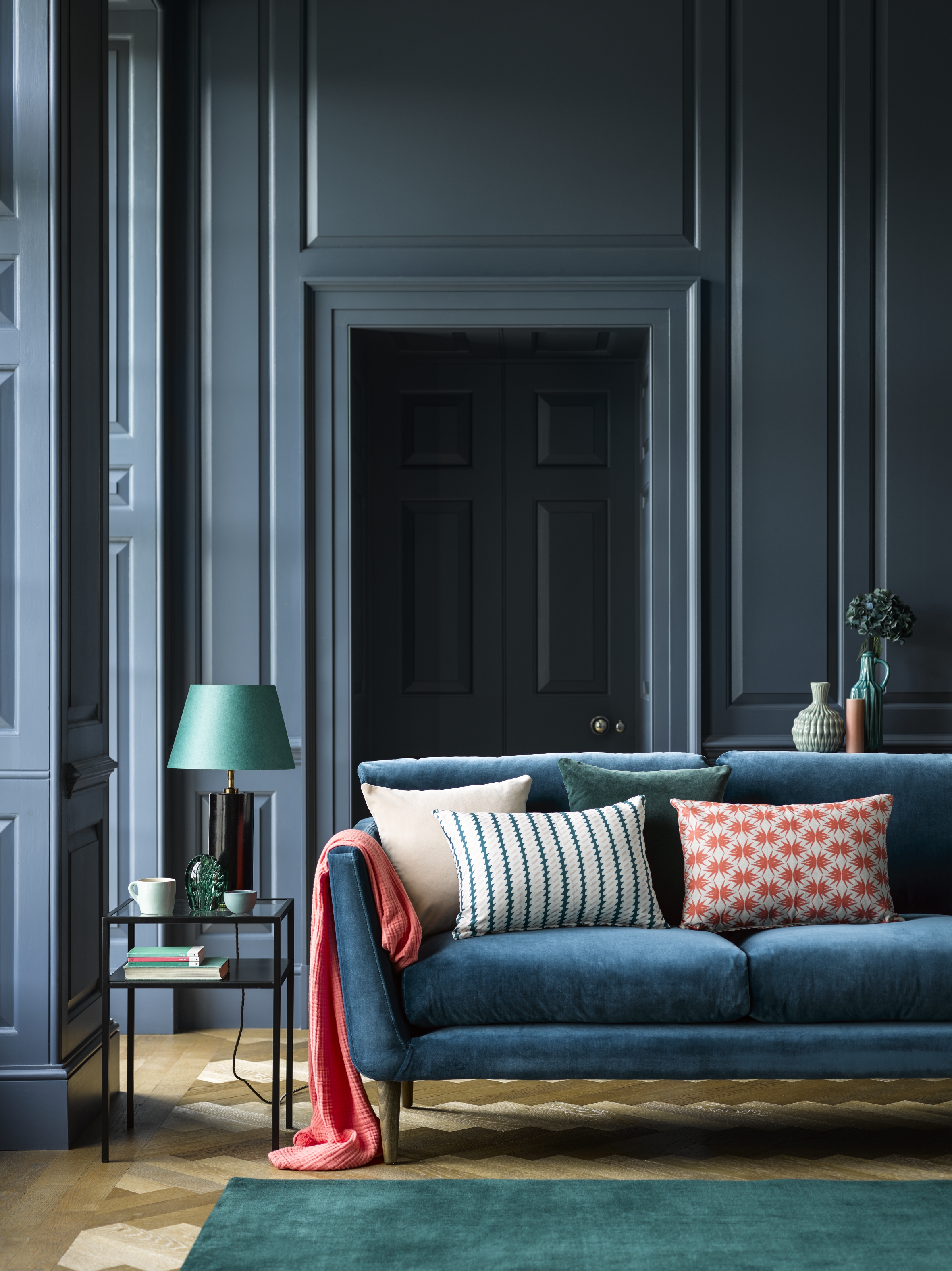
Adding a strong – and the same – color to the walls and doors in your living room is an easy way to add visual weight and up the impact factor. The room above, featuring beautiful pops of brighter green and red, manages to be dramatic, stylish and cozy without being too congested, or 'high mass'.
See: Living room ideas – clever ways to decorate living spaces
3. Give a traditional snug a fresh update with contemporary upholstery
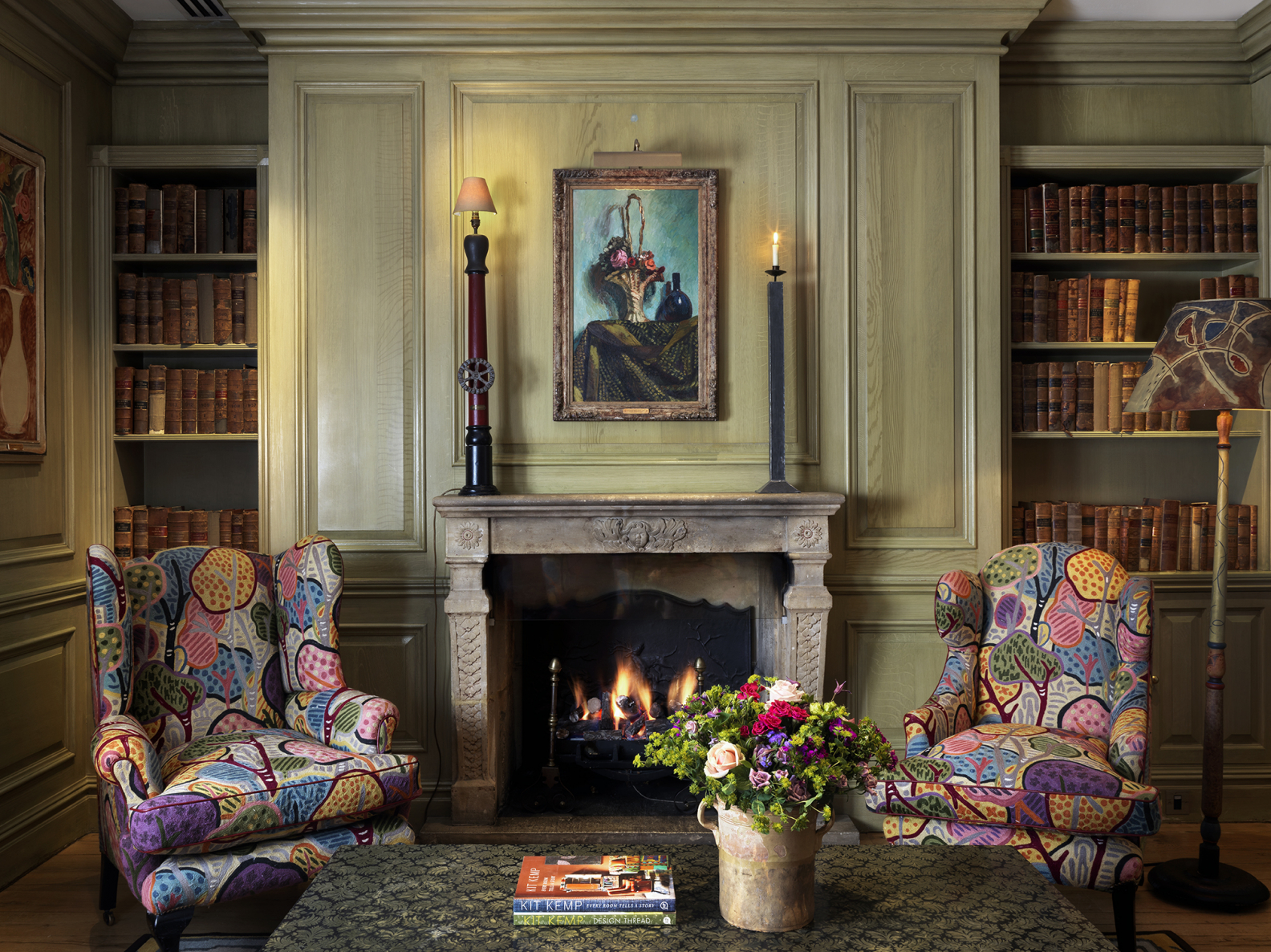
Inject a modern feel to a grand snug or drawing room with colorful fabrics on beautiful furniture.
'A wing chair often works well in a drawing room,' says Kit Kemp. 'It exudes grandeur and opulence with its upright, powerful posture and scroll shape armrests. At Charlotte Street Hotel in the library (pictured above), we have upholstered our wing chairs in a colourful crewel embroidered fabric by Pierre Frey. The two chairs sit posing in front of a French stone fireplace. The chair becomes a statement piece of furniture when combining it with a modern textile.'
The chairs and bold fabric show how just a couple of visually weighty pieces can draw the eye and become the main focus without detracting from the beauty of the rest of the room.
See: Using texture in interior design – how professionals harness it to add depth and dimension to a room
4. Design a Scandi-style dining room or kitchen with low mass earthy materials
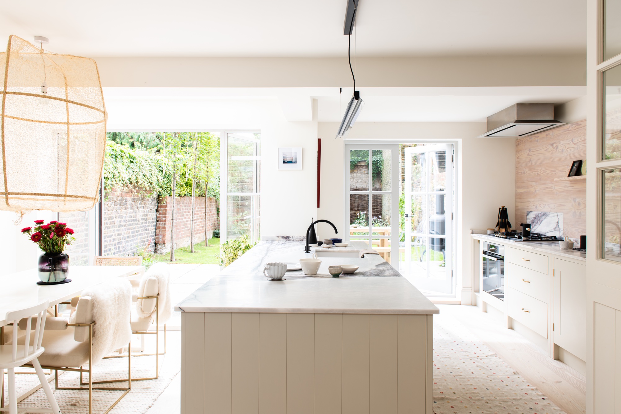
If you're looking for a clean-lined scheme with a Scandi design aesthetic, a low visual mass is key. Using organic materials like rattan against a white backdrop is perfect for the style. Adding a lovely olive tree or indoor plant is another way to add a natural element and some visual weight without the room feeling cluttered.
We love how the oversized rattan pendant anchors the space in this beautiful clean-lined kitchen/diner above by British Standard by Plain English.
See: Kitchen ideas – decor and decorating ideas for all kitchens
5. Elevate your home office with patterned rugs and glamorous details for a high mass, maximalist finish
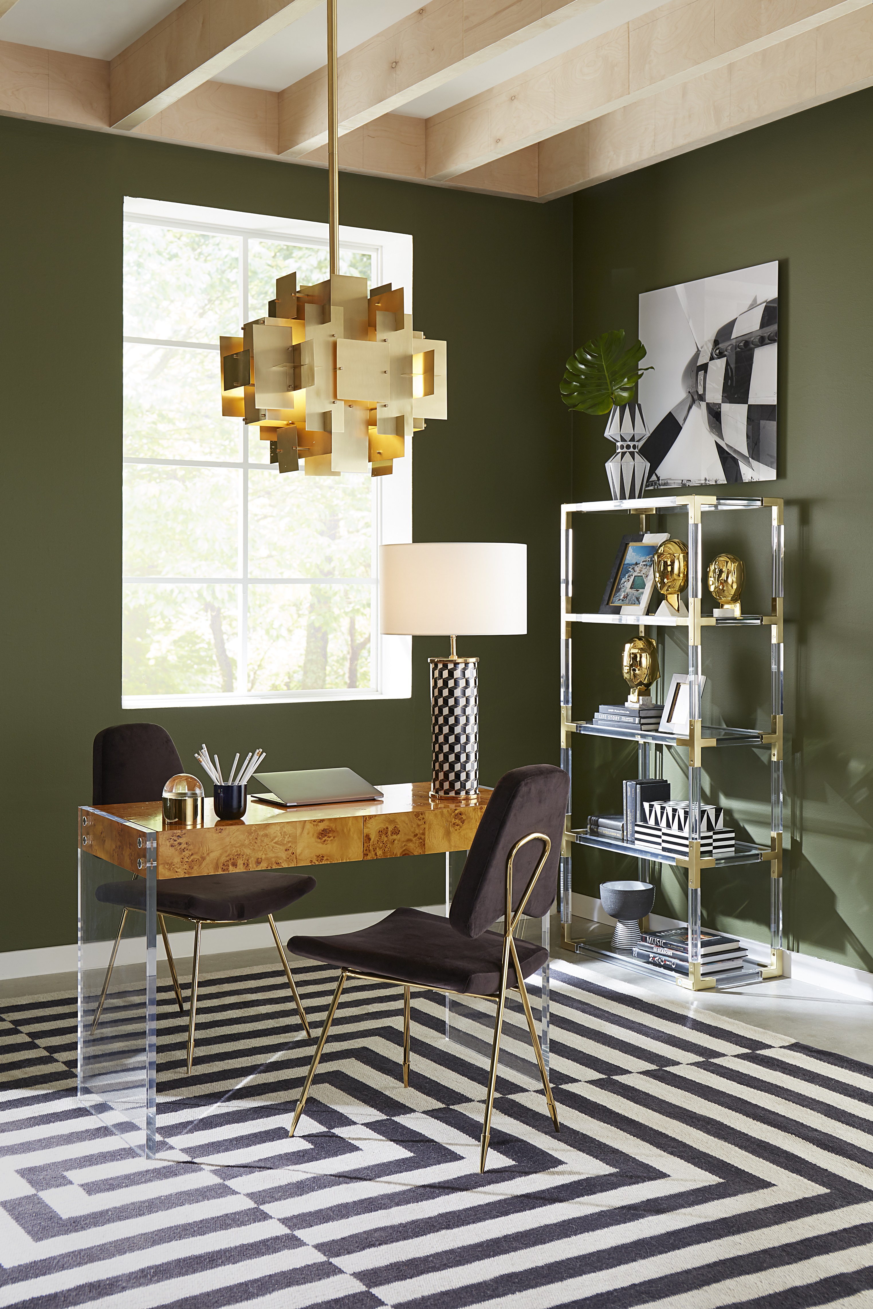
Adding visual mass through pattern, color, lighting and accessories can create an inspiring and vibrant space that boost your mood and productiveness – somewhere you look forward to going every day. This beautiful room by Jonathan Adler shows how you can use visual mass in patterned soft furnishings, like a statement rug, with carefully curated actual mass, that beautiful geometric light, the desk, shelves and chairs, to create a glamorous and joyful space.
6. Add bold prints and artwork to use visual mass for a stylish bedroom
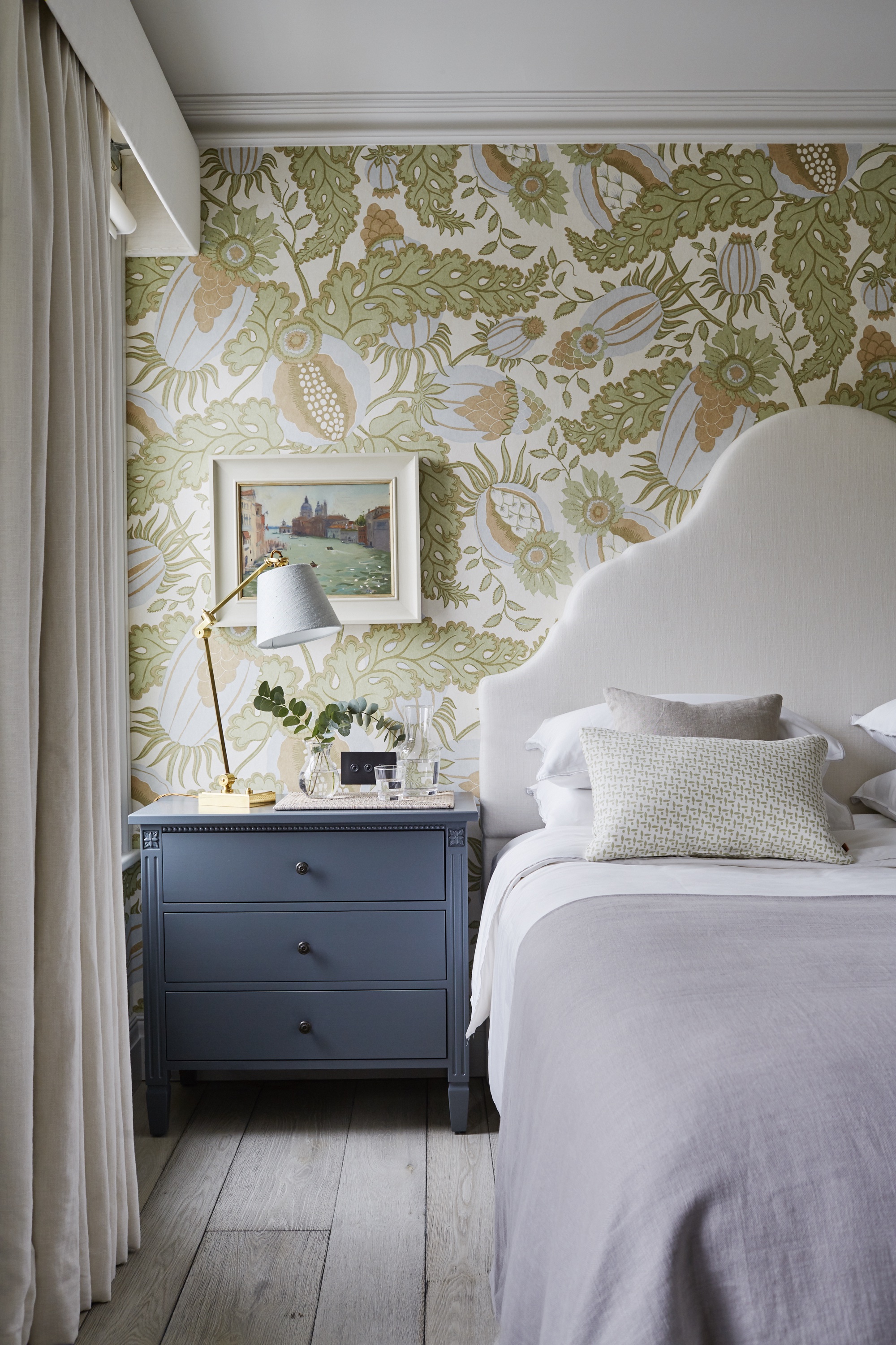
'Bold patterns and accent colors are wonderful additions to an interior as they not only add character and interest to what could otherwise be a fairly plain room, but they work to fill the space through a concept called "visual mass",' says Emma Sims-Hilditch, of design studio Sims Hilditch. 'A great example of this is the patterned wallpaper by Christopher Farr that we used in the master bedroom of our Parsons Green townhouse (above).
See: Bedroom ideas – designs and inspiration for beautiful bedrooms
'The bold pattern in the green colorway draws the eye, and is beautifully offset by the darker painted side tables, bringing the space to life. We also like to use artwork which is full of lovely colors as inspiration for the color palette in a room, which manifests in an array of beautiful hues and patterns being threaded through the space.'
Sign up to the Homes & Gardens newsletter
Design expertise in your inbox – from inspiring decorating ideas and beautiful celebrity homes to practical gardening advice and shopping round-ups.

Ruth Doherty is an experienced digital writer and editor specializing in interiors, travel and lifestyle. With 20 years of writing for national sites under her belt, she’s worked for the likes of Livingetc.com, Standard, Ideal Home, Stylist and Marie Claire as well as Homes & Gardens.
-
 Kris Jenner's favorite air fryer, the Ninja Crispi, is the perfect small kitchen solution – it deserves a place on the most compact of countertops
Kris approves of this compact yet powerful air fryer, and so do our own kitchen appliance experts, praising it for its multifunctionality
By Hannah Ziegler Published
-
 Ina Garten's storage pantry is an insightful window into all of the best cookware used by the chef – and it's easy to recreate on your kitchen shelves from $48
The beautiful dishware in The Barefoot Contessa's Hamptons pantry showcases the tools she uses most often to cook – this is exactly how you replicate it
By Sophie Edwards Published