How to make a small kitchen look bigger — 15 expert tricks
If you're wondering how to make a small kitchen look bigger, there is a whole range of clever design tricks to try
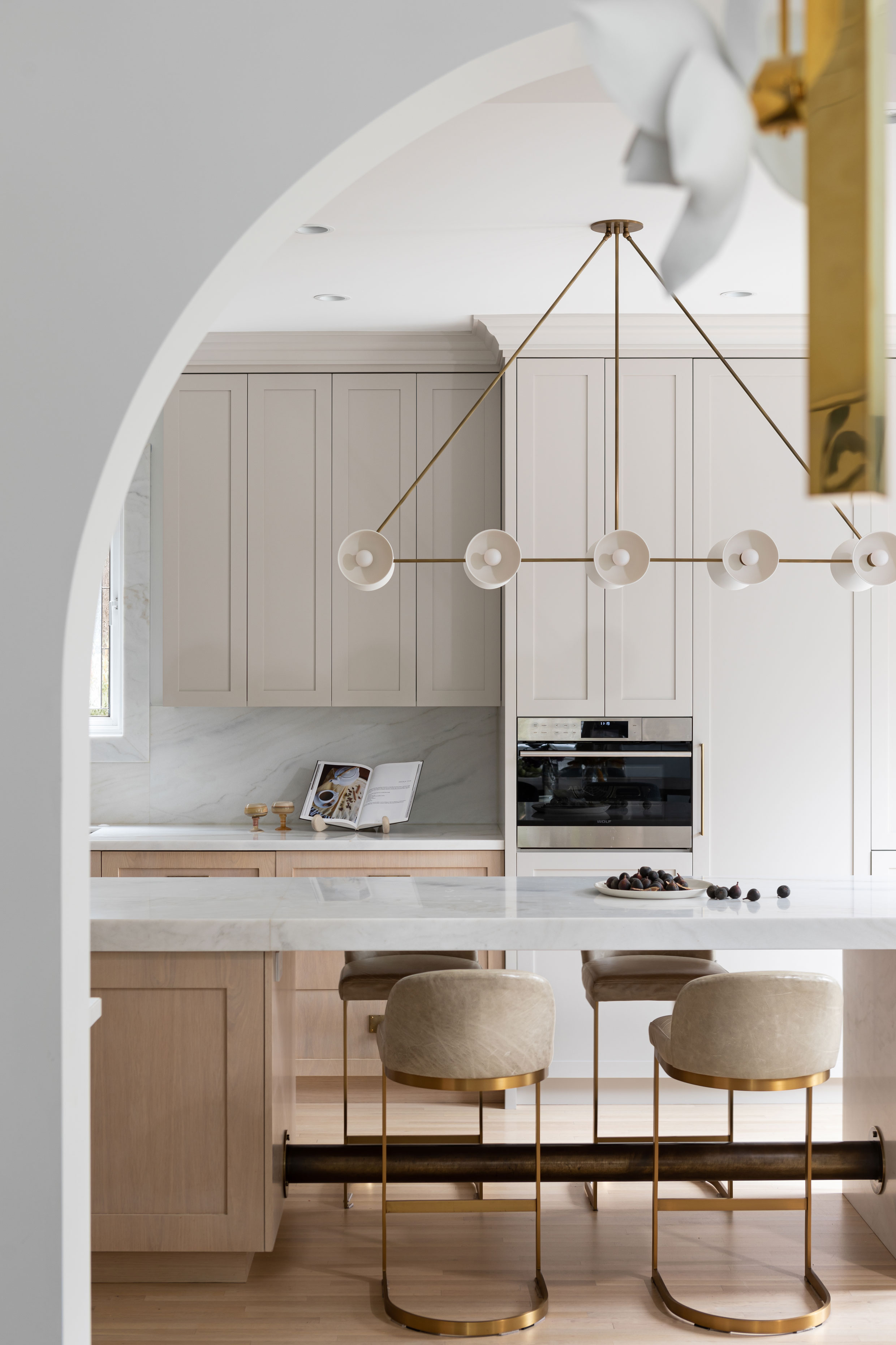

Moving to the home of your dreams but want to know how to make a small kitchen look bigger?
While you decide whether to renovate or remodel, there are many design tricks and small kitchen ideas you can use to create the illusion of space in your kitchen - whatever its size - from slimline units, removing wall cabinets and embracing reflection.
Even decluttering can help. The minimalist approach works well in small spaces and simple hacks, such as removing handles and using push/pull catches, are tricks you can use.
However, let's narrow it down for you: these are the best ways to fake square footage in a kitchen, according to the experts.
How to make a small kitchen look bigger
1. Replace a solid roof with a glazed one
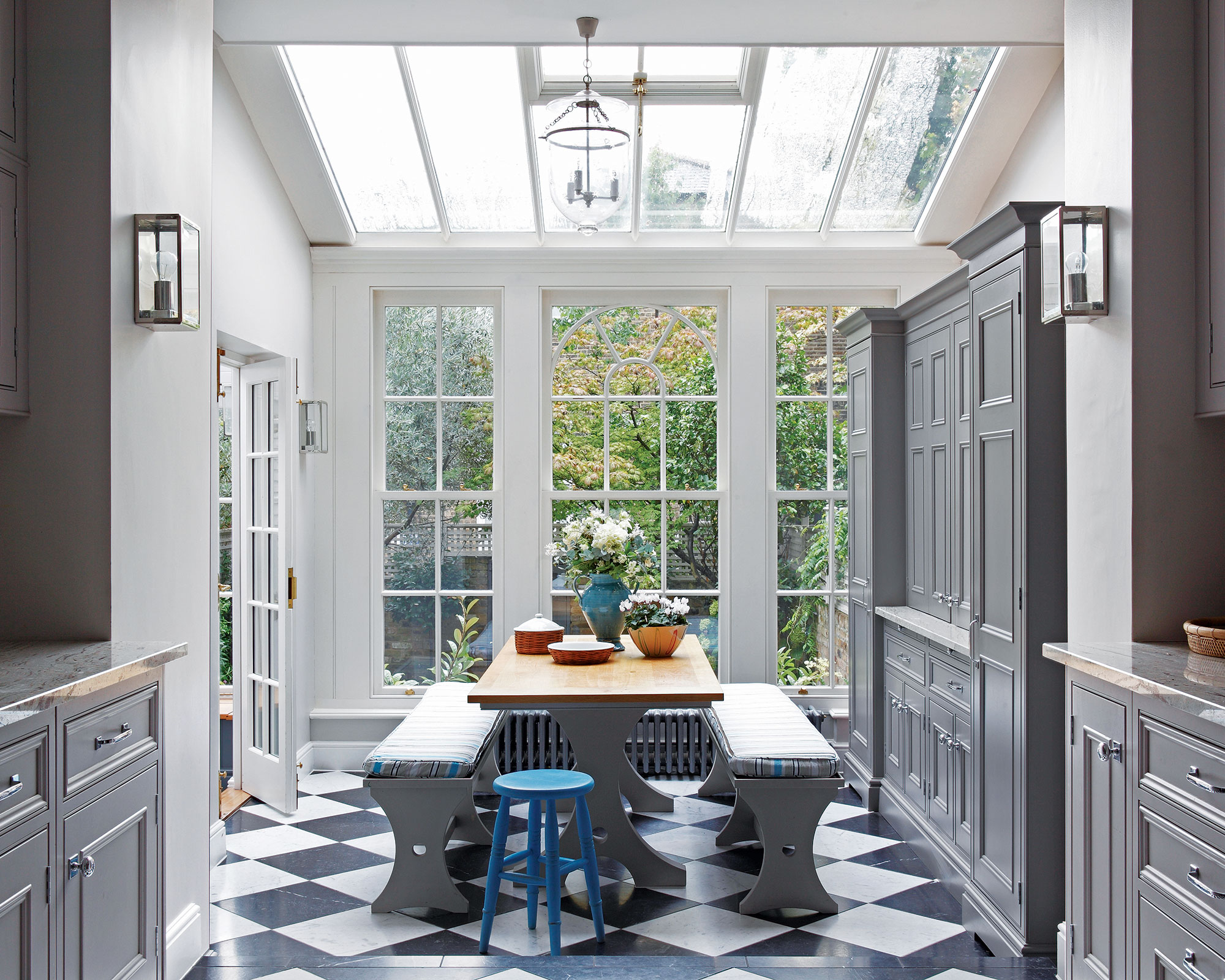
This is, of course, the most drastic of all the kitchen ideas for making a small space feel bigger. But any work you can do to visually raise the ceiling will have the most dramatic of effects, bar increasing its footprint with an addition.
Wall-to-wall, self-clean glazing with any framing given the narrowest of profiles will create a seamless, contemporary feel that will maximize the feeling of space. If you are on a tighter budget or do not want to replace an entire roof, a roof light fitted between existing rafters will create a brighter, bigger feeling space.
Raising a cavity ceiling to the rafters will make the kitchen ceiling seem higher, too. Just ensure you have enough insulation to stop heat, noise and kitchen smells travelling to the rooms above.
2. Plan the kitchen layout to the inch
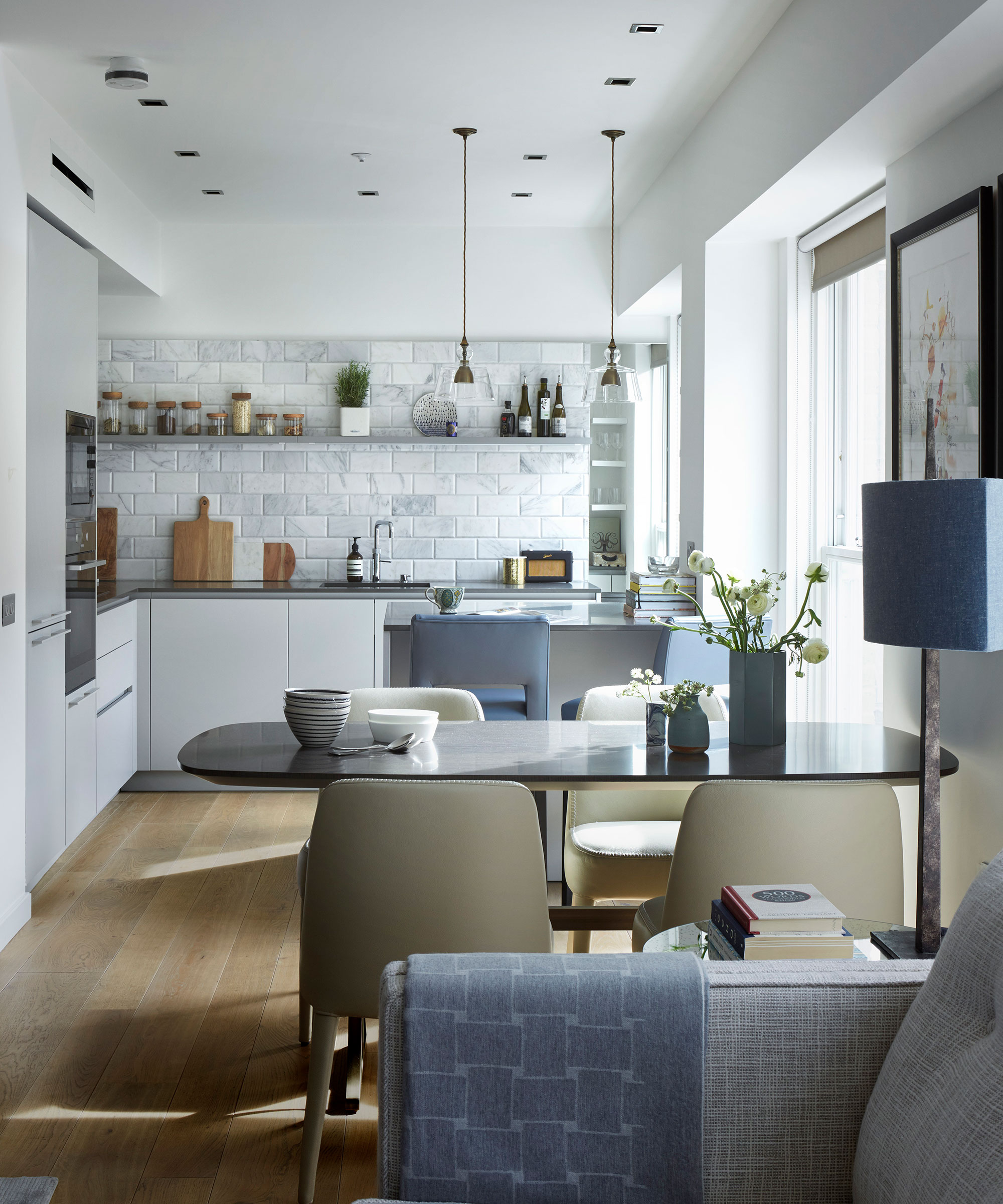
It's vital that small kitchen layouts are planned meticulously so that there is enough countertop space for prepping, enough thoroughfare space for moving around the room comfortably, and clever small kitchen storage ideas to keep the room neat and tidy.
Of course, using a professional to help you plan is vital, but go armed with what works well for you now and, importantly, what doesn't. Devote your energy to getting the layout just right before you move on to the really fun bit: aesthetics.
3. Choose white cabinetry to fake square footage
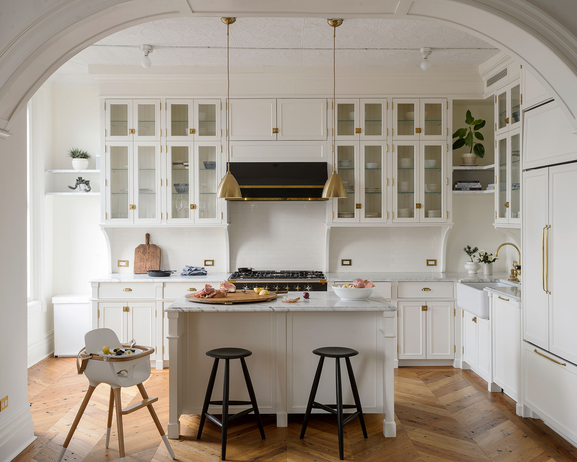
Simple but very effective, white kitchen ideas will always be the top choice to make a space appear bigger and brighter.
‘Despite bolder colors becoming more popular in the kitchen over the last few years, white has never gone out of style. It reflects the light, and adds endless possibilities for personalisation. So think about adding different textures and colors through the countertop material, backsplashes and other accessories to add warmth and interest to the scheme,’ says Melissa Klink, Creative Director at Harvey Jones.
The beauty of white is that it works whether your scheme is sleek and modern or classic and characterful. It looks clean too and works as a blank canvas for the rest of the space. This means you can use accent shades to pep up your kitchen color scheme if you wish, or keep it uber minimalist if bright shades aren’t your thing.
4. Stick to light-enhancing neutrals

Restful and sophisticated, nude shades in a kitchen will create a brighter feel, and you don’t have to use one color, you can opt for two or three. It also allows you to incorporate earthy tones with warm wood and stone.
Neutral kitchens are highly adaptable too. You can add in metallics to pep it up or pop in some accent colors, for the same reason. In this Gillian Segal-designed kitchen the paler shades are used on the wall units, whilst the warmer tones ground the scheme.
And if you're looking for lighting ideas for small kitchens too, pendant lights like the one shown above are a great option!
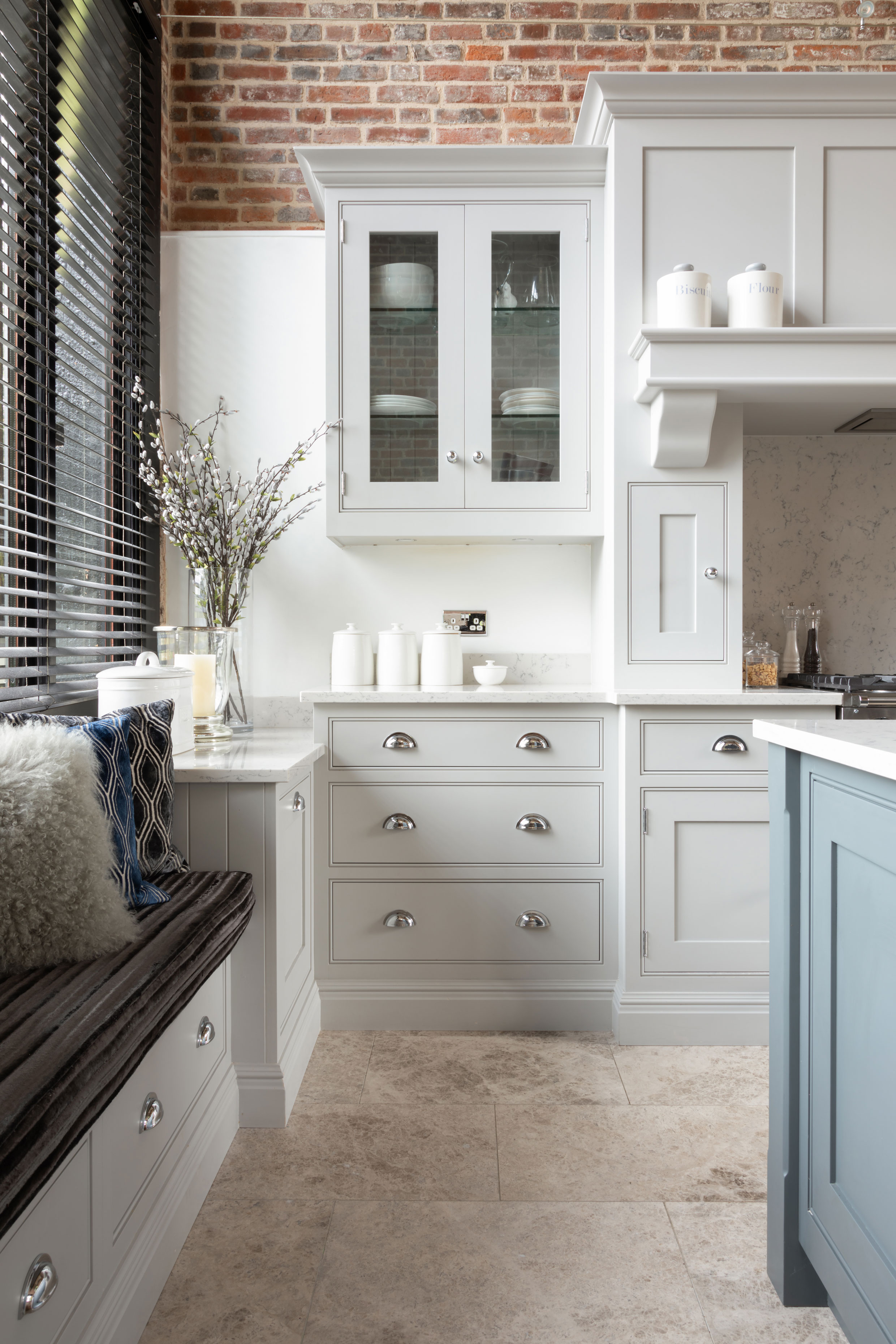
‘Lighter wood finishes and paint colors work well to expand the perceived space of your kitchen,’ says Tom Howley, Design Director at Tom Howley.
‘Pair light tones with very light-colored countertops, and your kitchen will look spacious and airy. If you do decide on floor to ceiling cabinets, these should only be fitted with glass door display cabinets. This will open up the space in a way that opaque cabinetry will not in a smaller kitchen.
'Soft shades of warm whites and earthy beige work well on their own but even better when used in a two-tone scheme. Two of our most loved shades are Tansy and Willow. Beautifully understated, they create truly stunning kitchens, enhancing architectural interest all without the need for bold color.
If you’re using lighter colors to enhance your space then try painting your walls in the same shade. This will focus your eye on the whole area, allowing it to feel larger and lighter.’
5. Keep dark colors to base cabinetry where possible
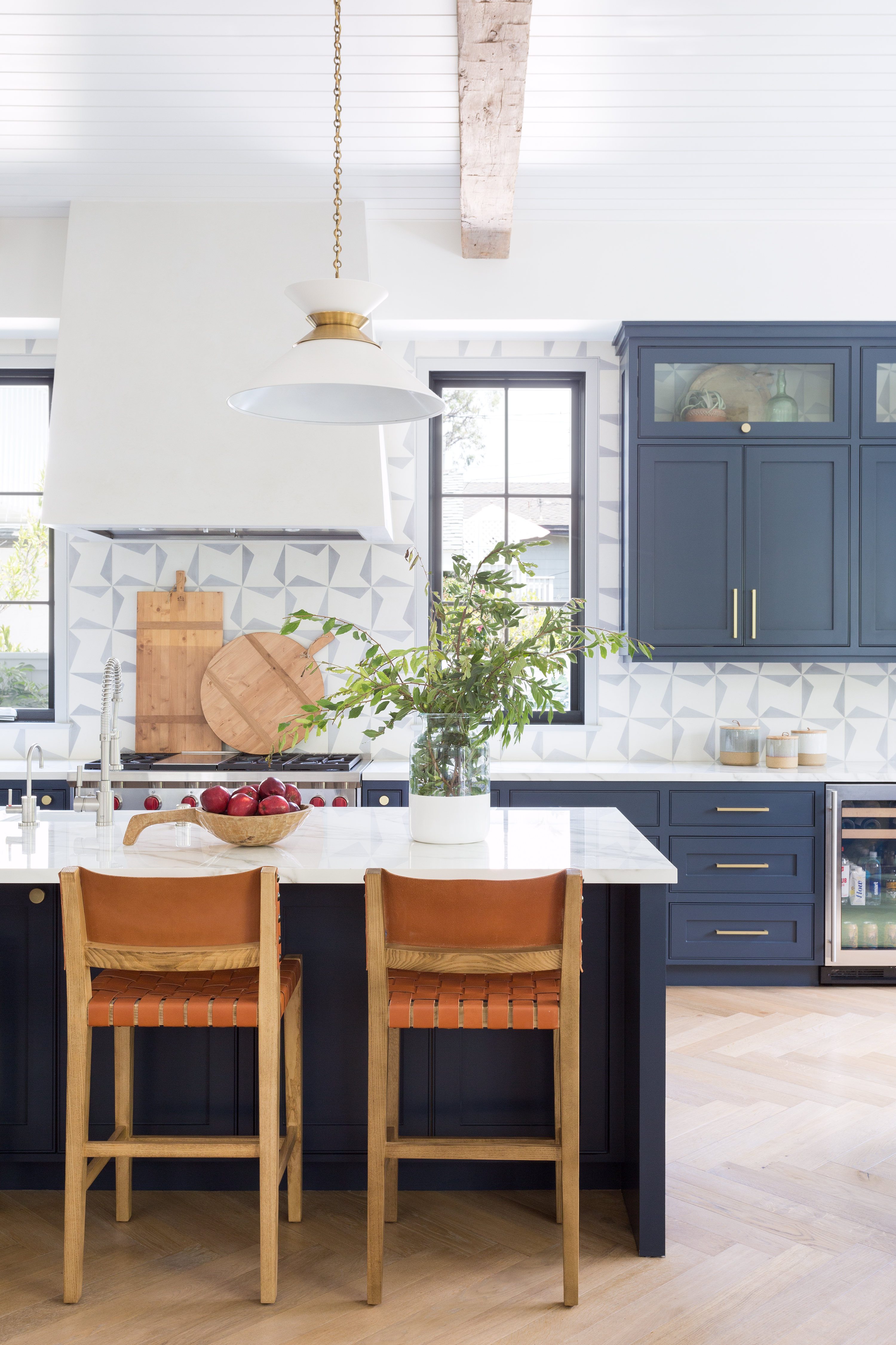
The single blue cabinet on the wall in this kitchen by Kate Lester Interiors is the exception to the rule. But the main thing to consider when you are choosing kitchen cabinet colors is that by keeping the bulk of the ‘darkest’ color in the lower third of the space, you keep the upper two thirds light and therefore airy.
The kitchen tile design is spot on. It unites the blue of the cabinetry and veining of the marble countertops with the white cooker hood, pendant and ceiling, without making the scheme feel dark. A good example of kitchen flooring ideas that make the space seem bigger than it is, herringbone kitchen flooring also creates a spacious feel, so that’s worth considering too.
6. Balance out dark cabinetry with pale countertops
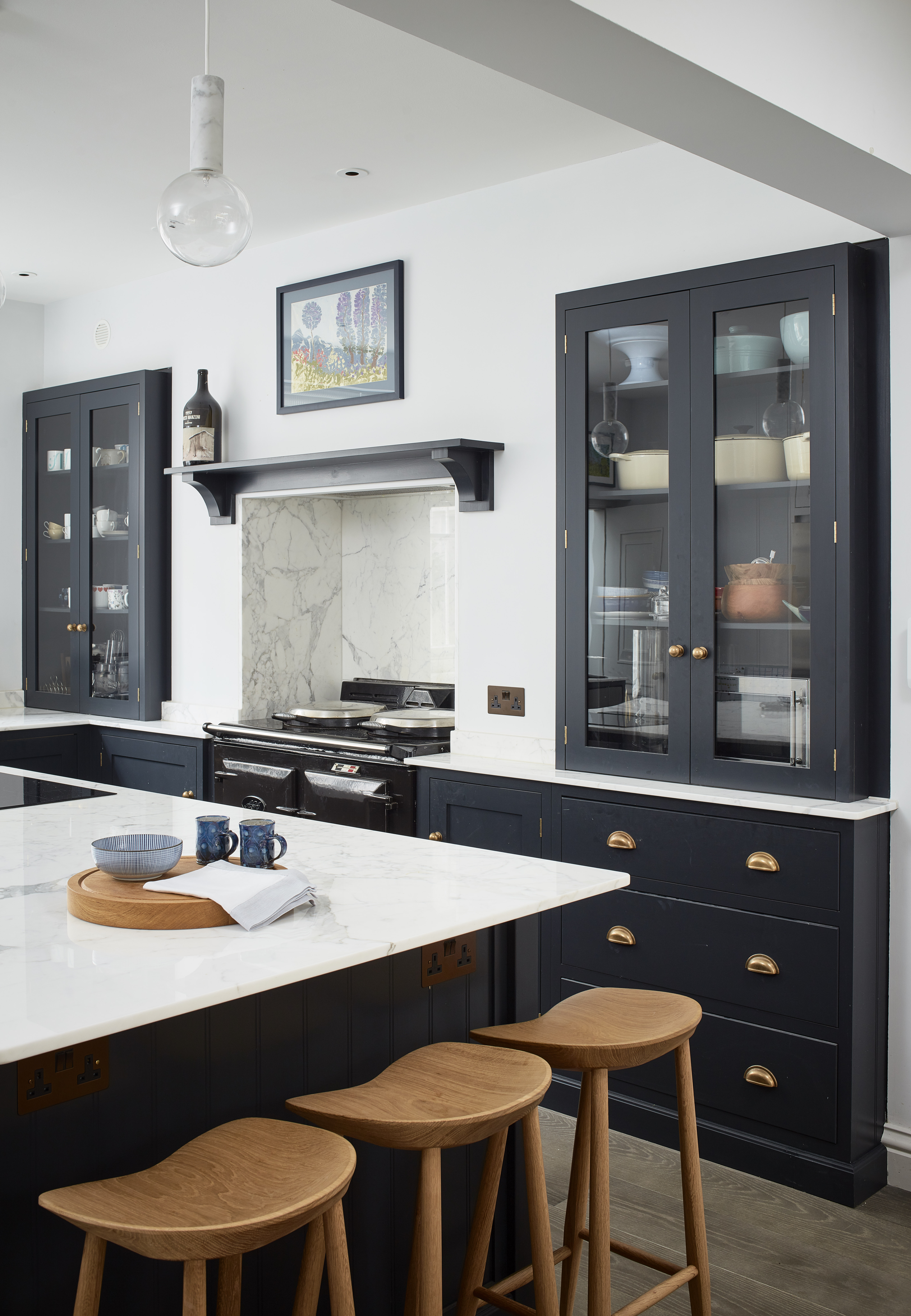
There’s a misconception that if you want a light and airy kitchen that feels spacious, you can’t embrace your love of dark and dramatic units. You can – all you need is balance, as you can see in this Yellow London-designed kitchen above.
The white marble countertops contrast beautifully with the jet black units and we love the decorative aspect of the marble veining within the range cooker alcove.
Of course, the white walls and ceiling help, and the scheme is kept from being sterile because you can see the colored tableware through the glass-door countertop units.
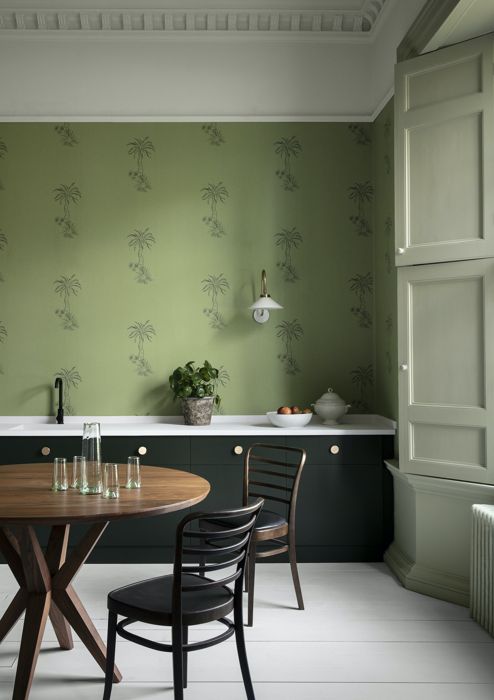
Green and white is always a good color scheme for any small kitchen because it's such a fresh combination.
Here we have three different greens – dark, mid and pale, all working together harmoniously. That’s one trick. But the main trick in this kitchen is the trio of white: white floorboards, white countertops and white ceiling. Note that this starts at the picture rail, which is a guaranteed way of making a room feel more spacious.
The wallpaper choice is also key, as Andy Greenall, Head of Design at Paint & Paper Library explains:
‘To create a spacious feel in a kitchen, opt for a design that contains space around the motifs in the pattern, such as Lighthouse Palm – Chelsea Green shown here, which works beautifully with Stable Green cabinets.’
7. Create visual continuity with to-the-ceiling cabinetry
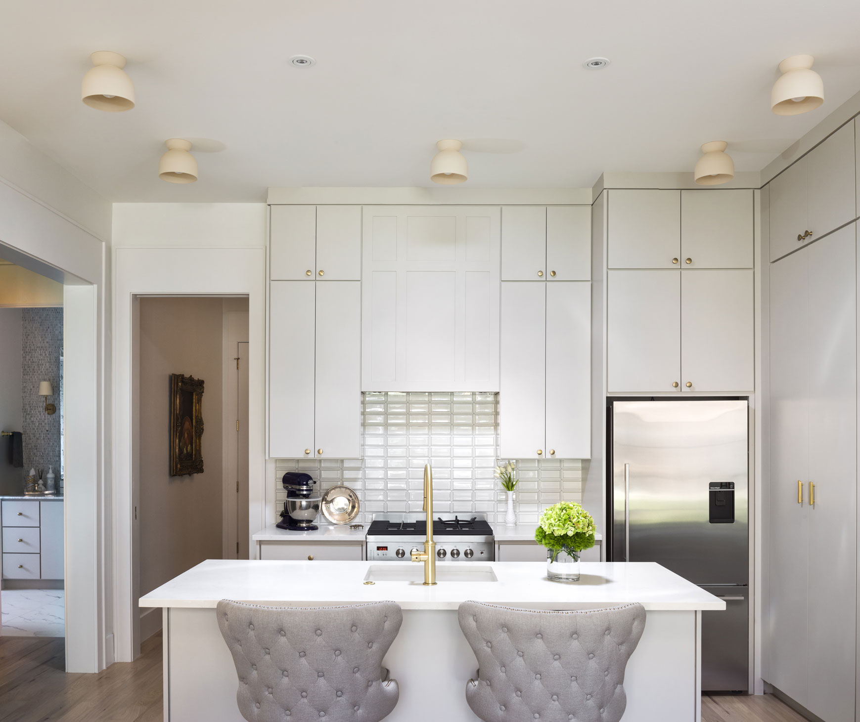
When you can’t go wide, go up and make the most of every available inch you can. It’s often worth employing a joiner to do something as specialized as this, as they will be able to create storage that fits to perfection.
Make symmetry your friend too, as it will keep the eye busy and away from the fact that the kitchen is on the smaller side. Opt for gold elements that carry on through the scheme, from the taps to handles and accessories.
8. Widen the room with wall shelves not cabinetry
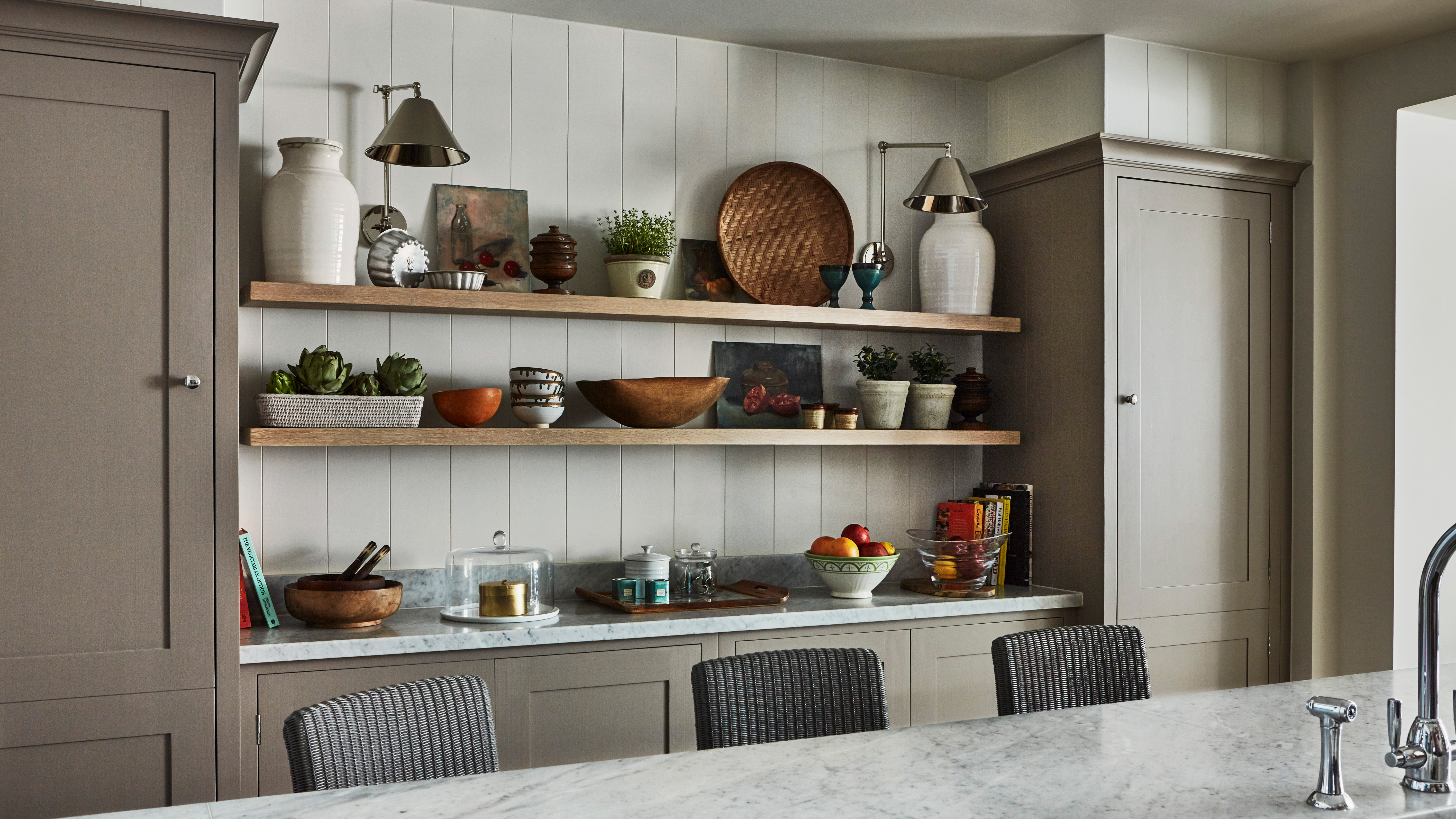
Replacing the solid bulk of kitchen wall cabinets, which fill up valuable visual space and can block light, is a dramatic way to fake square footage in a kitchen. And the best thing to replace them with are beautifully populated kitchen shelving ideas.
The downsides to open shelving are that, of course, you have less storage and that you need to keep them spick and span. That said, you can see what’s what at a quick glance and use the shapes and textures of your pieces to enhance the overall look of your kitchen.
9. Consider freestanding furniture over fitted
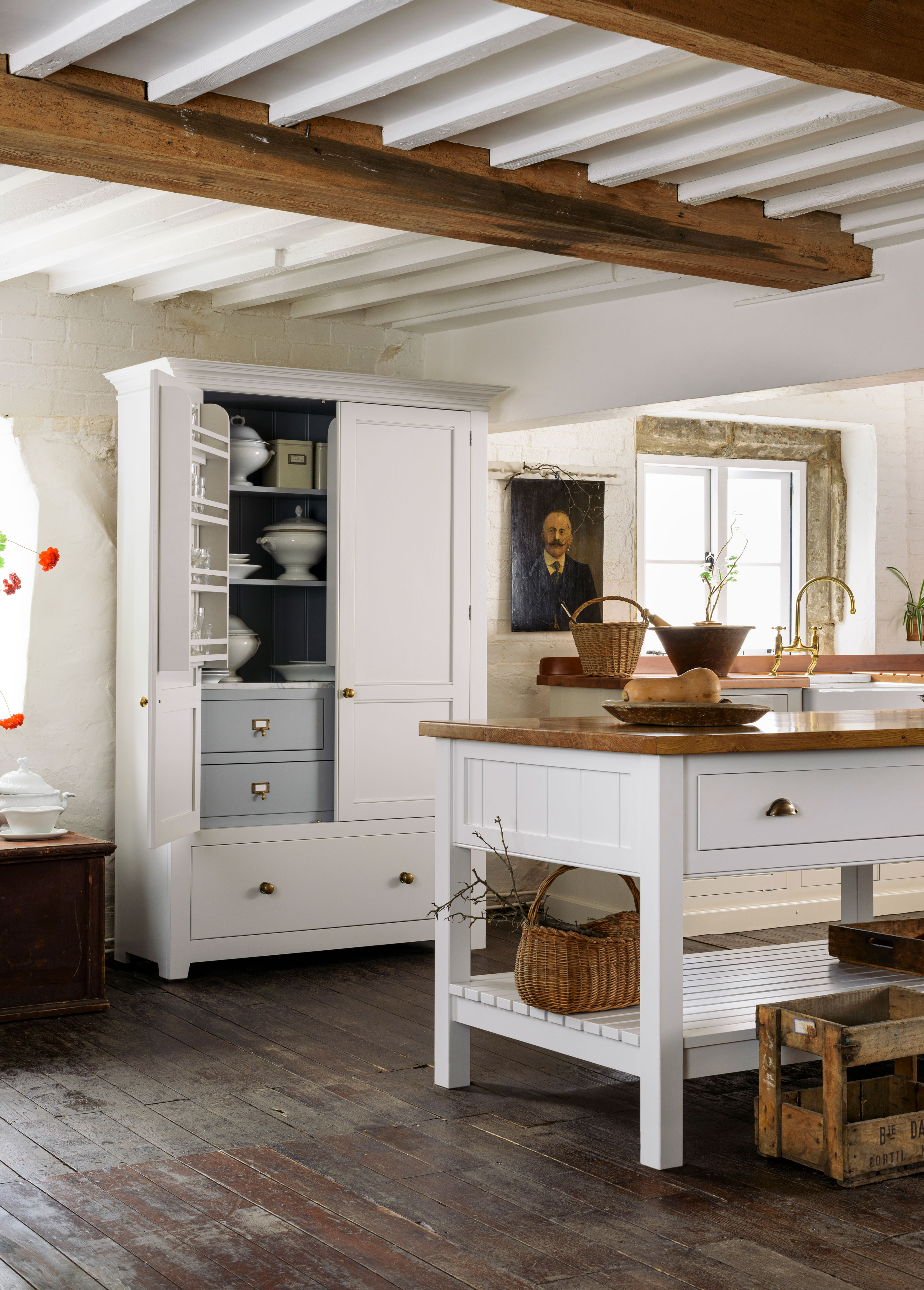
Even if your flooring is dark like these floorboards in this beautiful deVOL cottage kitchen, you can lighten up the scheme with the cabinetry you choose.
Freestanding pieces that have legs will allow you to see underneath, which creates an illusion of space. Plus, pick a white-painted finish that will help to reflect and bounce light around. Another advantage of freestanding is that you can move the furniture around and therefore maximize the kitchen space you have.
10. Stretch floor space with light-colored, large format floor tiles

Size does matter and we’ve long been fans of lovely big floor tiles in a single color. They are spot on to use in kitchens, as Isabel Fernandez, Director at Quorn Stone explains below:
‘A smaller kitchen requires careful thought and consideration to give the illusion of a larger space. Contrary to belief we often find a larger tile can work well at achieving this. A smaller tile results in lots of grout joints which can enclose the space and detract the eye from the tile. We often suggest a 900mm x 600mm tile as it is a versatile size that works well in both smaller and larger areas.
Alternatively, wood effect porcelain is becoming increasingly popular in tighter spaces due to their long and narrow format. If you choose a complementary grout color it makes the grout less noticeable, which again helps to open the space out.’
11. Conjure up space-enhancing reflections with mirrored backsplashes
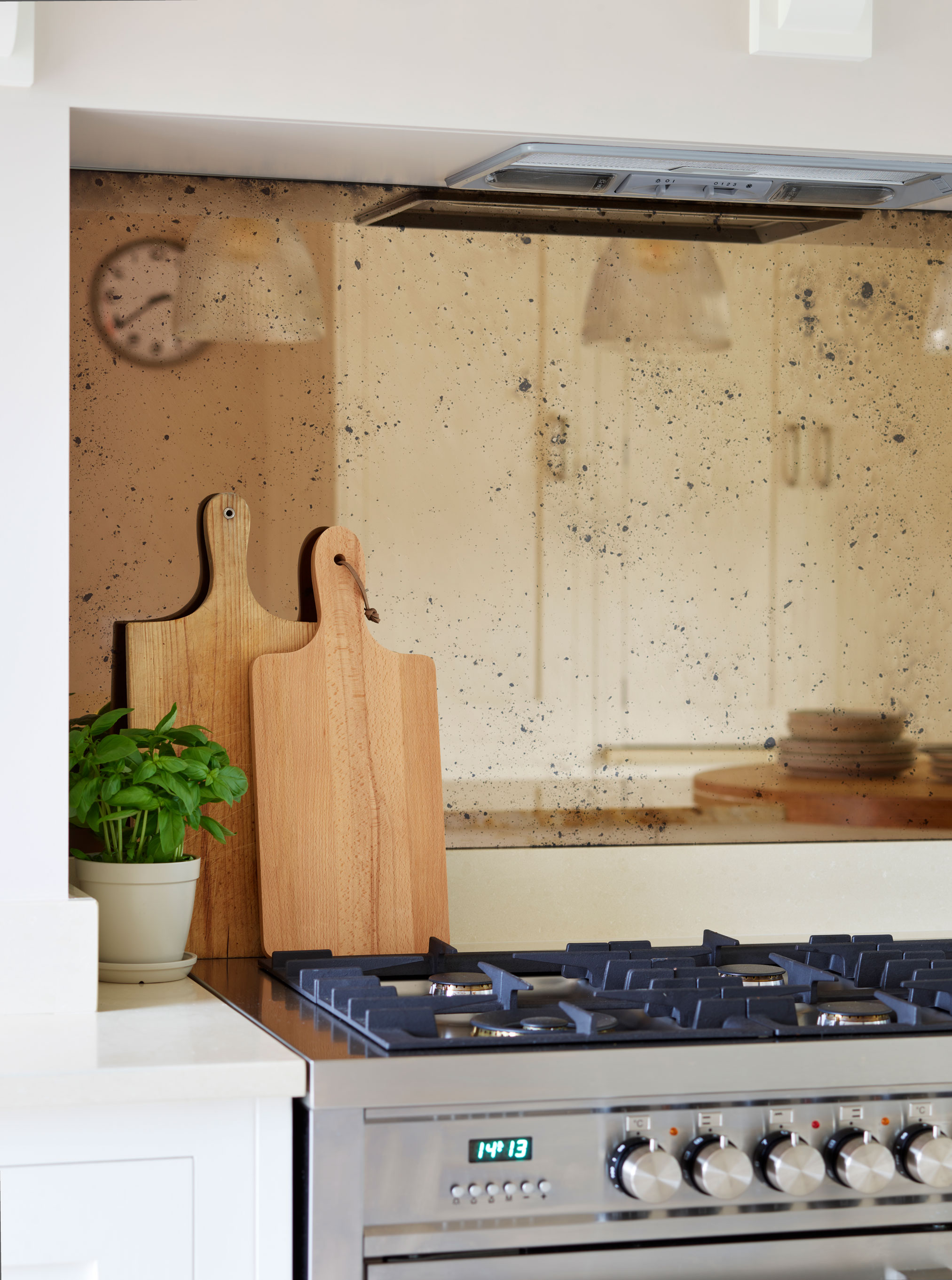
Of course, light-reflecting kitchen backsplash ideas will make a small kitchen look bigger, but take this a step further by swapping out pale-colored materials for a mirrored backsplash. This is a classic interior design trick for making a space seem larger and brighter, as Melissa Kink, Creative Director at Harvey Jones explains:
‘Mirrored backsplashes are a great choice as they allow light to travel further within the room. Any use of mirrored surfaces will add energy to an area, helping the kitchen feel more open.’
Using one continuous piece rather than a tiled design will help the mirror to be more effective at its job to double your space visually. We like this antique-look finish, as it’s got more character than plain glass and it also adds interest and diffuses the light nicely. Plus it doesn't take as much cleaning as regular mirrored glass.
12. Distract with pattern
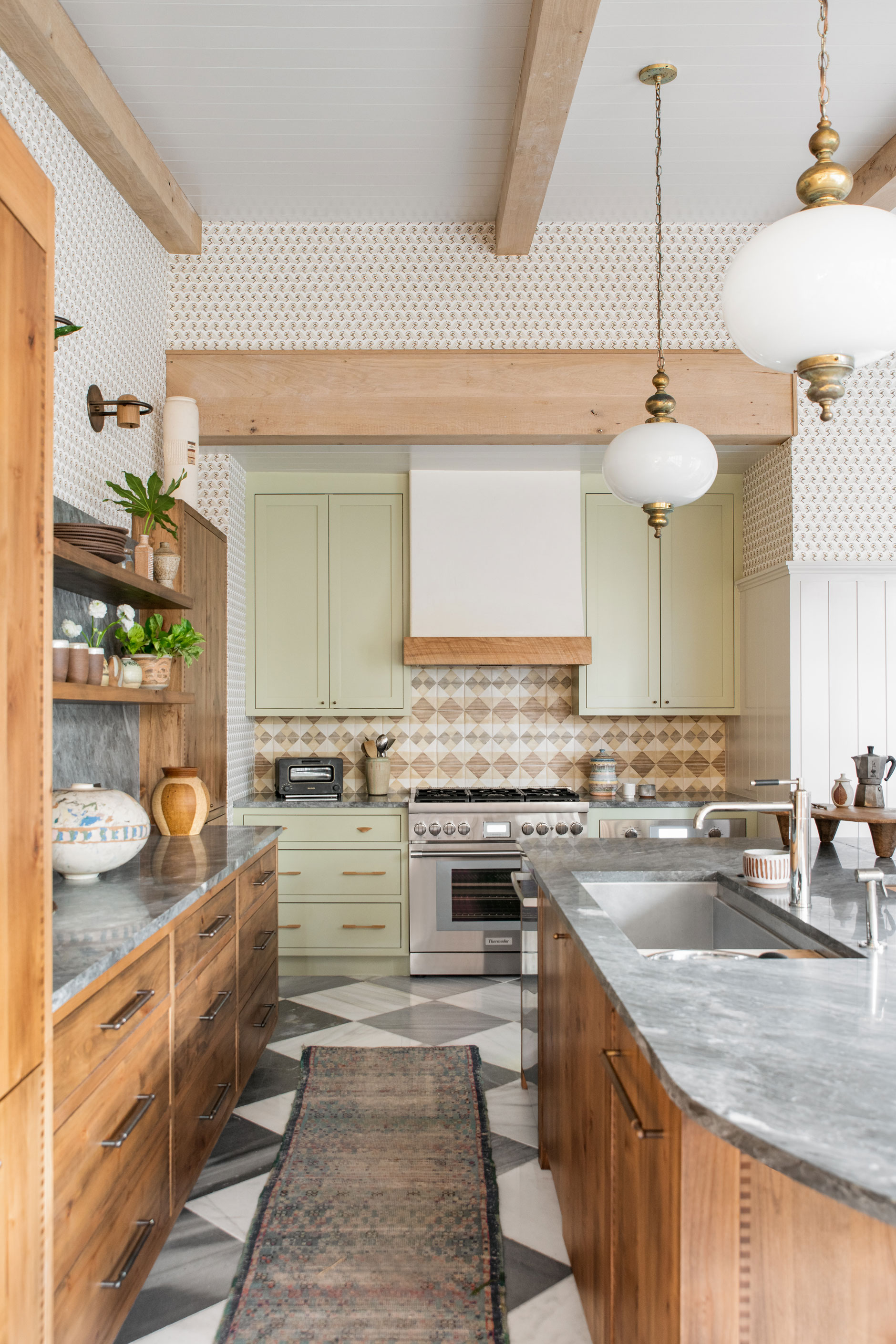
Designed by renowned Charleston based interior designer Cortney Bishop, this charming kitchen shows how you can mix various patterns whilst still achieving a light kitchen space. Cortney’s love of teaming patterns and hues shows through, and the reason it works is because of the clever change in scale.
The chequered floor tiles are large and tie in with the gray of the countertops. Next we have the hexagonal backsplash tiles that are smaller. They work well with the natural wood from a color scheme point of view.
Finally, the ditsy wallpaper print takes our eye up to the white painted ceiling and that’s how you use three different patterns to create a lighter and brighter kitchen.
13. Ditch the drapes
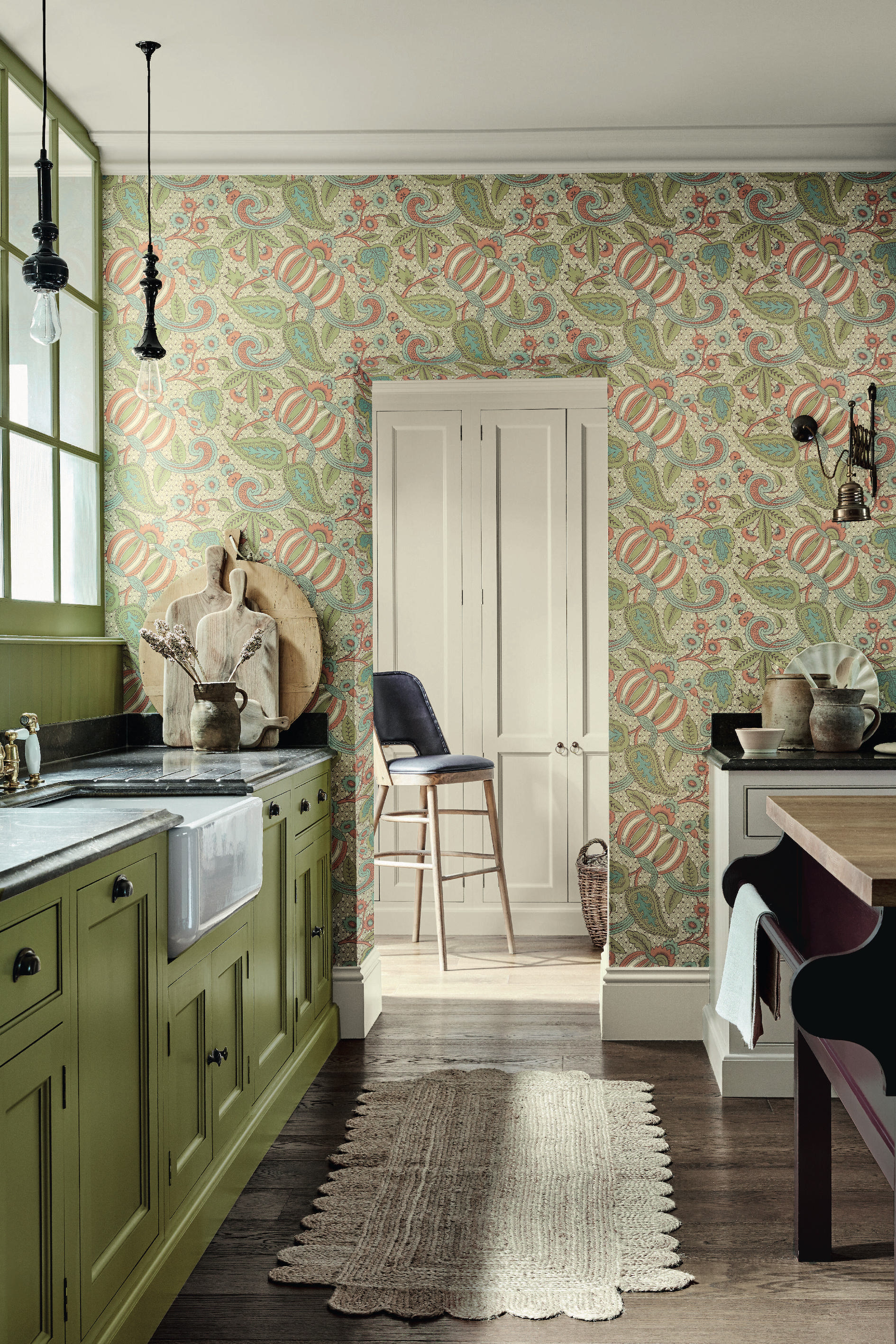
If you’re not overlooked by neighbors you can take down your blinds and/or drapes for instant light. It’s a simple tip, but one that’s very effective.
We love this idea of painting your units the same color as your window too (shown here is Little Greene’s Citrine (71)); it will create a cohesive look that will become a design feature in its own right and will remove the need to have a decorative blind.
14. Make the most of architectural details
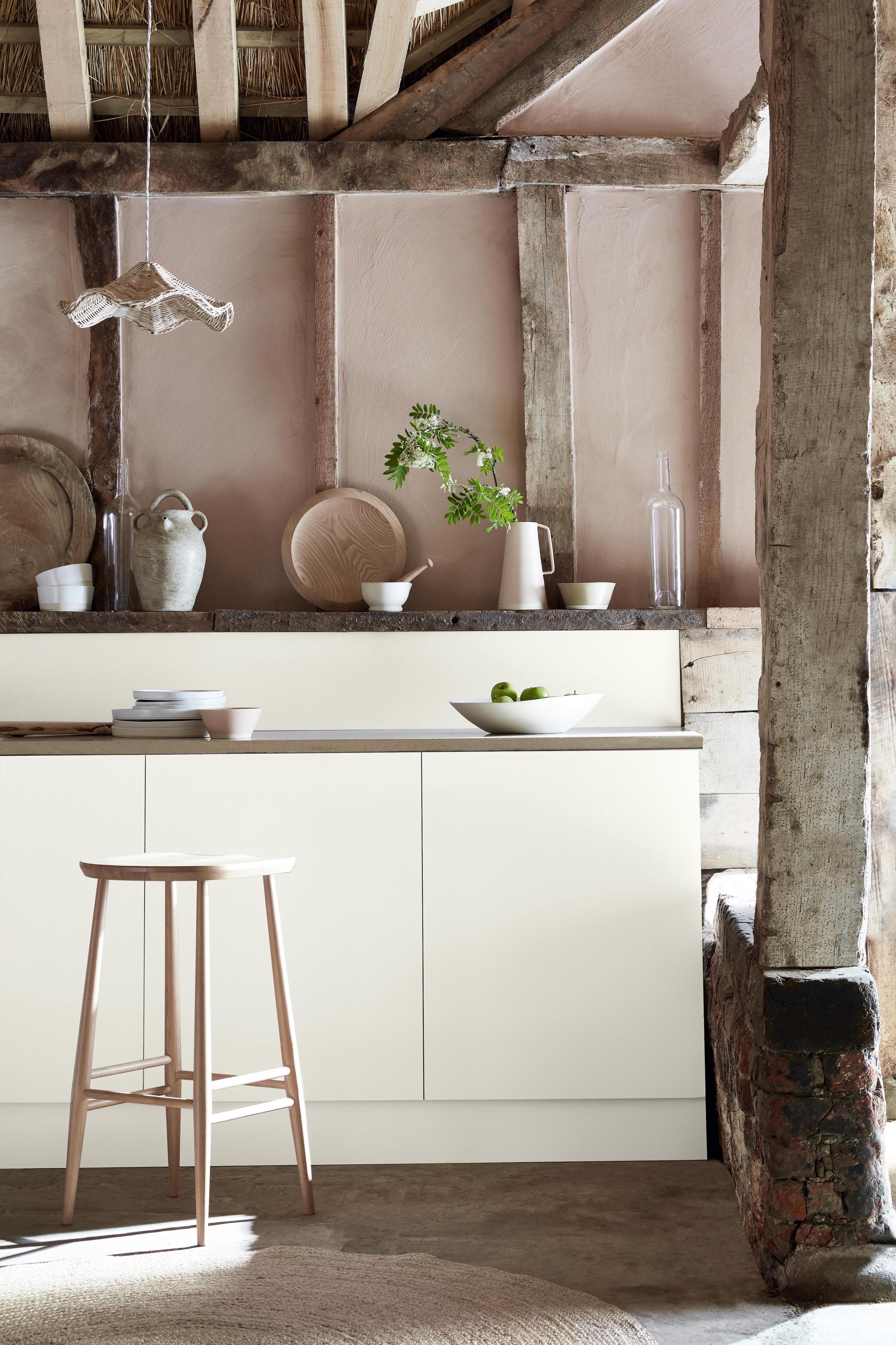
‘When choosing colors for a kitchen, it’s important to consider the colors that already exist within the space. Be that furniture, flooring or furnishings, these elements should be included as colors within your palette,’ advises Ruth Mottershead, Creative Director at Little Greene.
‘Where a kitchen features an abundance of original architectural detailing or natural textures, from flagstone flooring to beams and exposed brick, opting for a soft, warm, mineral-based white such as flint will not only ensure all these elements are pulled together in a naturally neutral scheme, but that the result is bright too.’
15. Be as minimalist as possible
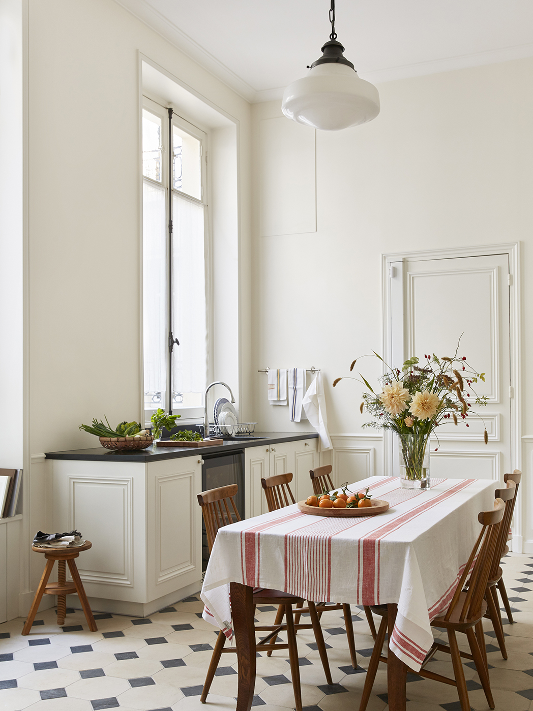
We all know that clutter makes a space seem smaller, and if you can pare down your kitchen essentials to the point where you can live without wall units then all the better.
There are several other design options that you can implement too. Betsy Kasha, Co-Founder of Paris-based interior design studio Kasha Paris explains her process:
‘In the kitchen, we tend to use Roman shades made from sheer, translucent fabric to maximize the natural light. Not only does it make cooking more pleasant, but it even makes your food look better. We sometimes use the iconic “checkerboard” pattern on the floor or dark stone countertops to bring out the bright walls. In a diner-kitchen, we select simple, elegant furniture for a lighter feel.’
Sign up to the Homes & Gardens newsletter
Design expertise in your inbox – from inspiring decorating ideas and beautiful celebrity homes to practical gardening advice and shopping round-ups.

Sophie has been an interior stylist and journalist for over 20 years and has worked for many of the main interior magazines during that time, both in-house and as a freelancer. On the side, as well as being the News Editor for indie magazine, 91, she trained to be a florist in 2019 and launched Flowers Inside My Head where she curates beautiful flowers for modern weddings and events. For Homes & Gardens, she writes features about interior design – and is known for having an eye for a beautiful room.
-
 Miley Cyrus breaks a cardinal decorating rule with her 'floating table' – her unexpected layout transforms a dead space into a stylish breakfast area
The singer tosses aside the maxim that furniture shouldn't be floating in the middle of the room with an innovative kitchen layout
By Sophie Edwards Published
-
 It’s a concept straight out of a fashionista's playbook, but I used the Sandwich Method to organize my kitchen shelves – it’s never looked sleeker
It transformed messy to mesmerizing in a matter of seconds
By Punteha van Terheyden Published