Home office design tips – 11 rules interiors experts follow for beautiful spaces
We asked the experts in home office design for their top advice on creating a space that works, practically and aesthetically

Design expertise in your inbox – from inspiring decorating ideas and beautiful celebrity homes to practical gardening advice and shopping round-ups.
You are now subscribed
Your newsletter sign-up was successful
Want to add more newsletters?
When our jobs suddenly transferred home, many of us were left with no time to come up with clever home office ideas before pitching into the day to day. And even those who already spent one or two days a week in a home office may not have designed their rooms or work areas for five days a week use.
But with working from home a fixture in many of our lives for a while to come, now’s the moment to revisit how your work space fits into your home, and make it a beautiful, organized and inspiring place to spend time.
Read on for home office design tips from interiors experts on making your home office as attractive as the rest of your home – and perfectly functional, too.
Article continues belowHome office design tips – from interior design experts
If the past year at home has given you pause for thought about your home office setup, these expert home office design tips should help crystallize any thoughts you may have already, and give you some great advice to correct any existing niggles, too.
1. Focus on the desk first
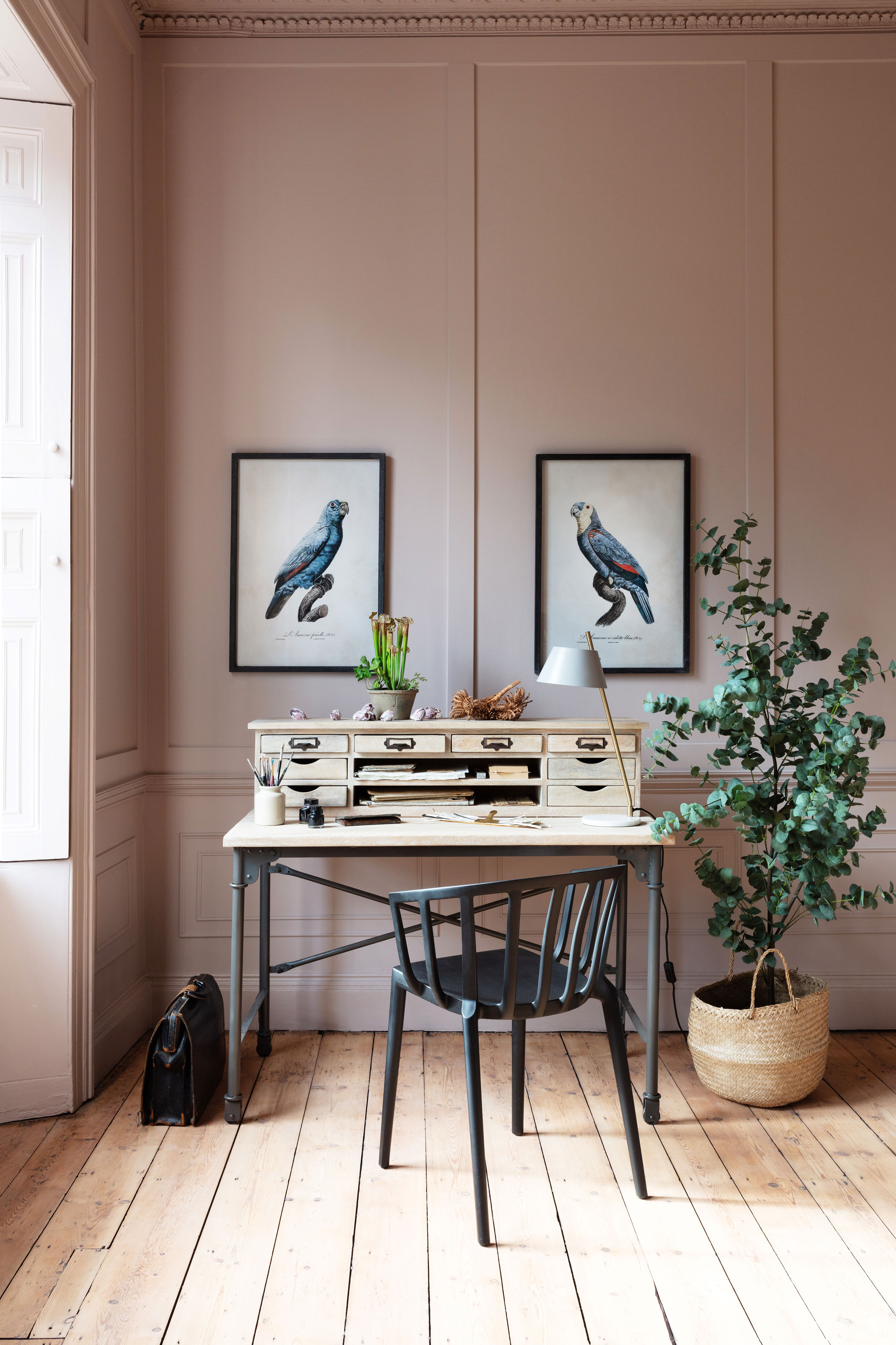
This piece of furniture will – probably – dominate your room and it is where you will be posted all day long, so it has to be right.
Designer Kelly Wearstler makes the desk the star of her home office design – showing that even when space is limited choosing a desk that’s a beautiful piece of furniture in its own right can make yours an inspiring space to spend your days.
In her own work space, Kelly keeps her collection of art and design books close by, displaying them on a nearby wall for ‘visual texture and stimulation’, she says.
Design expertise in your inbox – from inspiring decorating ideas and beautiful celebrity homes to practical gardening advice and shopping round-ups.
If your work area is part of another room, being able to clear everything away at the end of the day can be vital for wellbeing, which is where hidden desk ideas come in.
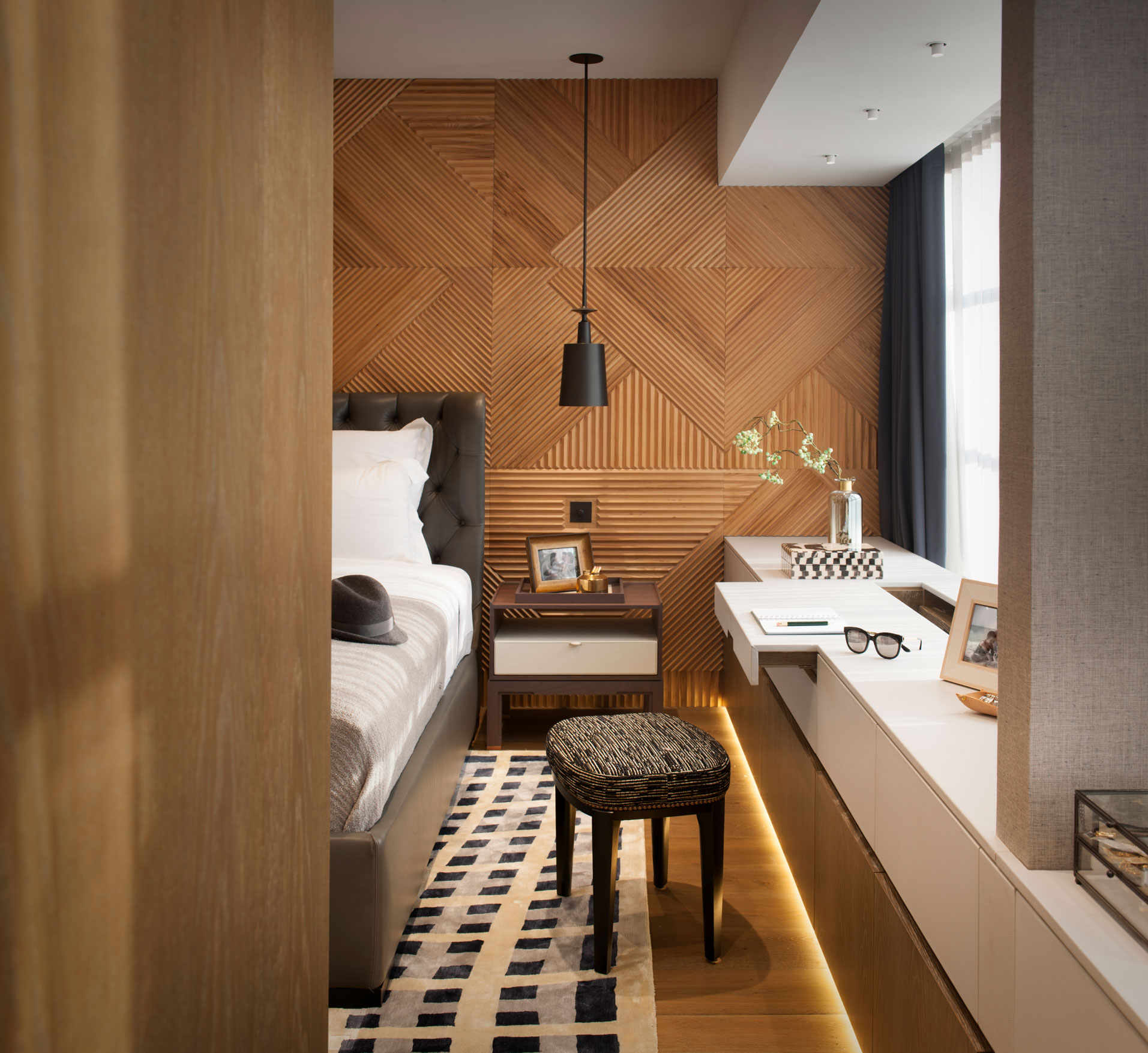
You can have them built in (as above in the room designed by TG Studio), opt for an antique armoire or go for a purpose-designed piece. Modern contemporary furniture specialists Heal’s aren't the only clever company to have come up with a desk that conceals work essentials until it’s time to start again.
‘Our Reveal desk features a flip-top lid with a built-in brass pin board and expansive work top, so you can keep all your important notes in one place,’ explains head of buying Sabina Miller. ‘At the end of the day, the soft-close top can hide away your set up and any reminders of work, transforming it into an elegant console table.’
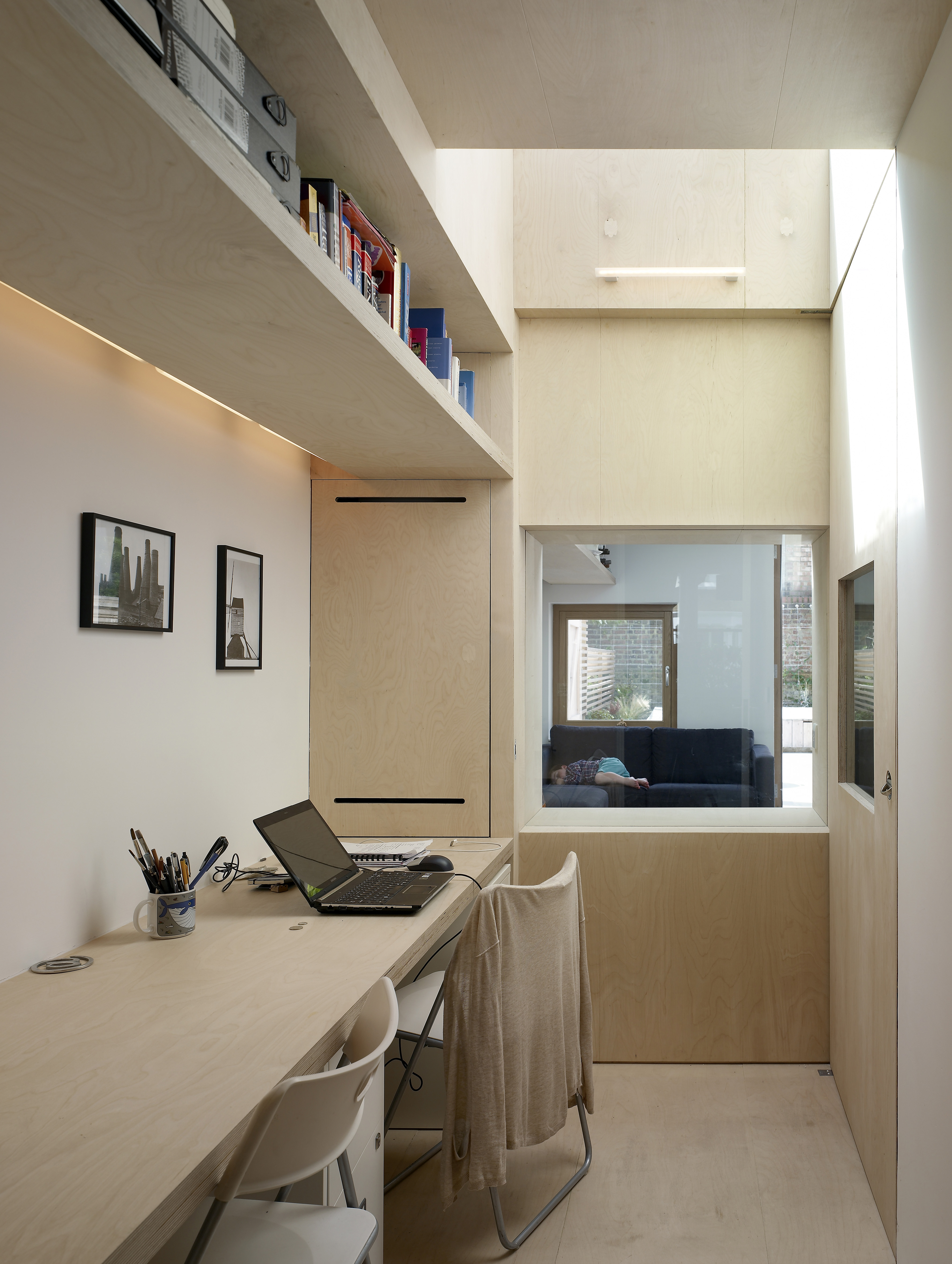
Project by Hayhurst & Co Architects
‘We know so many people are trying to carve out a niche or carve out a space that they can leave their work things set up overnight – so that they're not packing their things away, and so the room doesn't look terrible,' Nate Berkus and Jeremiah Brent told Homes & Gardens. 'A console could easily go against a wall with a dining chair at it, or a desk chair. Add a pair of lamps or a single lamp and you’re set up for your computer workstation.’
The couple retrofitted a cabinet in their home to accommodate a workspace, and finds value in under-utilized or overlooked nooks and crannies of a home.
'I’m all about the versatility of pieces that allow you to work, and then close work off,' says Nate. 'If there's a way that you can travel to your work station – even putting that work station in a different part of the house or in a corner of an area that you don't particularly use – it goes a long way,’ he explains. ‘The ceremony of checking in and then also checking out goes a really long way in creating a balance, he said. 'I like the idea that once you're done with working, the piece and area takes on an entirely different energy.’
Another solution if the office needs to be part of a living space or bedroom? Call on a joiner to build it in, and opt for a hinged desk surface that folds up to hide its purpose after hours, as UK-based interior designer Emma Sims-Hilditch loves to do here.
And while you're choosing the desk? Get a chair that's a perfect fit for you and your desk – and adjustable if more than one of you will be using it.
2. Pick lighting for looks
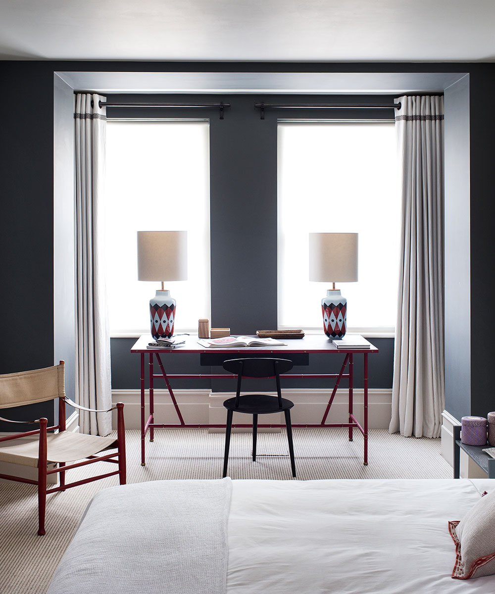
For a home office that feels like a luxurious space rather than a commercial one, skip the standard office lighting, advises designer Shalini Misra who designs luxury interiors worldwide.
The lighting possibilities? ‘Pendants and chandeliers combined with table lights, wall lights, niche and bookshelf lighting and some spots,’ she says.
However, that doesn't mean there isn't space for practicality. ‘I might use a cordless battery operated lamp like Neptune's Hanover which can be easily moved to close the desk,’ says Emma Sims-Hilditch.
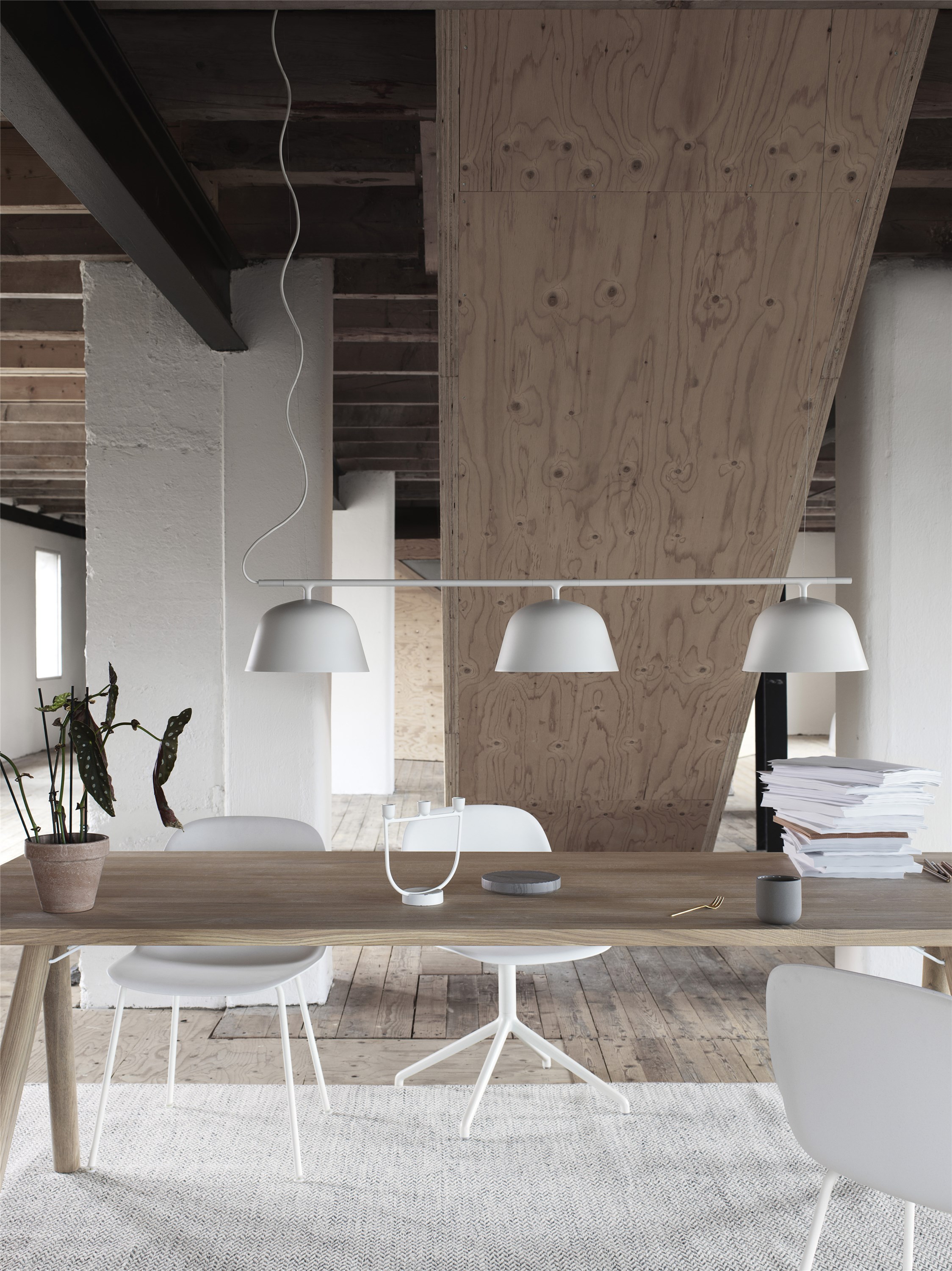
3. Mix the old with the new
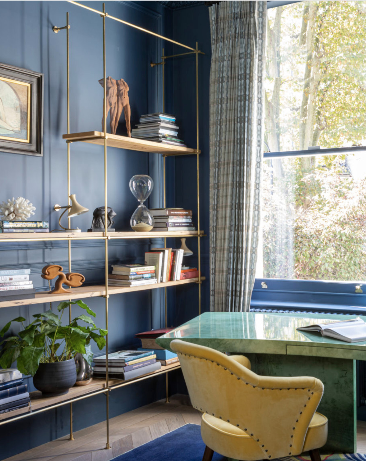
Boutique design practice Kitesgrove demonstrates that marrying vintage pieces with modern ones can create a beautifully rustic and 'lived-in' look. The best way to do this is to let the main antiques take center stage (whether that’s a desk or a chair) and give old-school pieces a new lease of life, if necessary – this can be done by reupholstering or revarnishing.
4. Create a view
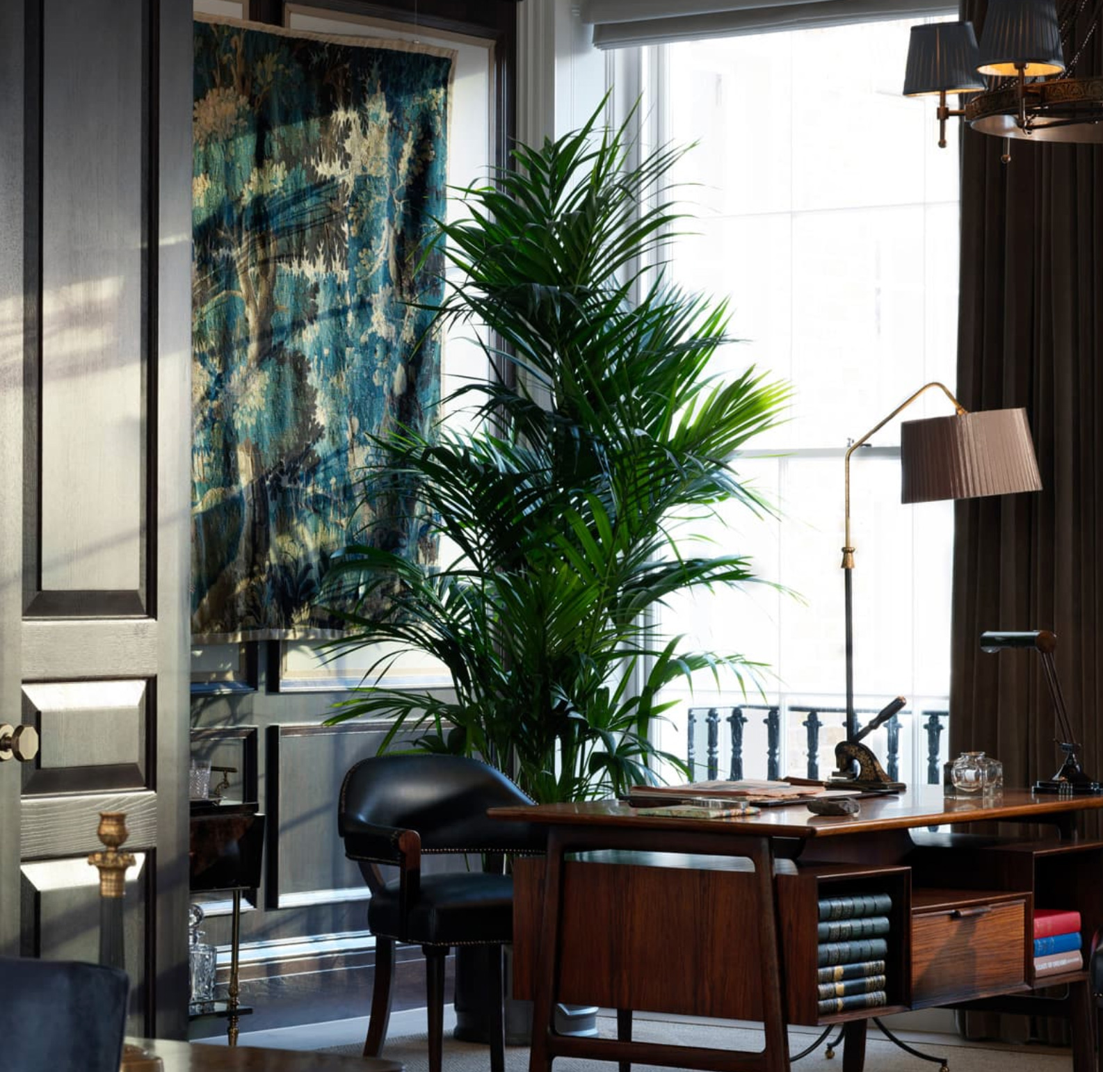
If you don’t have the luxury of a great view – or even a window – in your home office, be inspired by Justina Blakeney of Jungalow and make one. If you can fit a selection of houseplants on the far side of the desk, so much the better, but if there’s not space for the real thing, hang or prop a large foliage print in your eye line as the designer has done for her own studio desk.
Can’t find the right image? Follow Justina’s lead and take your own photos of foliage and have them printed at super scale and framed for a window-style outlook from the desk.
The room above demonstrates the plant-first approach perfectly. It was designed by Albion Nord as part of a project in London.
5. Dress office shelves
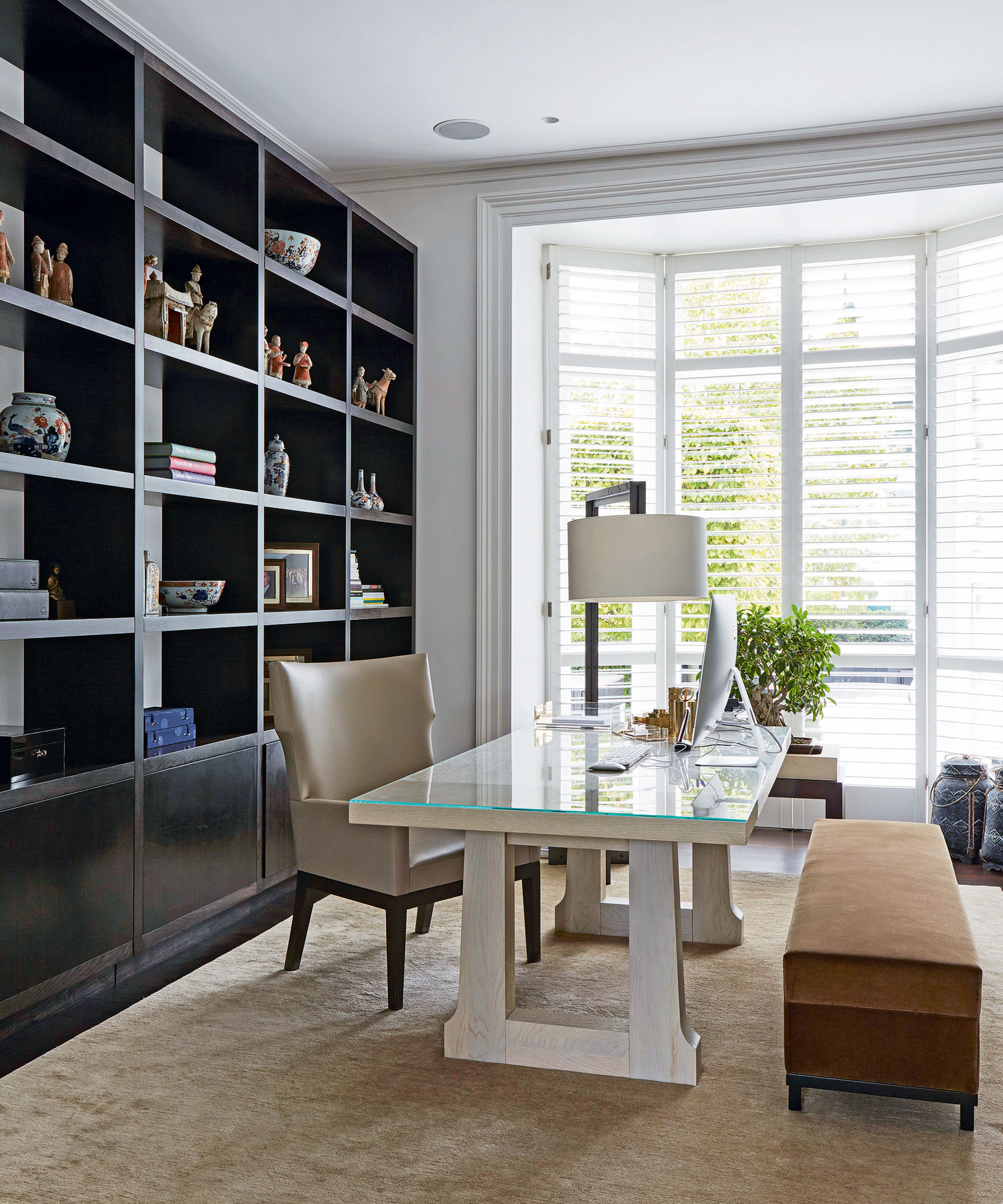
While it might seem like most office shelves are just thrown together with work related knick-knacks, the reality is that the majority of them are carefully curated for maximum effect.
Interior designer Kit Kemp says that it’s important to dress office shelves with a color scheme. She adds that creating a colorful selection of books (which match the surroundings) will help to tie the space together.
6. Add points of interest
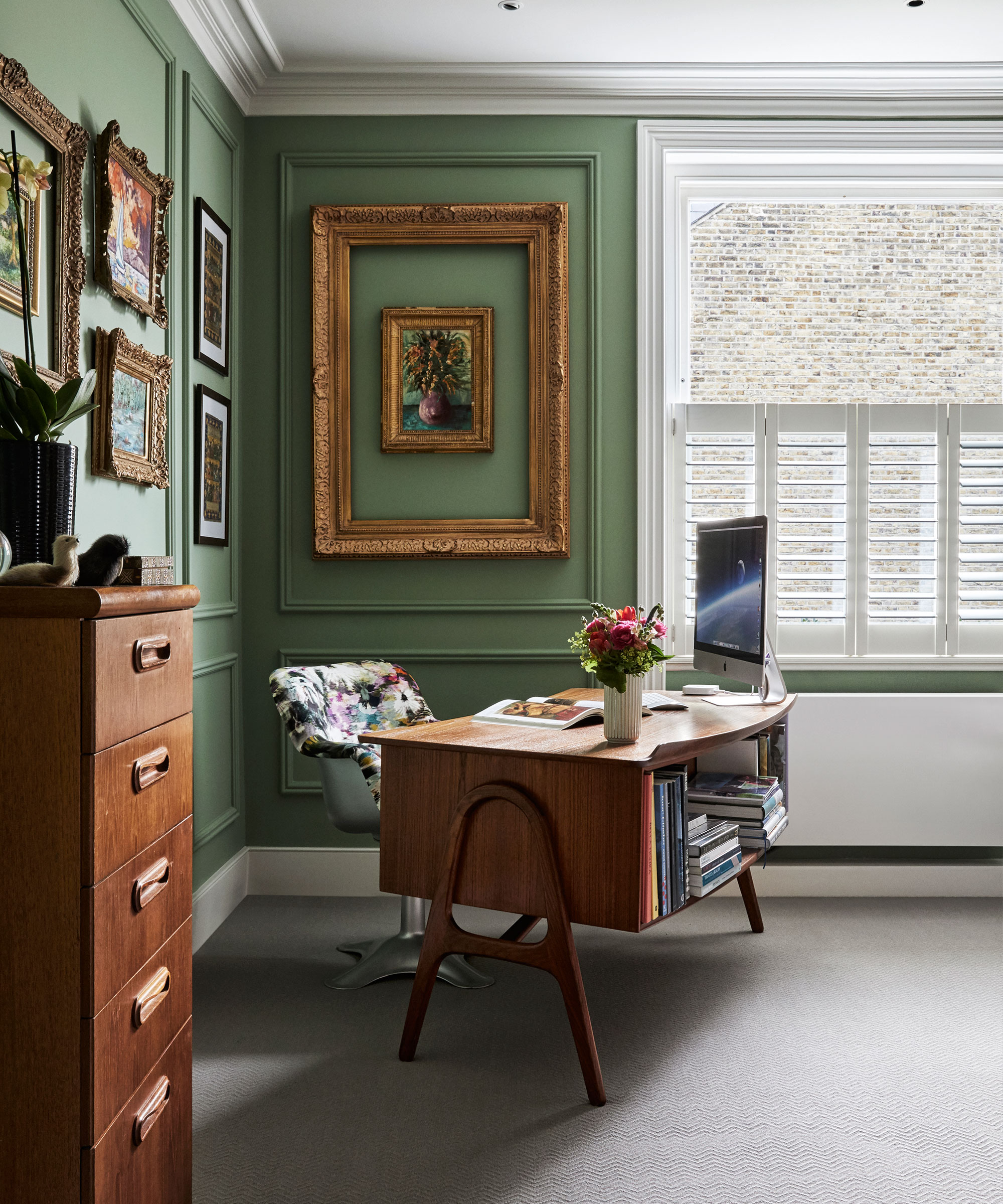
An office may be a place for work, but that doesn’t mean that it has to be dull. London-based interior designer Sophie Ashby of Studio Ashby suggests adding points of interest, such as artwork and ceramics, to give your home office a personal touch. This will also help to make the area more inviting to work in. Who doesn't want that, after all?
Hopefully you won’t be staring at the wall of your home office too much but if you do from time to time, why not make it interesting? Turner Pocock likes to use a print wall above a desk in an office space, particularly against a jazzy wallpaper.
Use the same frames for a more polished effect or different styles and colors for something totally unique.
Jeremiah Brent is also a fan of artwork in a home office, suggesting utilizing framed art and simple accessories to conceal unsightly electronics while adding interest to the room. 'Leaning a piece of art in front of the computer when I’m not using it goes a long way in creating a separation from work, and also putting a candlestick in front of [the art] or on the same corner. I think if you put everything away, along with finding interesting ways to conceal them, it helps with checking out,' he says.
7. Don't be afraid to go dark
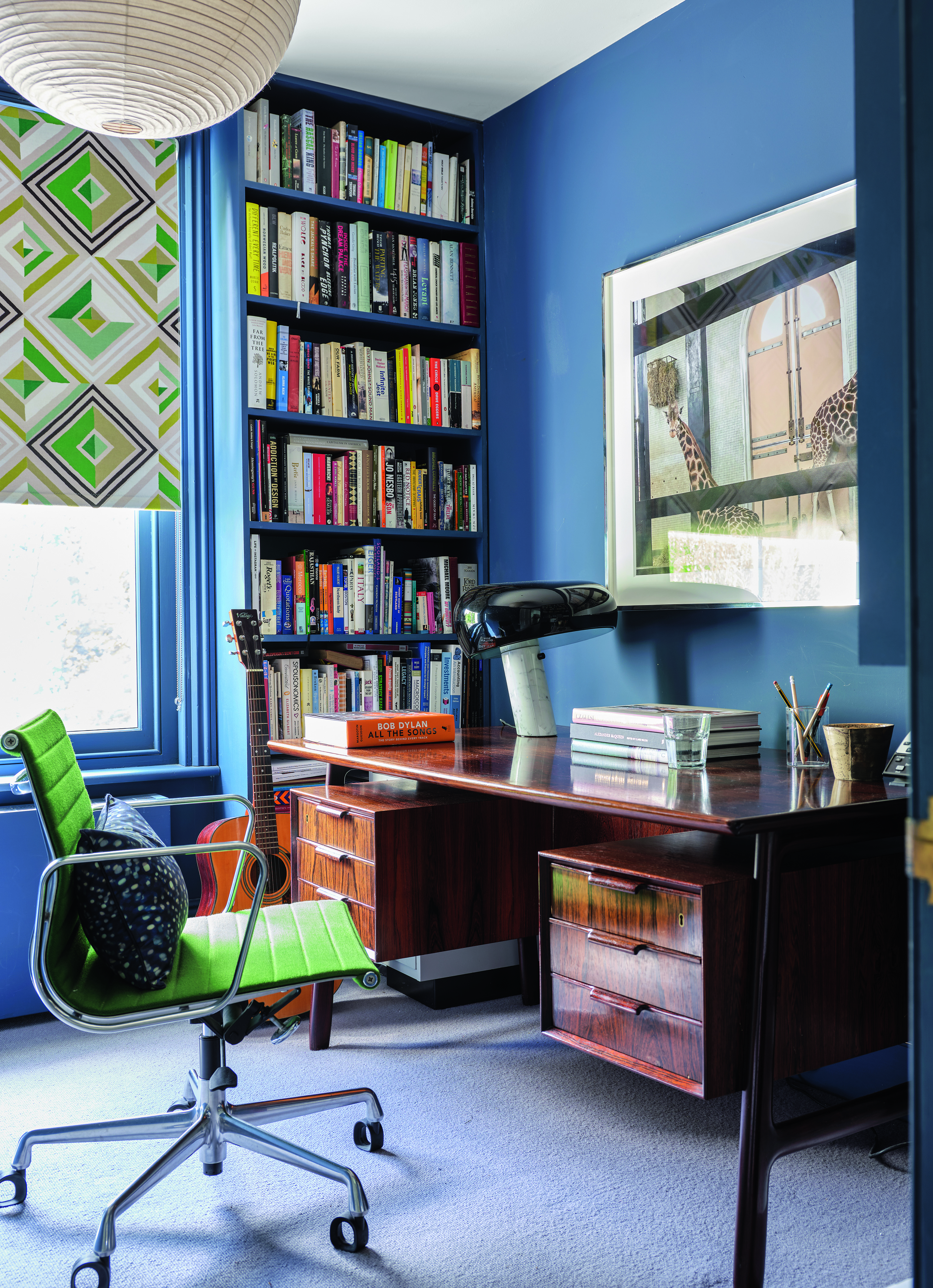
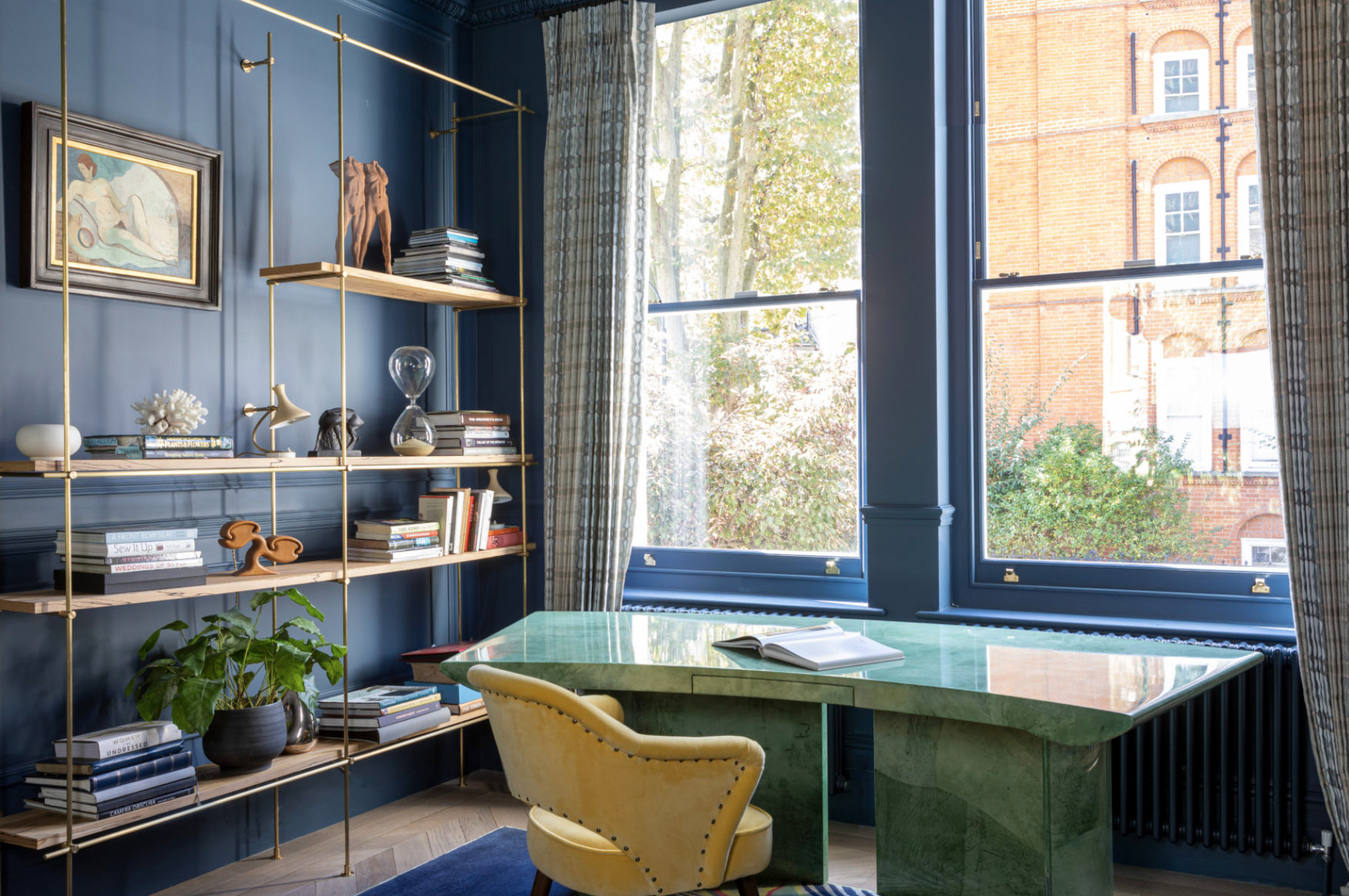
Most people opt for fresh, neutral tones for their study spaces, neglecting richer and darker colors. However, Suzy Hoodless shows how a dark color, like a navy blue, can look great in a home office.
For those who worry that a dramatic color might make the room too dark to work in, the shade can be easily lifted with a lighter-coloured floor and plenty of interesting lighting.
Choosing a paint shade that gives you the get-up-and-go you need for a home office area. London-based interior designer Sophie Ashby choses green for work spaces because it’s the color of life, renewal, nature and energy, she says.
8. Minimize the paperwork
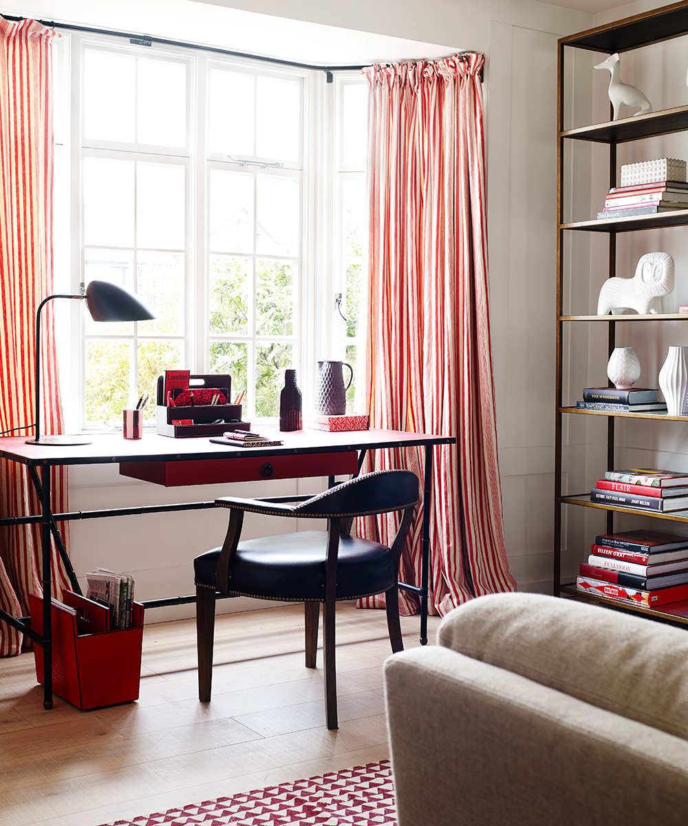
Piles of documents could mean home office clutter, so make like Clea Shearer of The Home Edit who lives by the mantra that ‘anything that can be scanned should be scanned’.
‘Unlike with physical copies, a digital filing system, either on a hard drive or secure sites like Dropbox, allows you to pay little attention to space restrictions and get more specific with your categories,’ the super home organizing duo explain.
Search is also made easy, the pair point out, as you can find what you need by date or keywords and don’t have to look through piles of paper.
9. Accessorize with intention
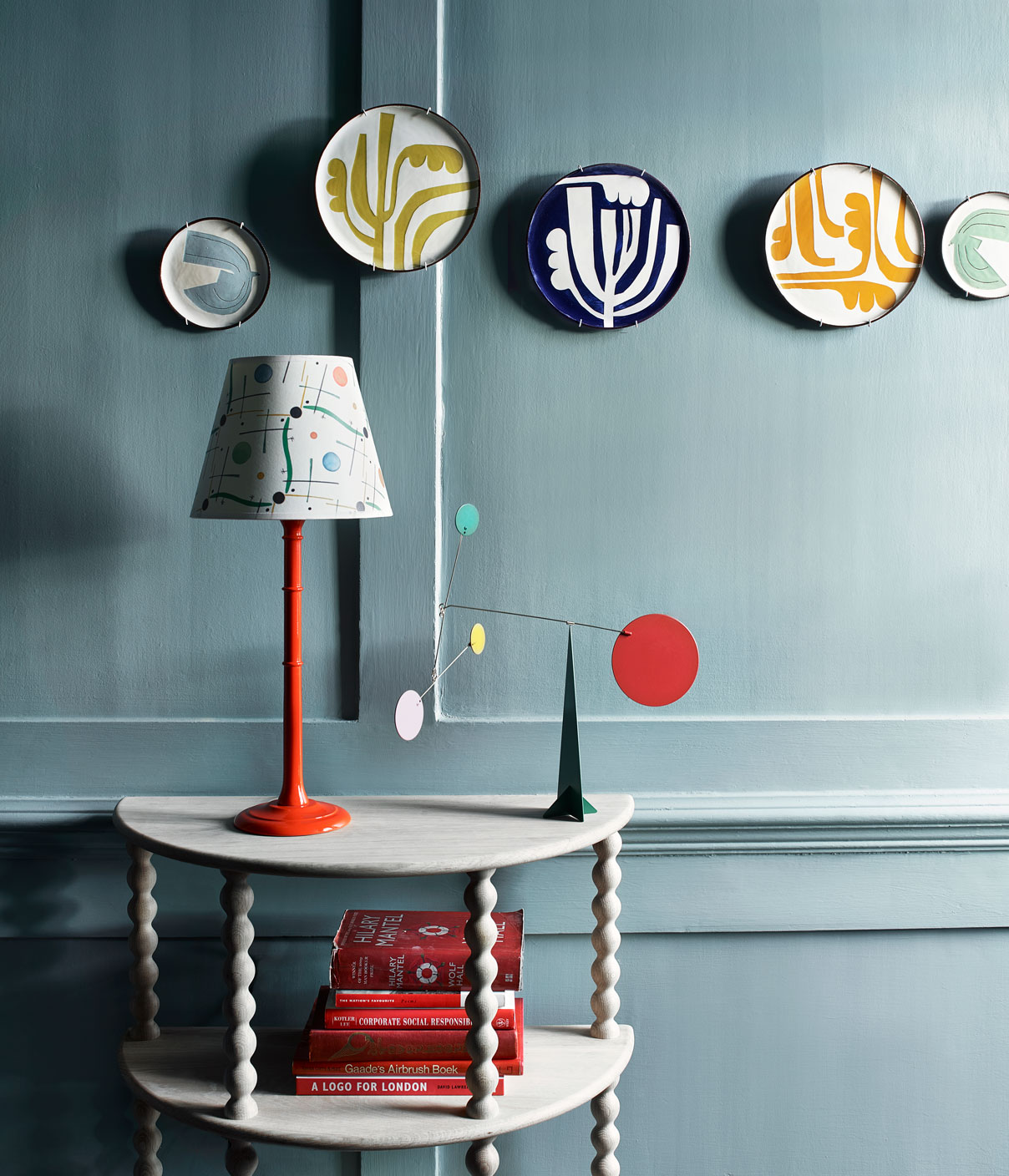
‘I think decorative objects tend to have a little bit more power when they're grouped in multiples,’ Nate Berkus says of accessorizing your workspace.
'So one box is lovely to have, but a collection of four of them on a side table under the lamp tells a story that shows that you are interested in that. Think about groupings of pottery, whether that's terracotta or chalky white ceramic, or minerals like geo, pyrite, and crystals. And there's always these sub categories within each category of object.'
10. Showcase your personality
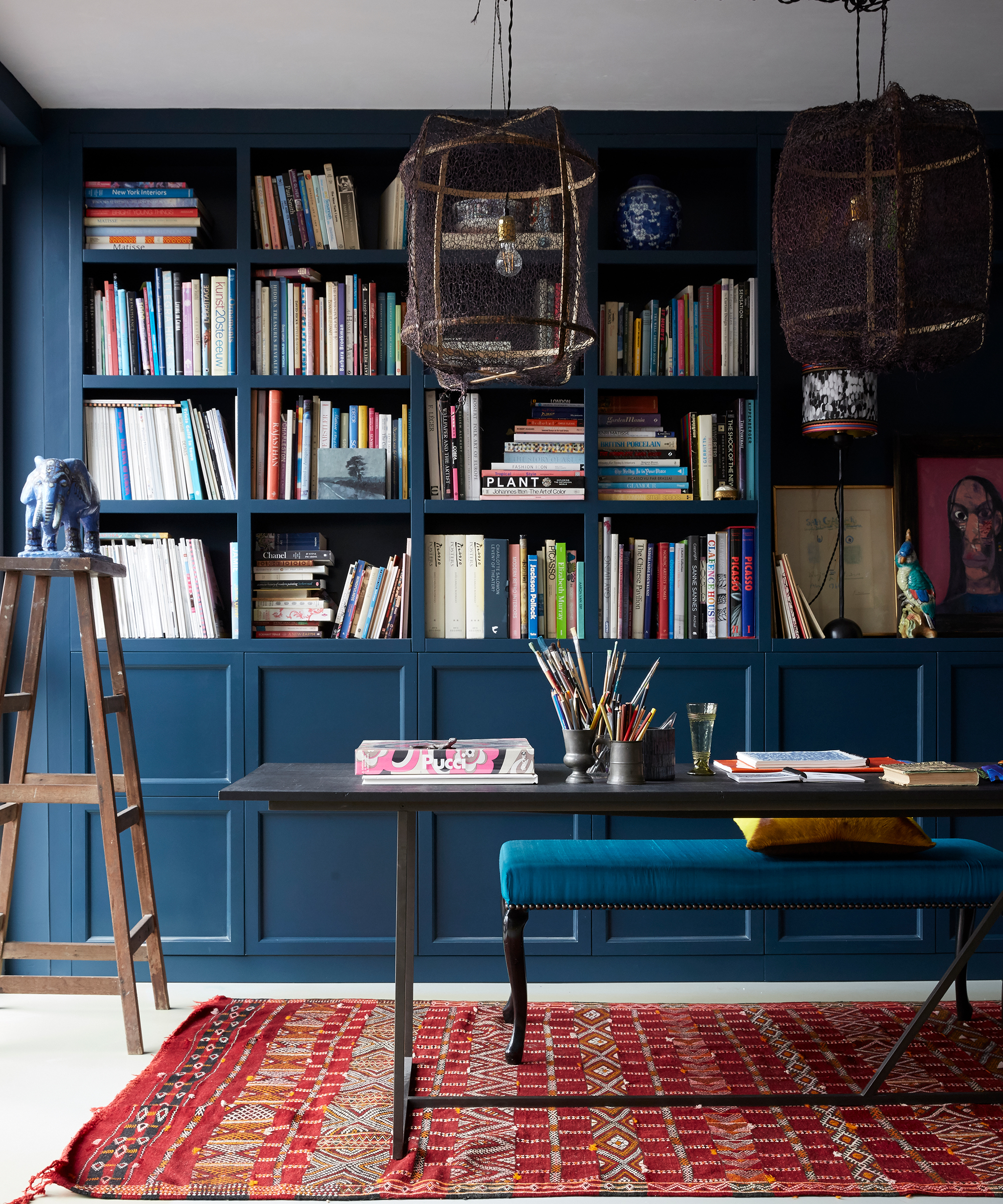
Nate Berkus says that simple design swaps can add a lot of life to an otherwise-dull work space. 'Do you like orange? Do you like tortoise, do you like Murano glass? Start looking for decorative objects that you can mix in with your books on your bookshelves. Look for vintage picture frames, vintage lamps and replace shades with printed ones from Etsy.'
11. Take your time – like you would in other rooms
Rome wasn’t built in a day – Nate Berkus would say the same about creating a home office aesthetic.
'I think it's really about spending some time not buying everything you see, but really doing a good job in editing and giving yourself some direction,' he tells us. 'Maybe you start with just one category and start looking for them, keeping your eyes open when you're out shopping or when you're online shopping.'
Additional words: Marc Lupo

Lola Houlton is a news writer for Homes & Gardens. She has been writing content for Future PLC for the past six years, in particular Homes & Gardens, Real Homes and GardeningEtc. She writes on a broad range of subjects, including practical household advice, recipe articles, and product reviews, working closely with experts in their fields to cover everything from heating to home organization through to house plants. Lola is a graduate, who completed her degree in Psychology at the University of Sussex. She has also spent some time working at the BBC.