Garden color schemes – how to use color in the garden
Create beautiful garden color schemes with this exert advice on the best way to use color in the garden for professional-looking designs

Rachel Crow
Choosing garden color schemes is one of the key considerations when looking at garden design.
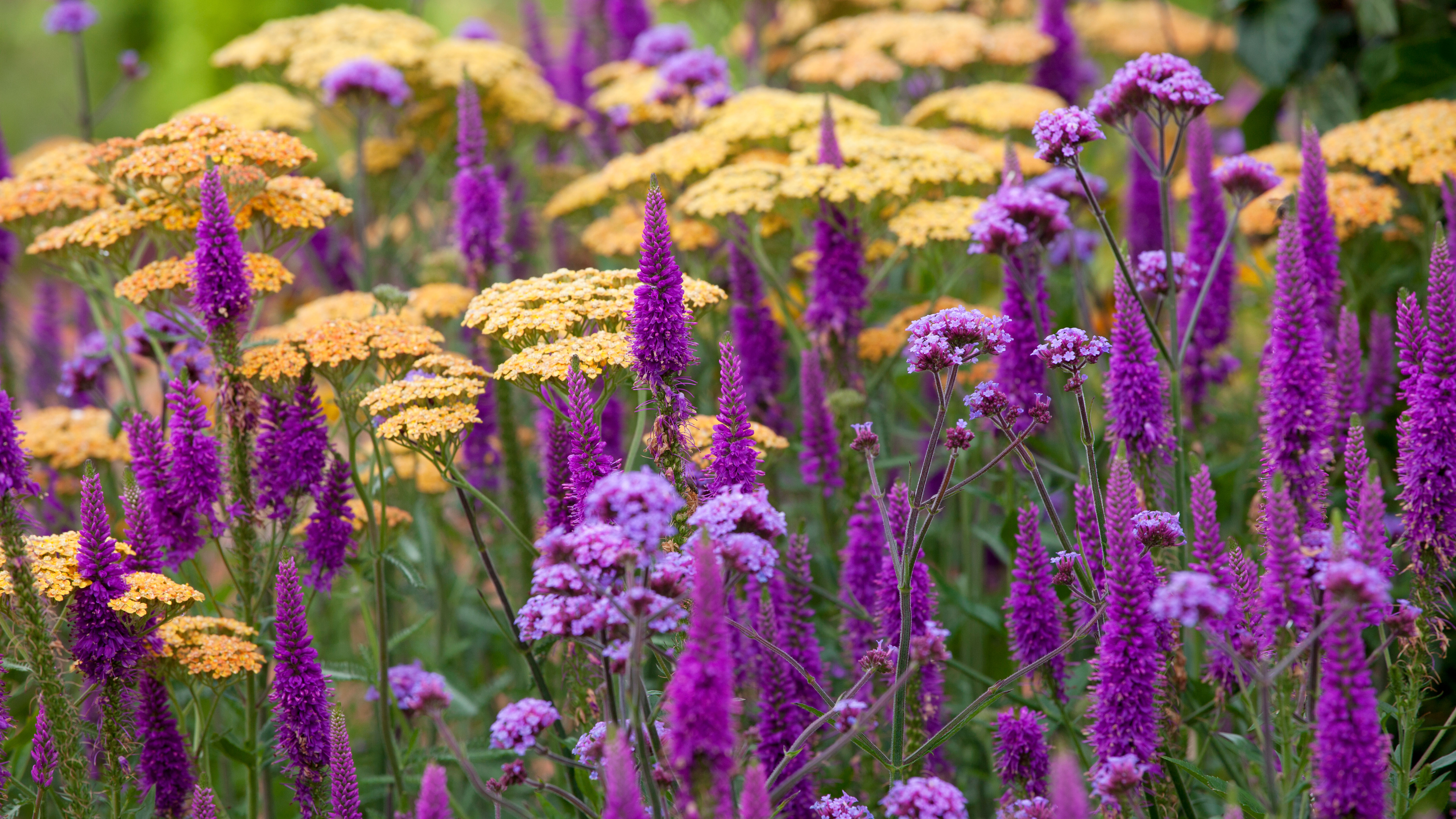
You can change the mood of your garden, or areas of your yard, through the use of color. This can range from a calming effect created by a harmonious selection of soft shades, such as muted greys, purples and blues, to vibrant and energetic spaces filled with rich reds, bright oranges and punchy lime greens.
A thoughtful use of color in the garden, together with form and texture, will form the basis of your garden ideas.
Whether you prefer strong garden color schemes, or more peaceful yet impactful white garden ideas, there are myriad options to choose from and different ways to combine color in the garden
Garden color schemes – as part of your overall design
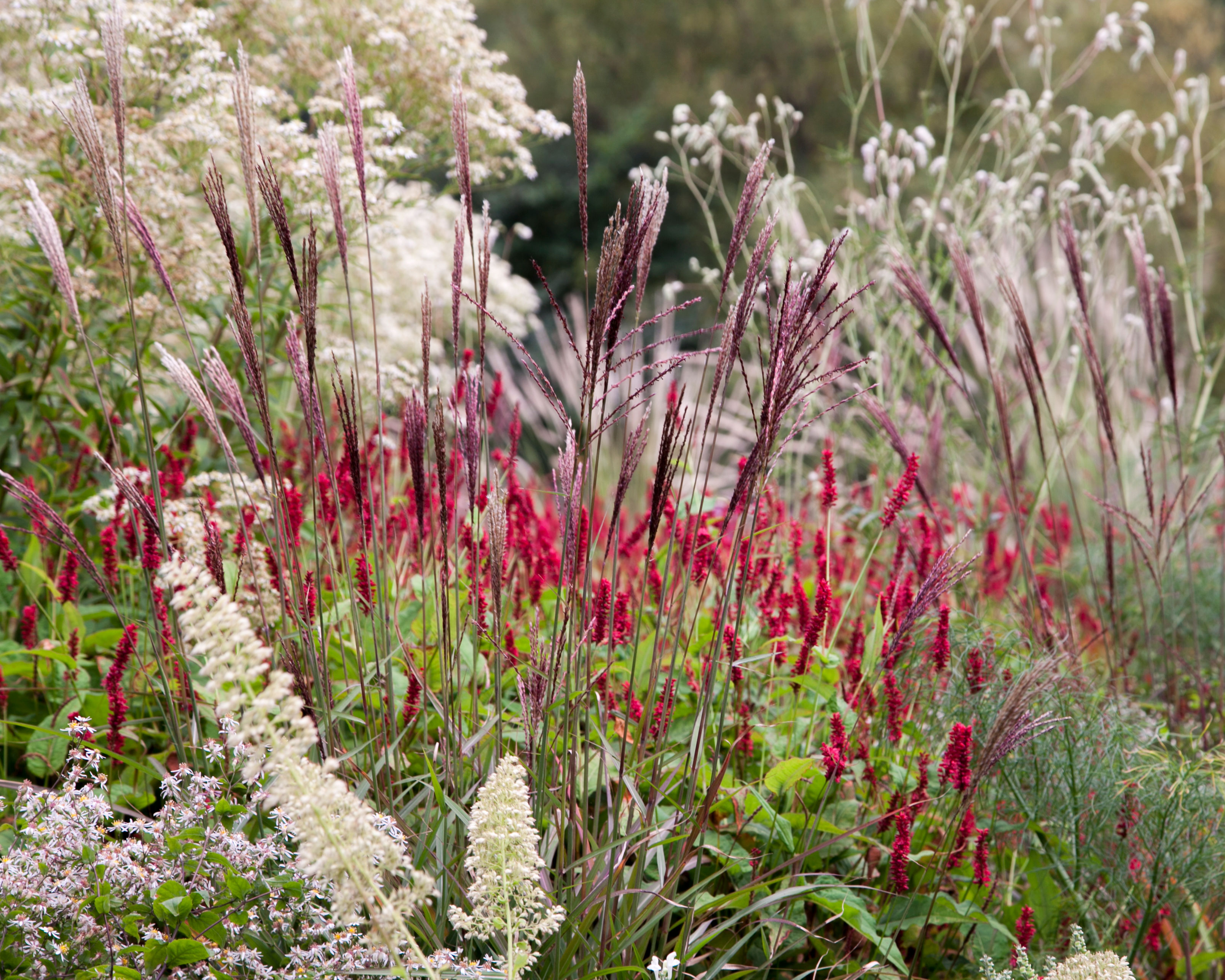
Seeing garden color schemes as part of an overall composition that includes texture and shape within your flower bed ideas is key. It’s important to understand how and where to use different colors in the garden design to achieve the best effects.
'When grouping plants, create a pinboard and Pinterest page of things that you like, to put a mood board together. If you look at blues, for instnce, you will see there is a range of different blues that slip into blue-green, and at the other end into blue-purple. Once you start to get all your palettes together, you can play with how things are combined,' advises award-winning landscape designer Dan Pearson OBE, who is renowned for his painterly planting style.
Also take into account the way light moves around in the garden, and the play of sunlight and shadow as these influence how we see color at different times of the day.
‘Color and light are key elements in the garden,' says garden designer Charlotte Rowe. 'Color gets refracted and changes throughout the day with the play of light on surfaces, which can really affect how color and light behaves in landscapes.’
Choose garden color schemes to create a mood
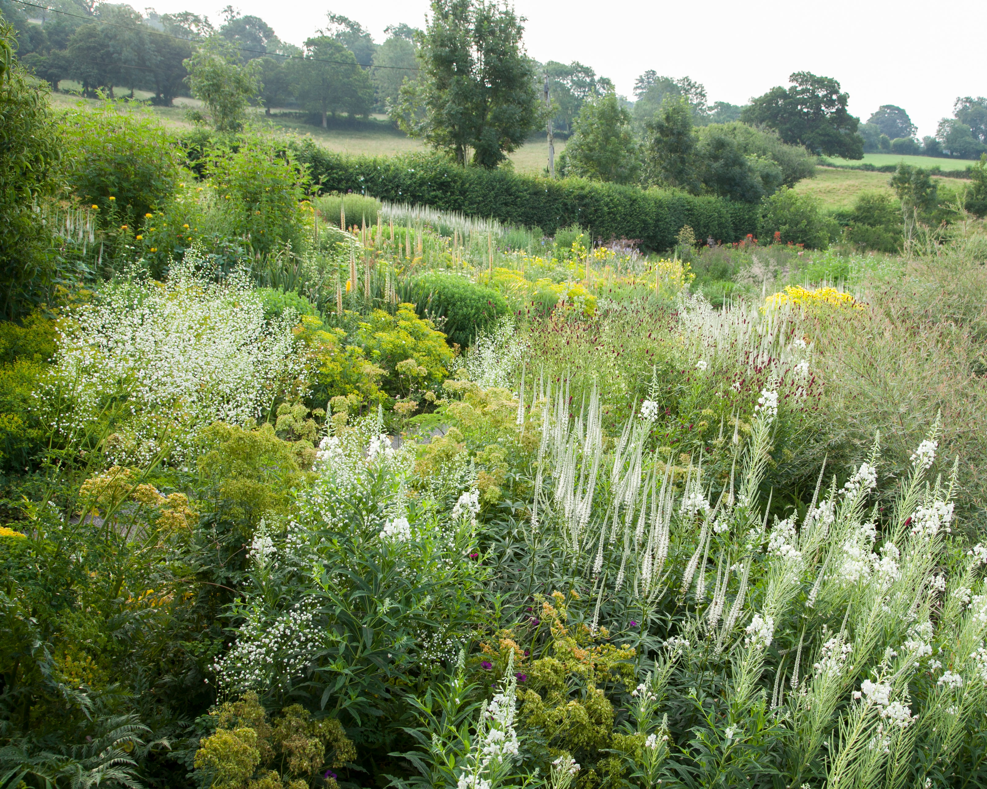
Color has a huge impact on mood and ambience, so choose your garden color scheme carefully.
'Color is a way of changing the mood in different areas of the garden. I would use whites for something that feels calming, including plants such as cow parsley and clean whites, or those with hints of cream or yellow, rather than whites with pink in them. This keeps the mood uncomplicated for a restful zone,' explains Dan Pearson,
Choosing colors to create different moods can add to a sensory garden experience.
'All the colors have different applications. Blue, for instance, makes you feel calm and is best in shadow where the color is more interesting – it becomes quite fugitive in bright lights. Whereas reds are used for providing energy. I use them in a place that is not too far away from where you might be looking as they can be distracting. If I want to catch attention, I’ll use a small amount of reds further away, but only in small amounts,' adds Dan.
When it comes to choosing garden color schemes, garden designers tend to limit the color palette to green plus two other colors. Whether you are choosing summer bulbs or late summer flowers, there are many options.
‘A riot of color is great if you really know what you’re doing but it’s safer to restrict the color range,’ says Charlotte Rowe. ‘Limit the use of color in backyard landscaping, too. We never use the color green for trellis and fences as it fights against the natural color of the plants.’
Instead, choose neutral colors and local materials wherever possible, such as brick and flint. The exception is very dark grey for walls, fences and trellis, as it helps boundaries recede, makes the space look larger and is brilliant for off-setting plants.
Start with green when choosing color in the garden
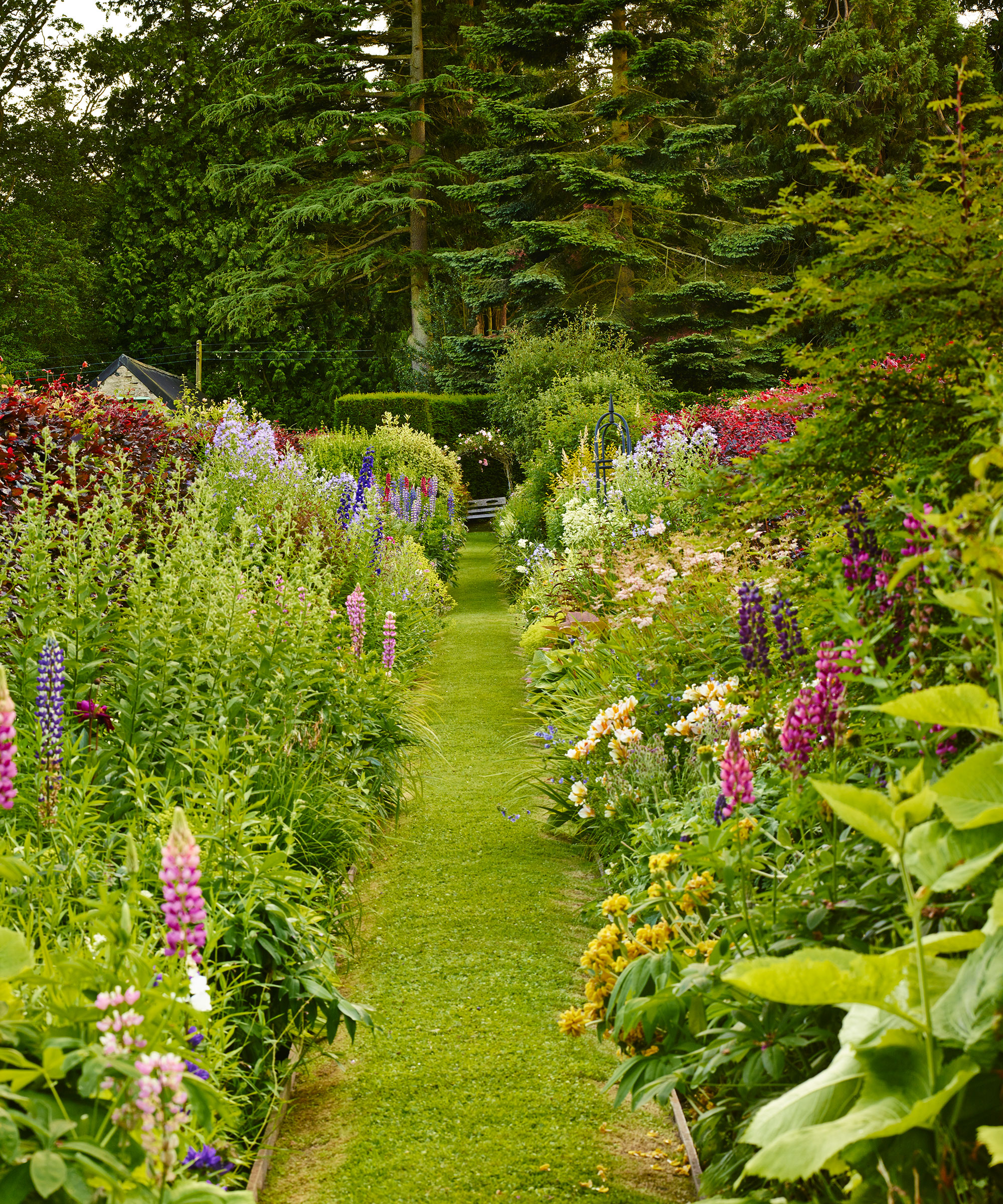
Don’t underestimate the use of the color green in the garden.
'Green is often overlooked and a much-underestimated color in the garden; however, it is, of course, the most important of all. It underpins most things in landscape settings, and you can play with its various tones to create a beautiful space,' says Dan Pearson.
‘It creates calm and connects us to nature,’ adds garden designer Michelle Brandon, who specializes in therapeutic gardens. ‘The garden doesn’t have to be all-singing, all-dancing color. We have enough stimulus in our lives to contend with as it is.’ Green is an important element to include if you're looking into how to design a restorative garden.
There is a tremendous range of green when it comes to garden color schemes, from dark holly greens through brown greens, copper coloured foliage to the lime greens. 'Holly has the darkness that works alongside purple, which can make somewhere feel quite sophisticated, whereas if you’re looking to create a vibrant garden zone, bright lime greens, such as euphorbias, will add a sense of energy,' explains Dan Pearson.
'I will often create garden spaces that are 90 per cent green. It is like a palette cleanser. You go into it, and it instantly makes you feel calm. You can gather your thoughts and it’s not confronting you in the same way that more obvious colors do,' Dan adds.
Evergreen shrubs and evergreen climbers can soften boundaries, 'as well as provide you with a lovely darkness that contrasts with other colors,' he says.
However, Dan cautions to 'think about the degree of variety in the greens in terms of seasonality. I do use evergreens, but I would rely on 60 to 70 percent being deciduous because you are building seasonal change. The evergreen provides you with the foundation; the deciduous greens provide you with that flux,'
Choose garden color schemes to zone areas
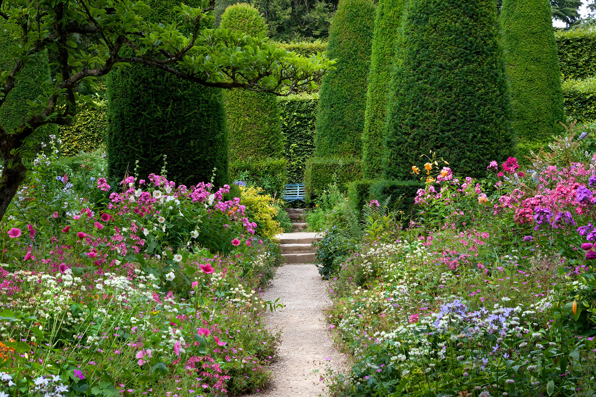
Using specific color ranges and styles of planting in different parts of the garden helps to reinforce the character of each area, resulting in a much more varied experience. But other things need to be decided first.
‘When I plan a garden color scheme, decisions on hues and detailed planting usually come last once the overall structure has been decided,’ says landscape architect Pip Morrison. ‘It’s definitely a case of last but not least though as it’s probably color, whether full-on or restrained, that has the most immediate impact.’
Pip suggests thinking of adjectives to describe the feel you want in your garden. These defining words help to form a unifying thread throughout the design, including in those later stages of planning the detailed planting when it’s all too easy to fall back on favourite plants and colors.
'If you’re zoning a garden in terms of color, you need to go all out and be quite strict. It makes the garden into something that becomes an event. If you start diluting it too quickly with other things, it then becomes something that is less of an experience,' says Dan Pearson.
Plan garden color schemes for borders
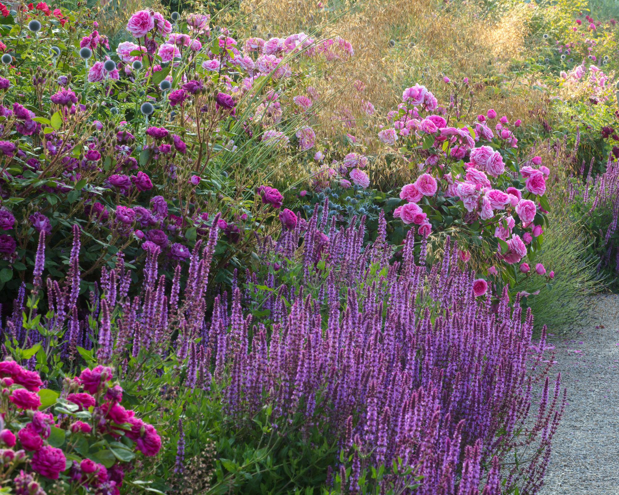
A stylish effect in a garden color scheme can be achieved through the use of restraint and repetition – and this is where knowing how to plan a flower bed is key to this, as is a knowledge of the color wheel (more on this below), which can lend a pleasing unity to the planting.
‘We love creating harmony through simplicity and rhythm in our planting,’ says designer Alistair W Baldwin. 'Repetition of color is a useful device to unify the garden and pull together a theme. The most simple and effective way to do this is by choosing one or two dominant colors. The trick to add that special wow is to plant colors in big loose blocks. It can be tempting to cram in more but try to keep things simple with a more subdued approach if you want to create a relaxing space. The fewer the colors, the more stylish the result.'
This south-facing border above uses a limited palette featuring the roses ‘Princess Anne’ (bottom left), ‘Young Lycidas’ (middle left) and ‘Harlow Carr’ (center) combined with perennials including Salvia ‘Amethyst’, Echinops ‘Veitch’s Blue’, Eryngium x tripartitum and Penstemon ‘Blackbird’.
Color changes through the garden
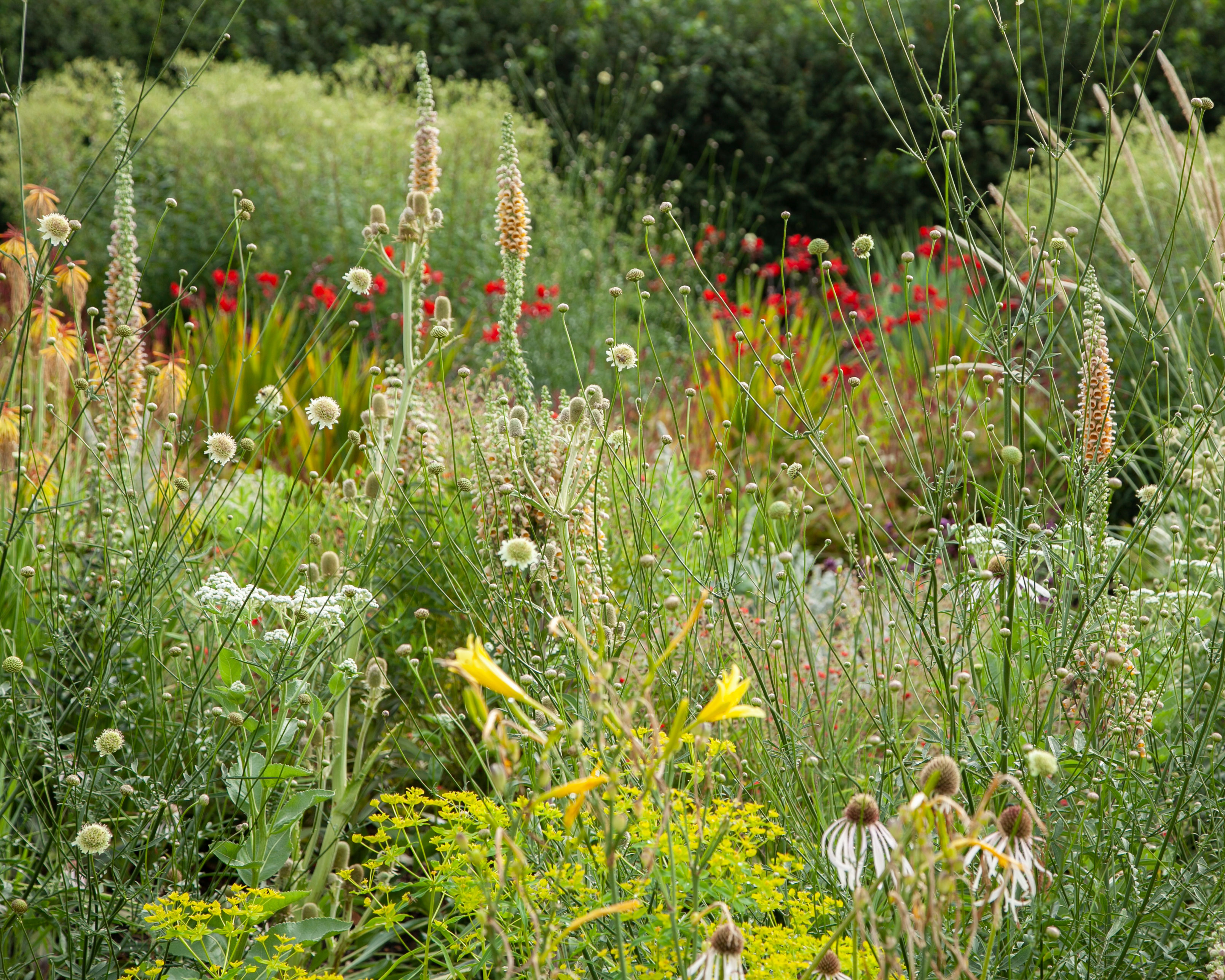
'In my garden, I have "color fields". It’s all one scheme, but as you move with the garden, you move into different areas where the color changes,' explains Dan Pearson .
'The center of the garden, which is the first that you enter when you come from the house, has the strongest colors; about 20 percent reds and 80 percent greens – it is pretty lively.
'I then replace the reds further into the garden with oranges, which allow me to leave the reds behind. Then the garden picks up through the oranges to dark reds, burgundies and browns. These allow me to move into purple and blue, which always have white in them to stop them from feeling heavy. You then have the softer, less demanding colors at the end of the garden and that includes smoky pinks.
'Your eye can travel through that because it's not demanding. Your eye wouldn’t be able to travel through that if it had the bright greens and reds at the end of the garden. You can stretch a yard by playing with a color like that,' he explains.
Make garden color schemes work for a contemporary look
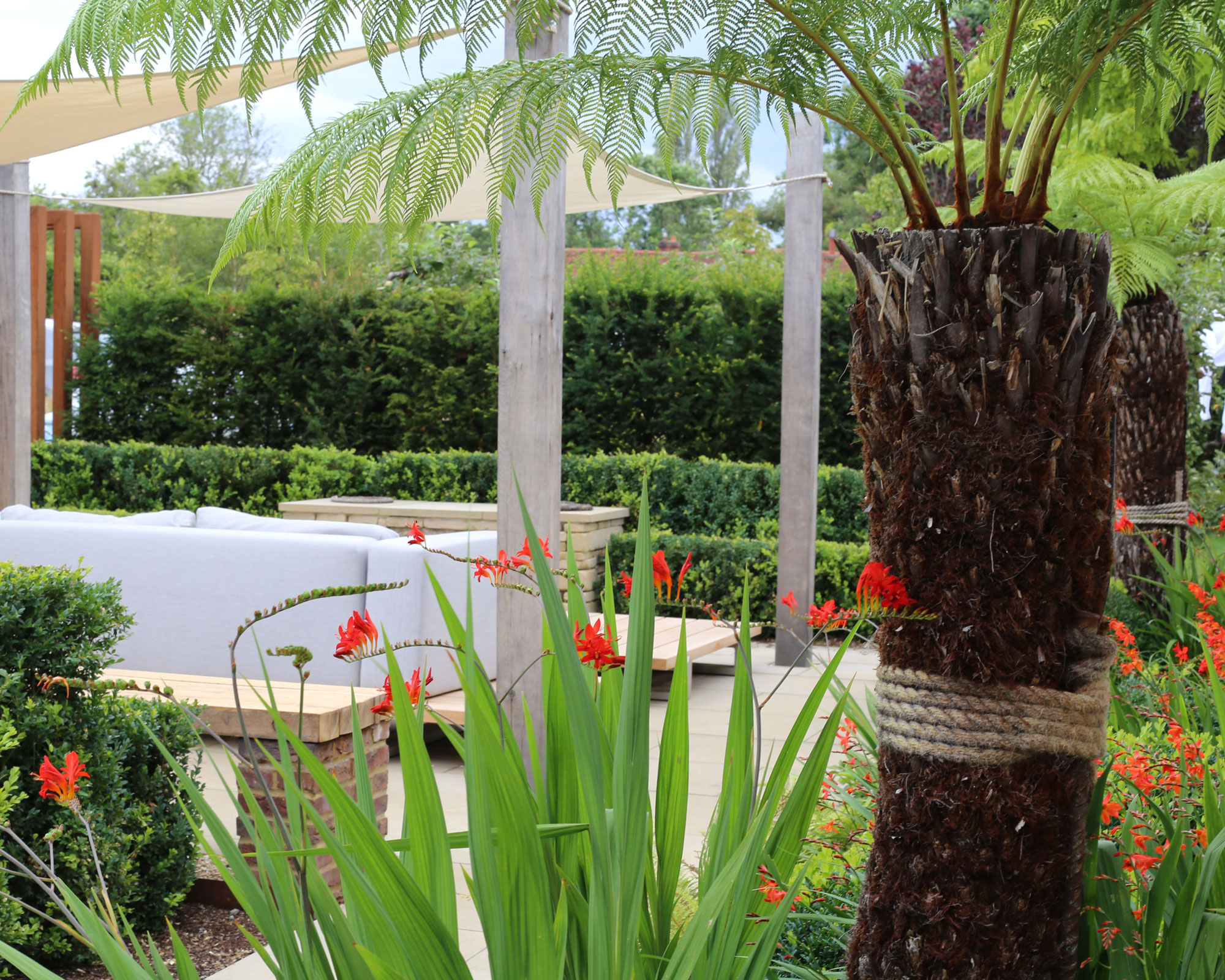
A garden color scheme in a modern setting can be anything you want it to be: have fun, break the rules and add some personality to your garden.
‘One of the things I love about using color in contemporary gardens is that there are no rules,’ says Patricia Fox of Aralia Garden Design. ‘There’s a real sense of freedom, which can lead to a truly innovative garden space.’
Simplicity is everything. Go minimal and choose just one flower or color as a highlighting touch, such as these bold orange flowers above which also complement the rusted look of Corten steel, pulling together the hard landscaping to create cohesive tropical garden ideas.
This courtyard features bold splashes of orange crocosmia against an evergreen backdrop of buxus and taxus hedging, with a theatrical green canopy of Dicksonian tree ferns overhead. A neutral hardscape of Corten steel arches, oak, reclaimed brick, sawn sandstone and cream canopies complements the look.
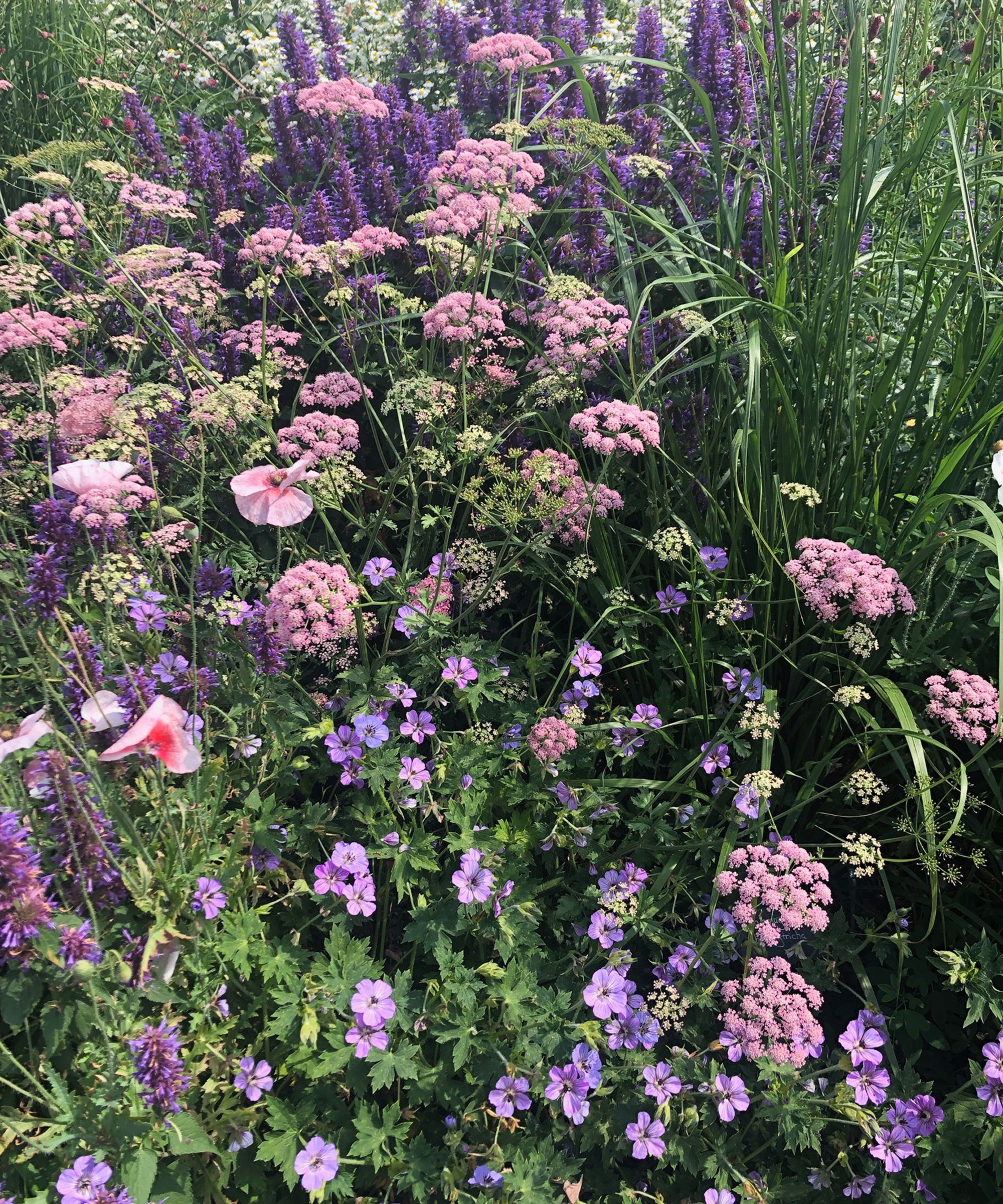
What colors go well together in a garden?
To work out which colors go well together in a garden, first decide on the mood you want to create for your garden color scheme.
‘Do you want it to be vibrant and energizing using bright and contrasting colors, or would you prefer a relaxing feel with a pastel-based color palette?’ says Sue Townsend.
Create a mood board of plants suited to your soil in the colors you like and note when they’re in flower. This allows you to see the effect of each of the plants next to each other before you take the plunge. Consider the color of the foliage of perennials, grasses or shrubs that add color to accentuate the plants beside them.
‘Drama can be ramped up in a garden when you put plants together that have close color associations,’ says designer Jane Brockbank. ‘Thinking more in terms of “pools” of warm or cool colors, put hot pinks/reds/magentas together or combine a palette of lilacs/blues/deep purples. There’s no such thing as clashing in my book!’
'Colors are often interesting when juxtaposed with the shade opposite on the color wheel. Orange, for instance, sits opposite purple, or bright magenta pink. You can get a wonderful burst of energy. To play with color and provide energy is a really interesting way of animating a garden,' says Dan Pearson.
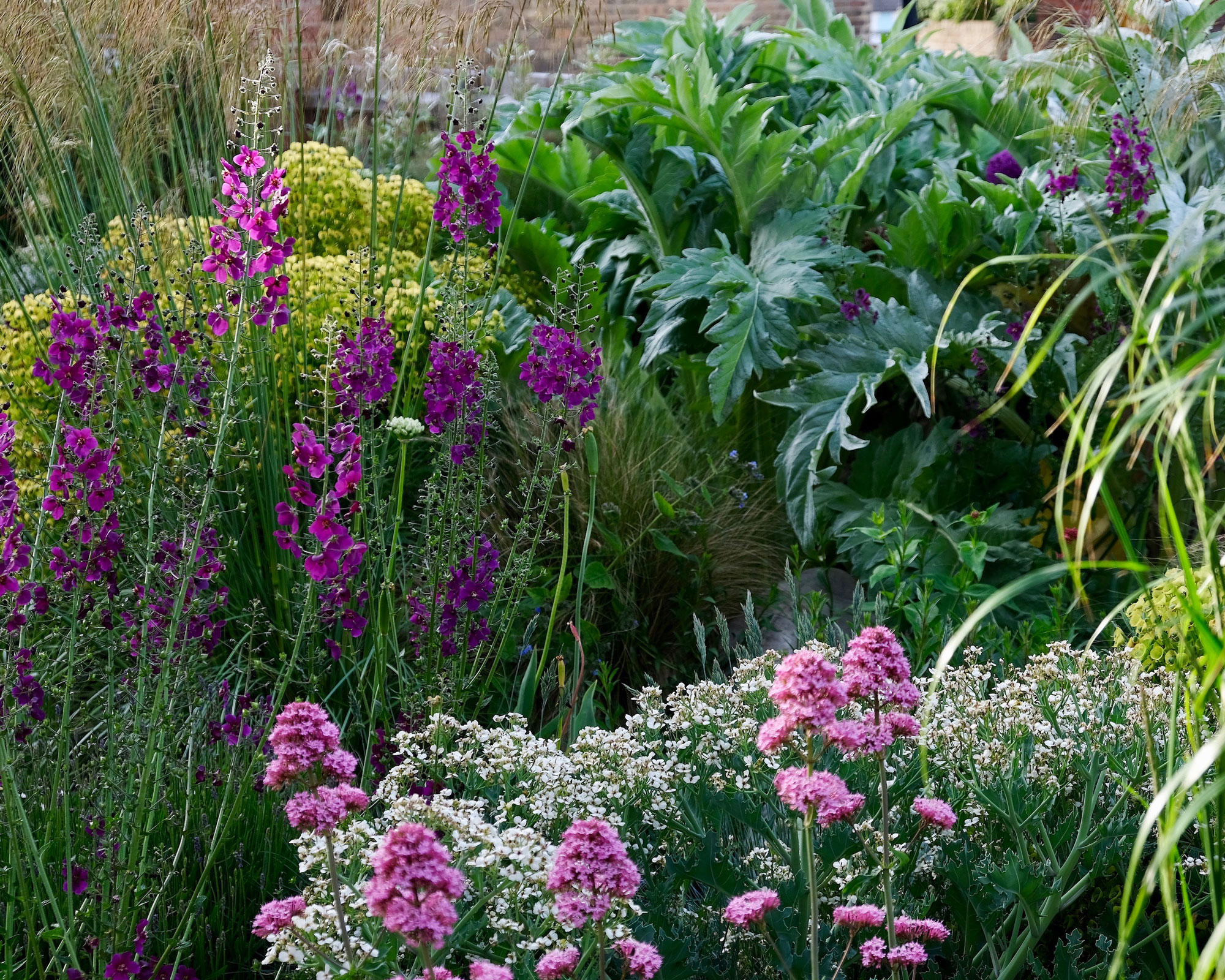
How do I plan a color scheme for my garden?
The color wheel provides a technical reference for organizing a garden color scheme, enabling us to make selections and contrasts so our color choices sing.
'Central to the color wheel are the bold and bright primaries red, yellow and blue,' says color expert Andrew Wilson FSGD and design consultant to McWilliam Studio and Director of London College of Garden Design.
'The use of these colors together in a planting scheme would prove lively but the real fun starts as we move away from primaries to mixing colors together. Our first stop is the secondaries or complementary colors opposite the primaries in the wheel. The use of red with green would be a good example as the combination makes the red more intense and the green brighter. The next group of colors are the tertiaries, which lie between the secondaries, for example warming up in the red spectrum.'
We often make predictable choices related to our preferences. If you want to be a little more experimental, start by placing a triangle on the color wheel so that each point sits on a color. 'First do the primaries, then move the triangle as if it were a dial – the points will sit on colors that will work together through contrast. These are color triads,' says Andrew Wilson. 'For the tetrads, place a square or a rectangle over the color wheel in the same way. The four corners will pick up colors that work together. Again, the square can be moved to change the color combinations.'
The properties of color are also important. Red is also known as an advancing color, noticeable and bold, suggestive of heat and energy in colors it permeates such as orange and magenta. Blue is a receding, cooler color creating depth and space in blues, blue-violet and blue-greens. Yellows are sunny and cheerful. Most are warm and pair well with reds and oranges. Greenish-yellows are cooler and suit more delicate combinations. Greens suggest calmness and freshness.
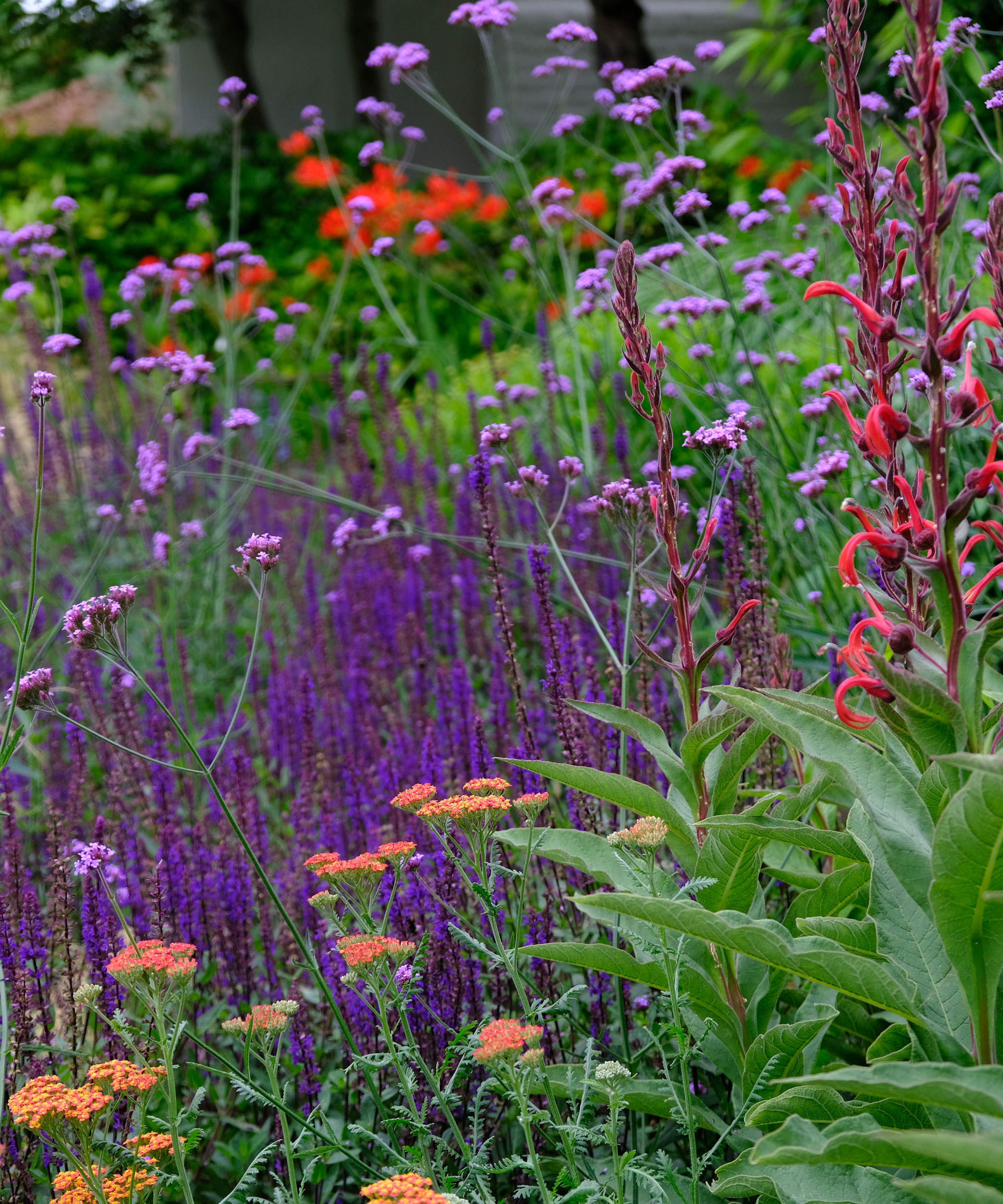
What colors look good with plants?
The colors that look good with plants – on house exteriors, paintwork, garden fence ideas and walls – really depend on the effect you want to create.
The most subtle way to choose colors that look good with plants is to rely on natural, local materials to show off your blooms, from natural stone to untreated timber. This will also help in creating a sustainable garden.
If you want to create drama, creating a backdrop that complements your planting will show it off to great effect. For example, cottage garden ideas can look beautiful against house colors that are sympathetic to the planting – think pastel blue, pink or yellow, for example.
Generally, greens aren't favored as a backdrop for planting, because they can look unnatural against the green of your foliage; however, harsher colors, such as grey, blue and even black can show off planting to great effect.
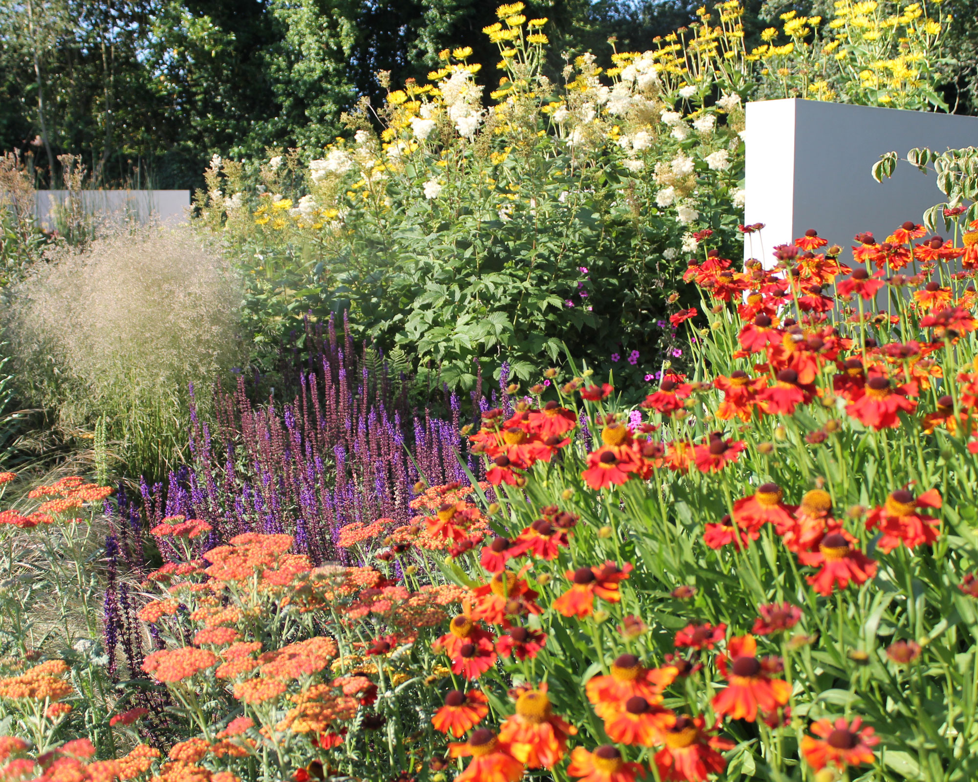
Can a garden be too colorful?
A garden can be too colorful if it contains too many contrasting colors. 'In terms of grouping or layering colors, it’s important that you have a degree of contrast, but not so much that it becomes distracting or confusing,' explains Dan Pearson.
Likewise, do not combine colors that might alter the mood of that area of the backyard. 'If you were making a blue garden, I wouldn’t allow it to contrast too readily with something like yellow because it would drain its energy and stop it from feeling tranquil. It’s a color that is influenced by light and the other colors that surround it. It’s a fragile color in a way,' he adds.
'It is often better to use pinpricks of color rather than big splashes.'
Sign up to the Homes & Gardens newsletter
Design expertise in your inbox – from inspiring decorating ideas and beautiful celebrity homes to practical gardening advice and shopping round-ups.
Lifestyle journalist Sarah Wilson writes about flowers, plants, garden design and gardening trends for Homes & Gardens. She has studied introductory garden and landscape design and floristry, and also has an RHS Level 2 qualification in the Principles of Plant Growth and Development. She is a regular contributor to Homes & Gardens and Livingetc. She has also written for Real Homes, Modern Gardens and Country Homes & Interiors magazines.
-
 5 times you should never paint a room gray – no matter how timeless you think this shade is
It might be dubbed a classic neutral, but gray isn't the right choice for every room
By Sophia Pouget de St Victor
-
 These 7 plants will excel and be pest-free next to rosemary – discover the best companion plants, plus what to keep away
Rosemary companion planting keeps plants thriving, deters pests, and can even improve the taste of some crops
By Drew Swainston